Advanced mapping

Andrew Ba Tran
November 4, 2015

New York Times

NPR

New York Times

The Upshot uses geolocation to push readers deeper into data

All the Lonely People

Blizzard of 2015

It was a record-breaking winter.

What are some ideas for data visualizations?

Give me five ideas.

WNYC's Data News

Embeddable radar

WNYC's Data News

Transit tracker

WNYC's Data News

Traffic map

The New York Times

A dashboard to track the status of airports, trains, and schools in NYC.

The Boston Globe

Static map of snow accumulation

The Boston Globe

Static chart of snow accumulation

The Boston Globe

Interactive chart of snow accumulation

WindyTY

Global weather conditions visualization

WindyTY

Global weather conditions visualization (open source)

Smithsonian

Geo-tagged social media updates related to the storm

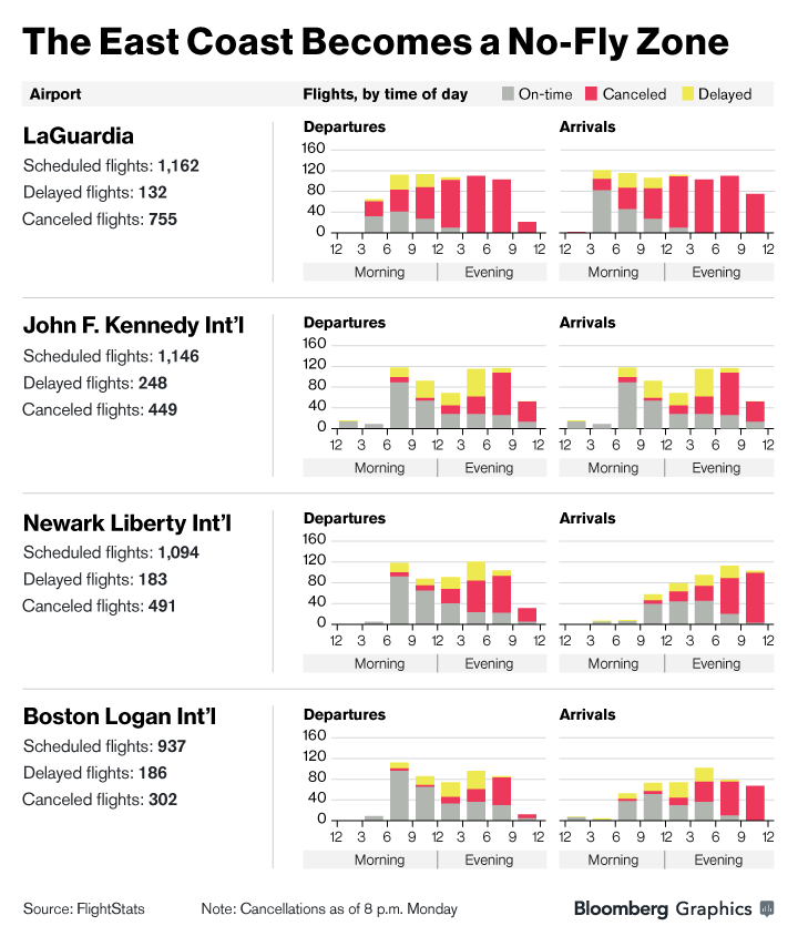
Bloomberg

Charting flight delays and cancellations

The Guardian

Collage of live camera feeds

You

A timelapse snow plow map