Making a Highcharts.JS chart from scratch
Highcharts is a JavaScript library for creating interactive charts.
To fully understand this walkthrough, it's necessary to have a basic understanding of Javascript, html, and css.
Some cool things about Highcharts:
- Compatible with all browsers and devices
- Open source, so that means it is free
- Lightweight
- Simple configuration using json to define characteristics
- Dynamic - Chart can be programmed to be modified after it's been generated
- Supports multiple axes
- Custom tooltips
- Date and time support
- Export features - for PDF, PNG, JPG, SVG
- Print option
Dozens of different types of charts
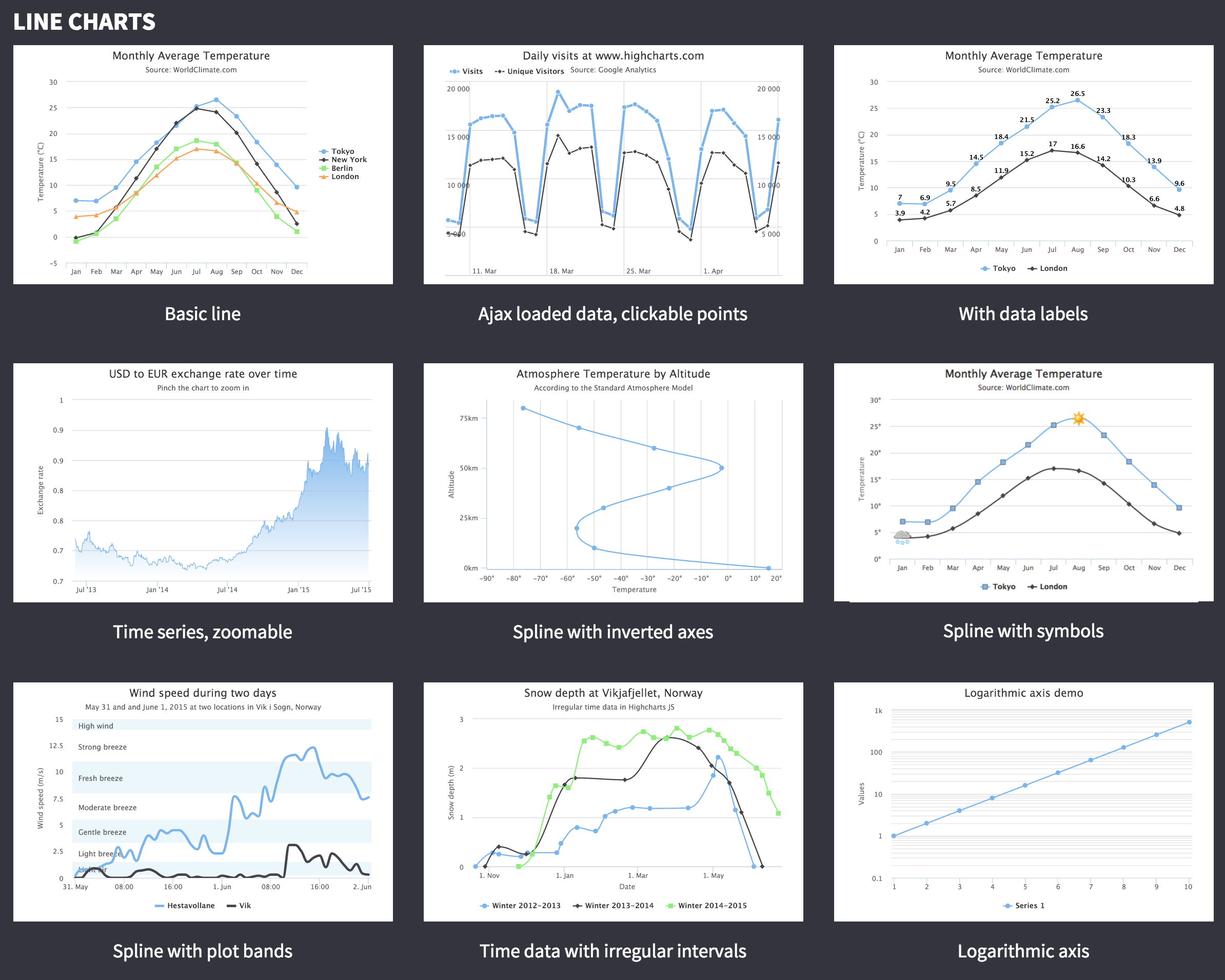
- Line charts
- Area charts
- Column and bar charts
- Pie charts
- Scatter and bubble charts
- Combinations
- Dynamic
- 3D charts (ugh, please don't)
- Guages
- Heat and Tree maps
Setting up the environment
Highcharts requires jQuery to work.
A couple ways to install jQuery:
- Download: Download it locally from jquery.com and host it locally
<head>
   <script src="/jquery/jquery.min.js"></script>
</head>
- CDN access: Content Delivery Access means using someone else's hosted jquery file instead of hosting the files on your own server. The advantage is that if the visitor to your webpage has already downloaded a copy of jQuery from the same CDN, it won't have to be re-downloaded.
<head>
   <script src="http://ajax.googleapis.com/ajax/libs/jquery/2.1.3/jquery.min.js"></script>
</head>
Install Highcharts
Same thing as jQuery: You can either download it or point to a CDN served version.
Downloaded Highcharts
<head>
   <script src="/highcharts/highcharts.js"></script>
</head>
CDN Highcharts
<head>
   <script src="http://code.highcharts.com/highcharts.js"></script>
</head>
Let's just use the CDN Highcharts version.
Step 1: Create HTML page
Start up a new page with jQuery and Highcharts javascript libraries.
The container div is used to contain the chart drawn using the Highcharts library
Step 2: Set up configurations
Highcharts library uses very simple configurations using json syntax.
$('#container').highcharts(json);$('#container').highcharts(json);
Here json represents the json data and configuration which HighChart library uses to draw a chart withing container div using highcharts() method. Now we'll configure the various parameter to create the required json string.
title
Configure the title of the chart.
var title = {
  text: 'Monthly Average Temperature'
};
subtitle
Configure the subtitle of the chart.
var subtitle = {
  text: 'Source: WorldClimate.com'
};
xAxis
Configure the ticker to be displayed on the X-Axis
var xAxis = {
   categories: ['Jan', 'Feb', 'Mar', 'Apr', 'May', 'Jun'
      ,'Jul', 'Aug', 'Sep', 'Oct', 'Nov', 'Dec']
};
yAxis
Configure the title, plot lines to be displayed on Y-Axis
var yAxis = {
   title: {
      text: 'Temperature (\xB0C)'
   },
   plotLines: [{
      value: 0,
      width: 1,
      color: '#808080'
   }]
};
tooltip
Configure the tooltip. Put suffix to be added after value (y-axis).
var tooltip = {
   valueSuffix: '\xB0C'
}
legend
Configure the legend to be displayed on the right side of the chart along with other properties.
var legend = {
   layout: 'vertical',
   align: 'right',
   verticalAlign: 'middle',
   borderWidth: 0
};
series
Series is an array where each element of this array represents a single line on the chart.
Configure the data to be displayed on the chart.
var series =  [
   {
      name: 'Tokyo',
      data: [7.0, 6.9, 9.5, 14.5, 18.2, 21.5, 25.2,
         26.5, 23.3, 18.3, 13.9, 9.6]
   },
   {
      name: 'New York',
      data: [-0.2, 0.8, 5.7, 11.3, 17.0, 22.0, 24.8,
         24.1, 20.1, 14.1, 8.6, 2.5]
   },
   {
      name: 'Berlin',
      data: [-0.9, 0.6, 3.5, 8.4, 13.5, 17.0, 18.6,
         17.9, 14.3, 9.0, 3.9, 1.0]
   },
   {
      name: 'London',
      data: [3.9, 4.2, 5.7, 8.5, 11.9, 15.2, 17.0,
         16.6, 14.2, 10.3, 6.6, 4.8]
   }
];
Step 3: Build the json data
Combine all the configurations.
var json = {};

json.title = title;
json.subtitle = subtitle;
json.xAxis = xAxis;
json.yAxis = yAxis;
json.tooltip = tooltip;
json.legend = legend;
json.series = series;
Step 4: Draw the chart
$('#container').highcharts(json);
Result
More
Are there more charts you'd like to try out?
Highcharts has great documentation on how to make each chart, as well as many extra advanced options.
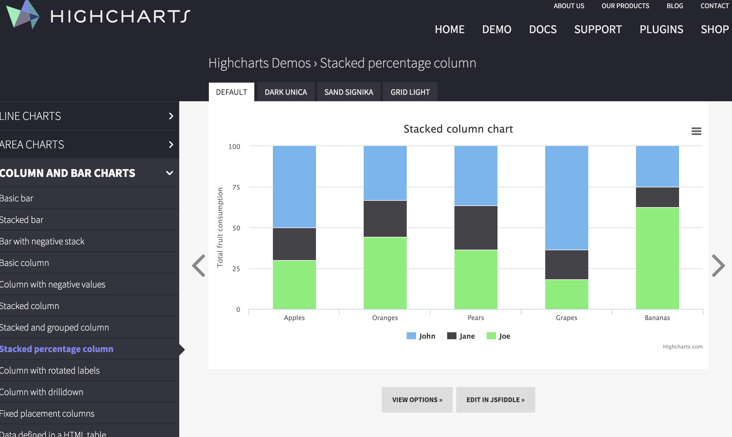
Just browse and select the type of chart you'd like to get more information.
Click View Options to see how the Javascript is structured to recreate it.
Click on Edit in JSFiddle to see the full HTML, CSS, and Javascript that recreates it.
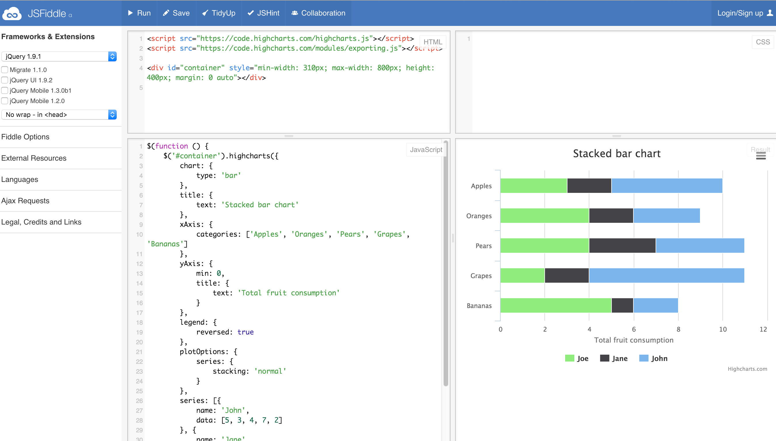
Now, just change out the data with the data you have.
Need help on how to do that? Move on to the next lesson: Converting data to JSON format.