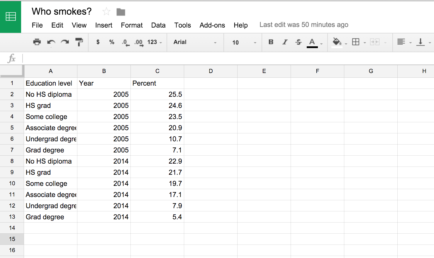
Making D3 charts using D3Plus.js
Data-driven documents, known as D3, is the most-common standard for interactive data visualizations.
It is built on Javascript but uses HTML and CSS to style it. As you can see based on the many examples on the official site, D3js.org, there are many opportunities to turn your data into an interactive visualization.
You might not have noticed, but we've used D3 before when we used Plot.ly.
Unfortunately, D3 takes some advanced knowledge of Javascript, HTML, and CSS to build it from scratch.
Plot.ly is a service for those who don't want to deal with the coding. It's a chart-building service that renders the visualizations using D3. However, there are limitations. You only have as much flexibility as their chart generators allow. Like height will always be limited.
However, D3plus.org is an alternative for those who want to create D3 visualizations with a high level of customizaiton but don't have the deep coding knowledge.
A group of people from MIT's Media Lab created D3plus as a sort of introduction, or bridge to D3.
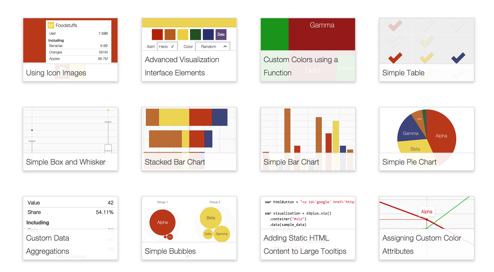
They have a set of visualizations, like scatter plots, tree charts, bar charts, etc.
All the code behind it is listed below each example and open to tweaking.
We're going to try it out and make the chart below.
Get the data
We'll replicate one of the charts used in this Connecticut Mirror story: The story in charts: Who still smokes?
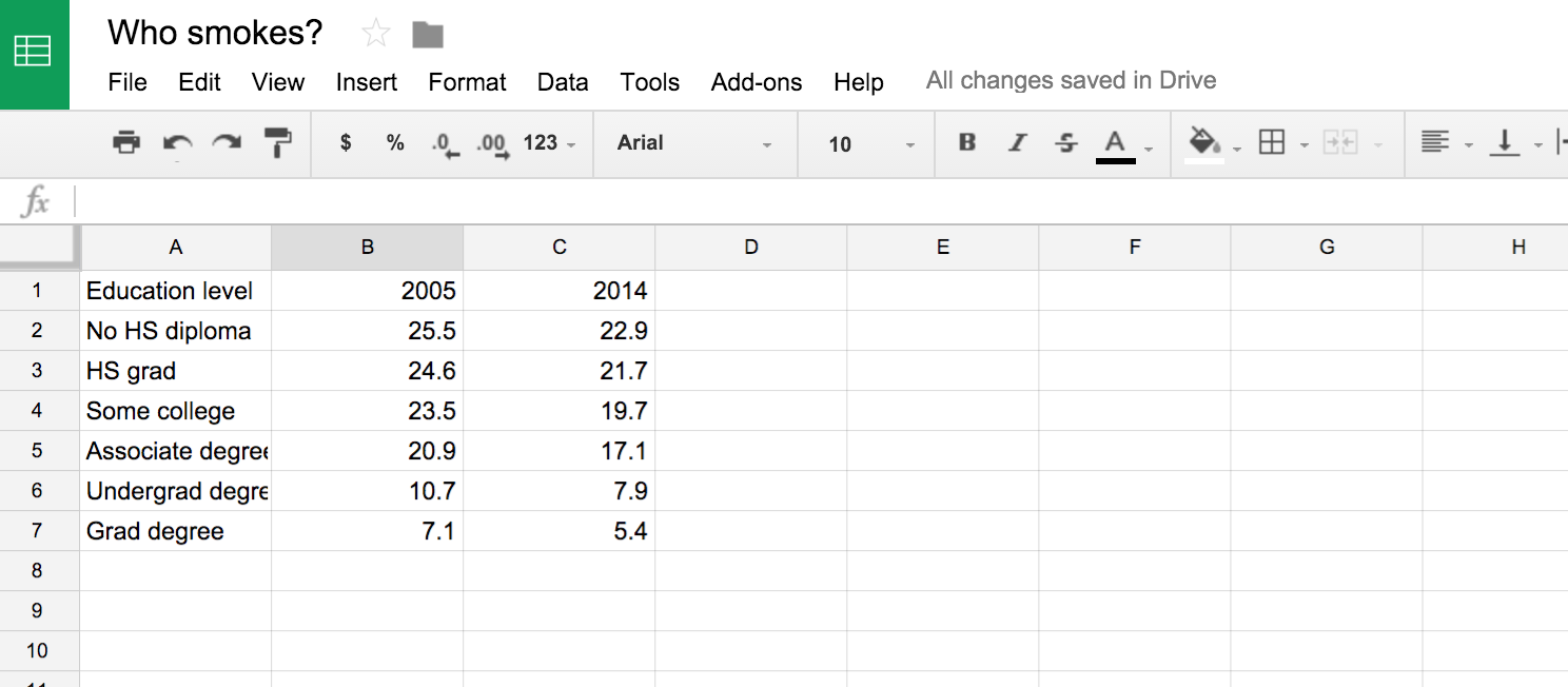
Start by taking a look at the data.
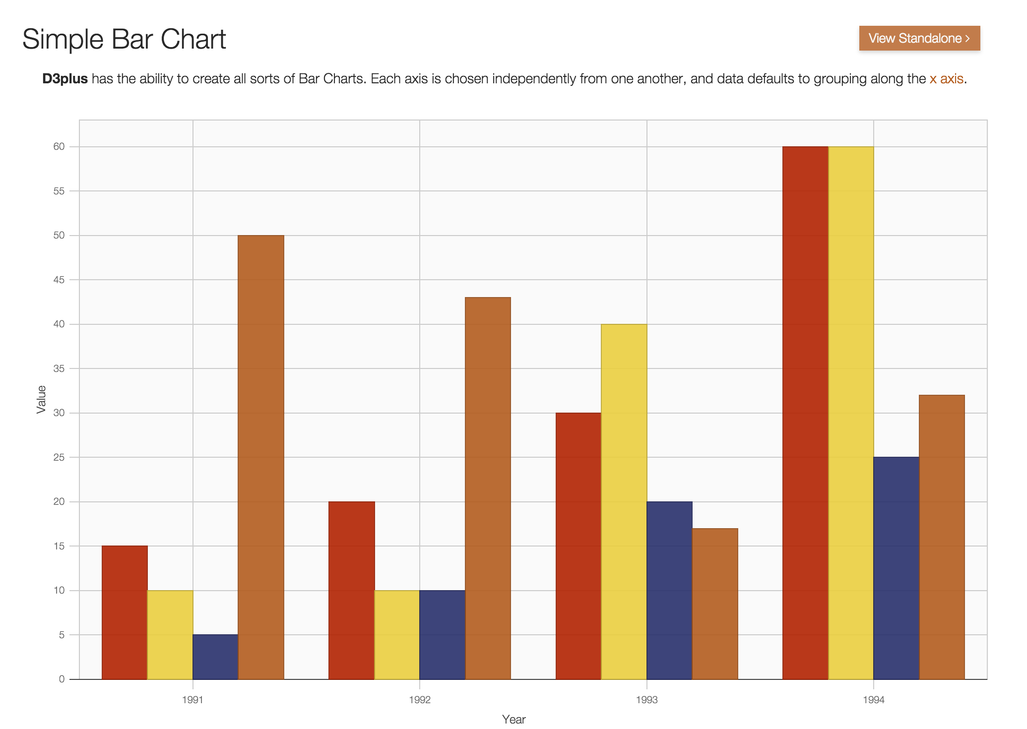
Find the bar chart example in D3plus
On the D3plus website, click over to the Simple Bar Chart plot example.
Copy and paste the D3plus code into a text editor
Underneath the simple bar chart is a GitHub gist (a way to display code snippets). Inside is the HTML code that includes the D3plus Javascript needed to render the bar chart.
Copy and paste the code below into a text editor like Sublime or Notepad++.
Swap out the data with your own
Replace this dummy data with the smoking data into the array in the HTML.
Tip: Instead of doing it by hand, use Mr. Data Converter to do it quickly.
Important: The format of the smoking data must match the format of the data in the Javascript array.
This might take some extra work. D3's requirements is a little particular that what you're used to while looking at data in a spreadsheet.
For example, it's logical to view the smoking data like this:
But for D3, it needs to look like this:
Do you see the difference?
The column headers 2005 and 2014 become variables and the data stacks up.
Education levels like No HS diploma are repeated in the same column but D3 will know that they are different because of the new column called Year.
It's tough to wrap your head around at first, but it's all in the name of data journalism, which is essentially figuring out how to do this:

So just to reiterate, and pardon me for belaboring the point but this is important, this is what the array would look like if you used the data from the Raw sheet at the bottom of this link.
[{"Education level":"No HS diploma","2005":25.5,"2014":22.9},
{"Education level":"HS grad","2005":24.6,"2014":21.7},
{"Education level":"Some college","2005":23.5,"2014":19.7},
{"Education level":"Associate degree","2005":20.9,"2014":17.1},
{"Education level":"Undergrad degree","2005":10.7,"2014":7.9},
{"Education level":"Grad degree","2005":7.1,"2014":5.4}]
If you replaced the data in the Simple Chart Example array with the code above, it wouldn't work because it's the incorrect format.
Instead, you need to use the data in the format from For D3 at the bottom of this link.
It looks like:
[{"Education level":"No HS diploma","Year":2005,"Percent":25.5},
{"Education level":"HS grad","Year":2005,"Percent":24.6},
{"Education level":"Some college","Year":2005,"Percent":23.5},
{"Education level":"Associate degree","Year":2005,"Percent":20.9},
{"Education level":"Undergrad degree","Year":2005,"Percent":10.7},
{"Education level":"Grad degree","Year":2005,"Percent":7.1},
{"Education level":"No HS diploma","Year":2014,"Percent":22.9},
{"Education level":"HS grad","Year":2014,"Percent":21.7},
{"Education level":"Some college","Year":2014,"Percent":19.7},
{"Education level":"Associate degree","Year":2014,"Percent":17.1},
{"Education level":"Undergrad degree","Year":2014,"Percent":7.9},
{"Education level":"Grad degree","Year":2014,"Percent":5.4}]
You'll also need to replace name, year, and value so that it matches the new data array.
    .id("name")         // key for which our data is unique on
    .x("year")          // key to use for y-axis
    .y("value")         // key to use for x-axis
    .draw               // This draws the visualization
Here's what the updated code should look like.
Upload the HTML file to your server
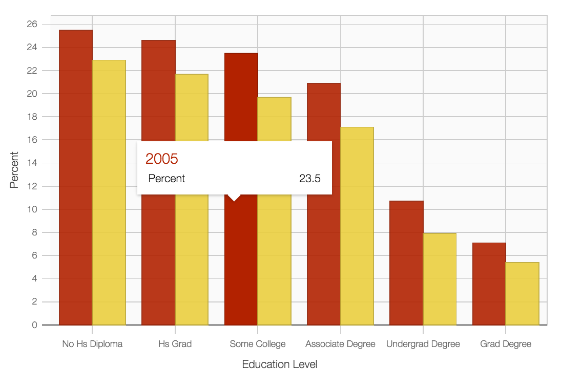
I've uploaded the file to my GithHub page but this is how it renders:
What's the problem?
Changing the height and width
We need to explicitly detail the dimensions of the interactive.
Add style="width:600px; height:400px;" to the <div id="viz"> tag.
The line in your code whould now be:
<div id="viz" style="width:600px; height:400px;"></div>
This is what it will look like now:
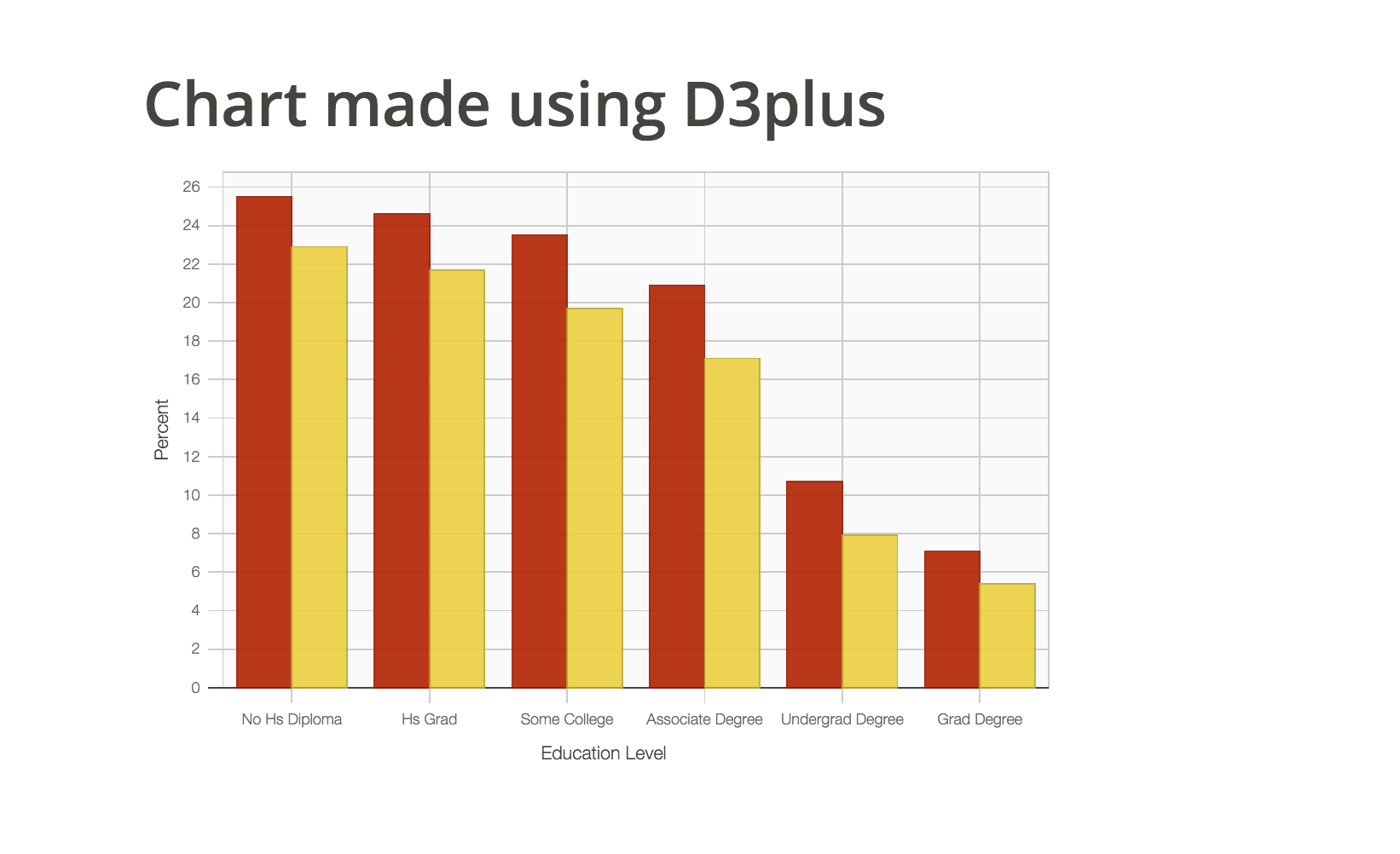
You could set the height and width to whatever you want.
If you have a responsive site, you could set the width to 100% and it would match the size of the screen.
It's up to you.
Next steps
Embed the interactive chart into your story
If you're using a content management system that likes to strip out custom code like Wordpress, you can upload the code as a standalone page and embed that into your site as an iframe.
So, for example, I'd have the chart here at http://andrewbtran.github.io/JRN-418/class14/d3pluschart.html
I'd need to put the code into the iframe code like below. The height and width should match. If you're putting together an iframe on a responsive site, well, that's a slightly more complicated.
<iframe src="http://andrewbtran.github.io/JRN-418/class14/d3pluschart.html" frameborder="0" width="640" height="440" overflow="no" scrolling="no"></iframe>
Paste the link above into your Wordpress site and it will look like this:
The bars are interactive.
Congratulations!
Explore some more and try to replicate other project examples on D3plus.