Investigating homicide stats
A column was published in the Wall Street Journal recently, stating that after decades of declining violence the recent rise in crime and homicides in cities across the country were because of what they called the "Ferguson effect."

Here's the interesting quote.
This incessant drumbeat against the police has resulted in what St. Louis police chief Sam Dotson last November called the “Ferguson effect.” Cops are disengaging from discretionary enforcement activity and the “criminal element is feeling empowered,” Mr. Dotson reported. Arrests in St. Louis city and county by that point had dropped a third since the shooting of Michael Brown in August. Not surprisingly, homicides in the city surged 47% by early November and robberies in the county were up 82%.
So the "Ferguson effect" — the cause being the death of Michael Brown and subsequent protests with the effect being more homicides across the country.
Time to put on your data journalist hat. As an exercise, let's go through the process of verifying this claim with data. Let's look specifically at St. Louis, since that police department covers Ferguson, and also Baltimore.
We'll find, analyze and quickly visualize what we find to see if there's any merit to the claims in the column.
We need data on homicides.
Where can we get data on homicides?
Reframe the previous question.
Who would collect data on homicides and why? Think local then wider in scope.
- City governments
- To track population, public policy adjustments
- Police departments
- To arrest those responsible
- Local news media
- To report on events that affect the public
- The Justice Department
- To track local, regional, state trends
- The Federal Bureau of Investigation
- To track local statistics
- Insurance, real estate companies, businesses
How can you get that data from them?
- Call them up
- Check online
- File a FOIA request
Let's get historical data.
The FBI's Uniform Crime Reporting Statistics site is a good place to start.
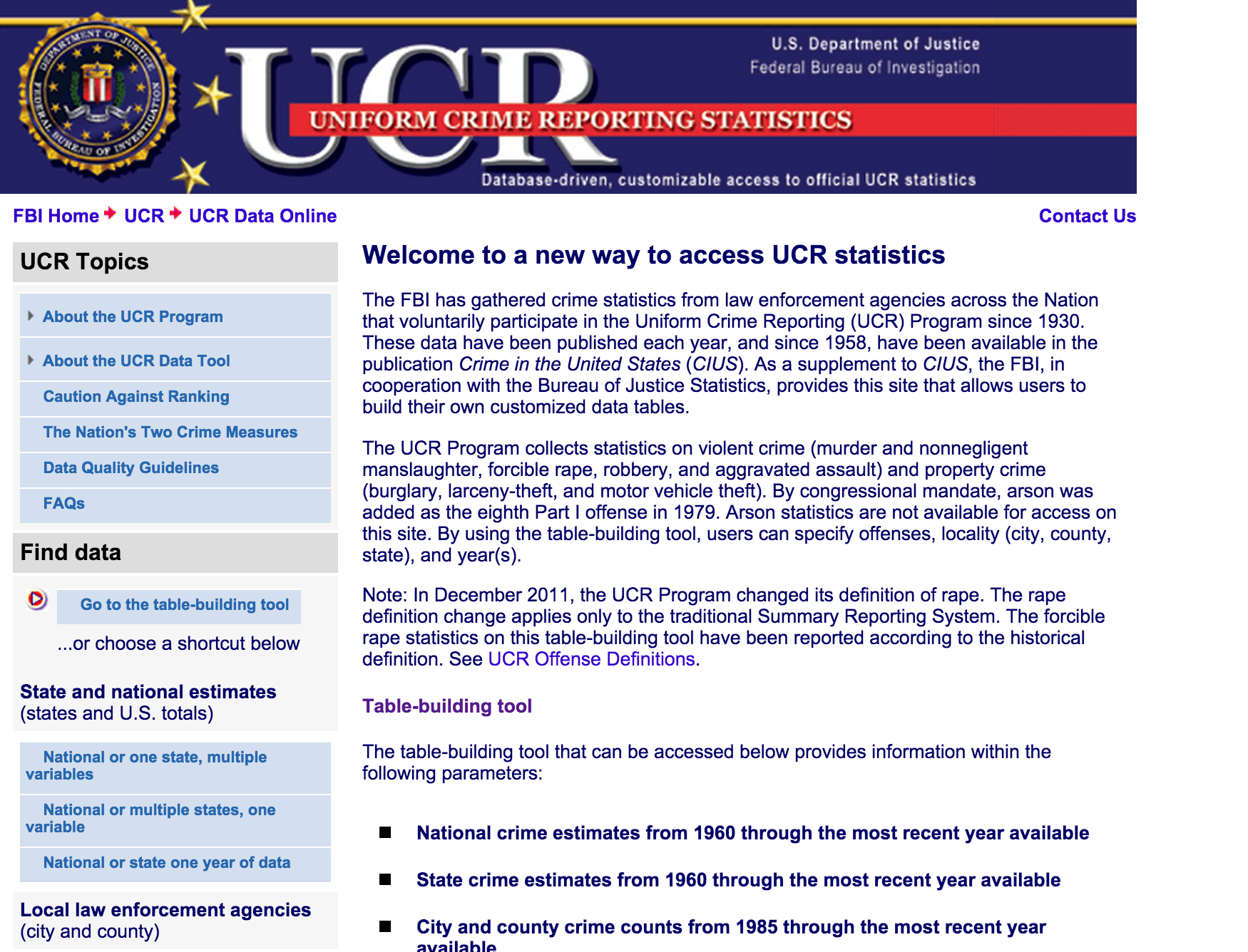
Select the Go to the table-building tool link on the left under Find data.
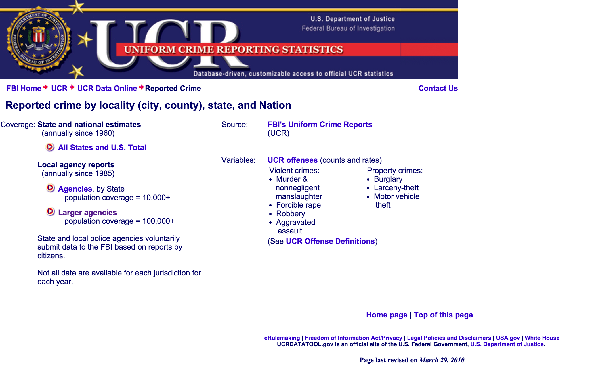
Lots of options here. We will look at the Larger agencies.
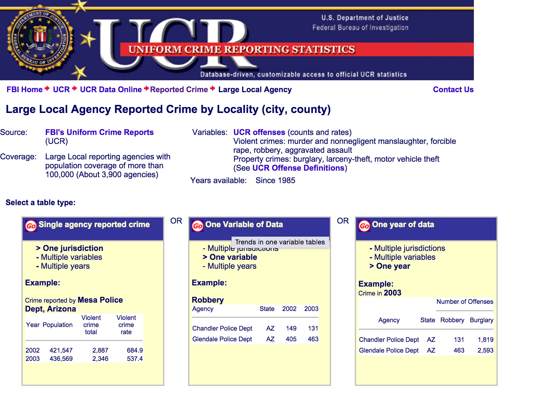
The site offers many ways to get the data. Choose the middle one. One Variable of Data. We want to look at just one type of crime (Homicides) over multiple years.
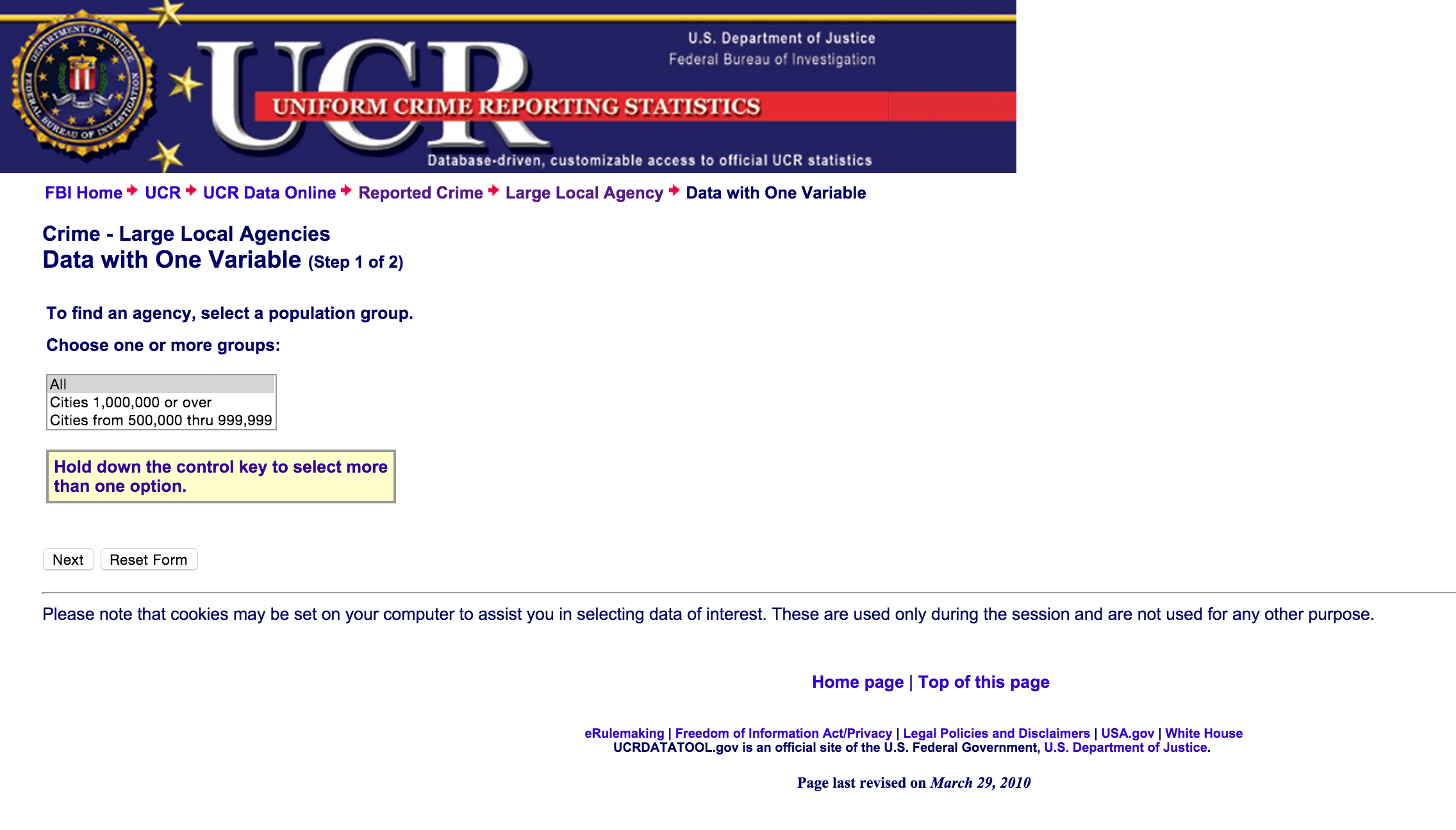
Go ahead and pick All and then click Next.
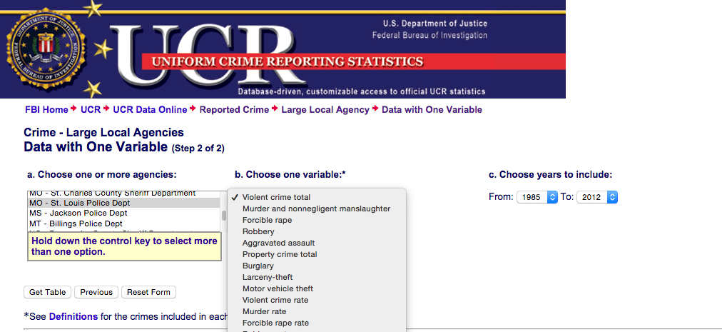
Select MO - St. Louis Police Dept and then select Murder and nonnegligent manslaughter in the pulldown menu. Choose as many years possible. Unfortunately, it looks like this data set is current up until 2012. We'll have to fill in the blanks with more data. Click Get Table.
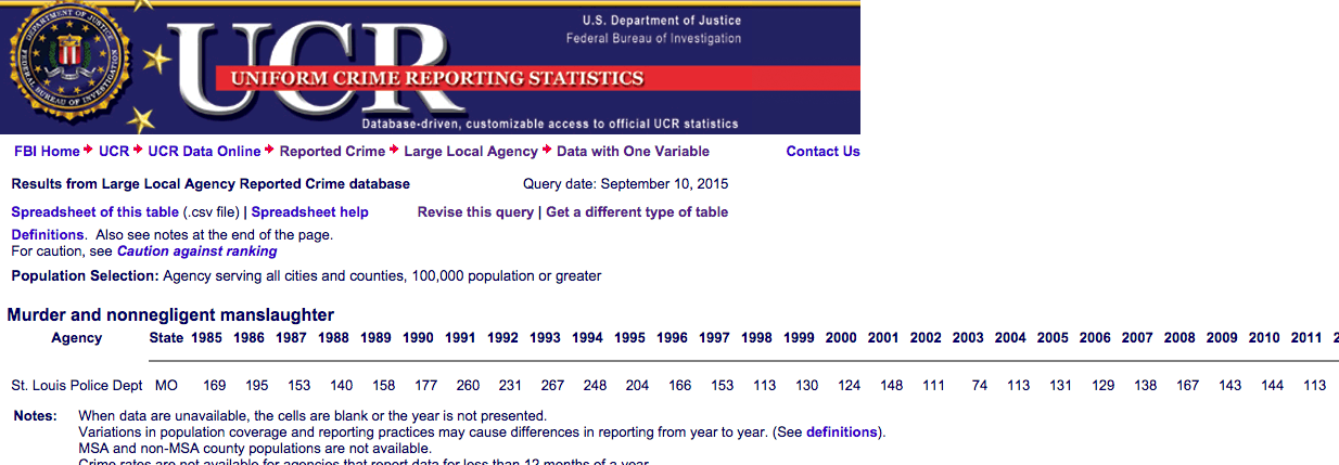
Now we've got a long table. Click on the link Spreadsheet of this table near the top of the page and a CSV should save. Or you can copy and paste the data into blank spreadsheet.
For this example, we're going to use Google Spreadsheets.
Bring in the data into a blank Google Spreadsheet. Copy and paste it in or import it.
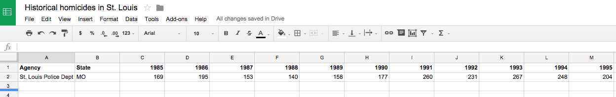
You might have to clean up the data by deleting some rows and columns but this is what it should look like. However, the data is incomplete since it only goes up to 2012.
We should fill in the gaps.
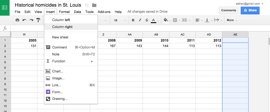
First, let's add some more columns to the spreadsheet.
Click Insert > Column right a few times until you get three new columns.
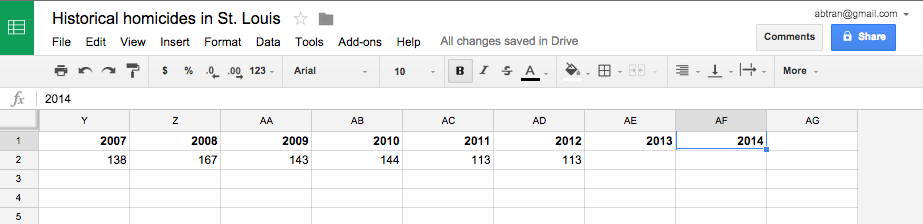
Label them 2013, 2014, and 2015.
Now go find the missing values. You can go to the primary source, St. Louis Police Department or the FBI has separate databases specificaly for 2013 and part of 2014.
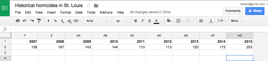
This is how it should look.
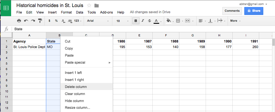
Before we chart this, we need to get rid of one column in this spreadsheet so it will render correctly.
Select the column button (B) above the State column. A mini triangle should appear on the right. Select that and click Delete column.
Why: We're going to turn this into a chart and that extra column would have thrown the program off.
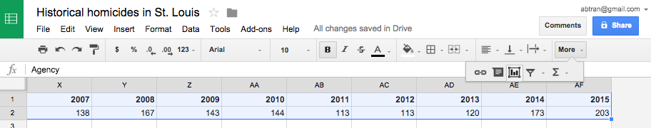
Select all the cells with data in it and look for the button on the top right that looks like a mini chart. Select that.
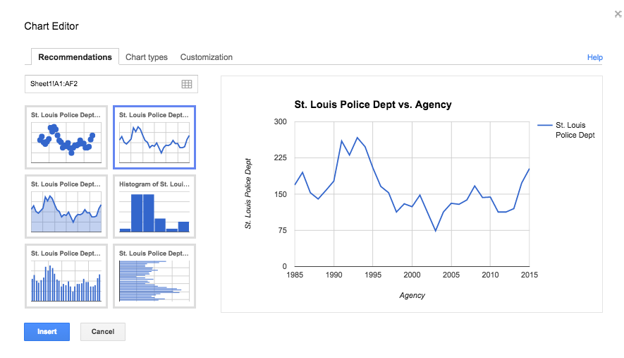
Select the line chart option and click Insert.
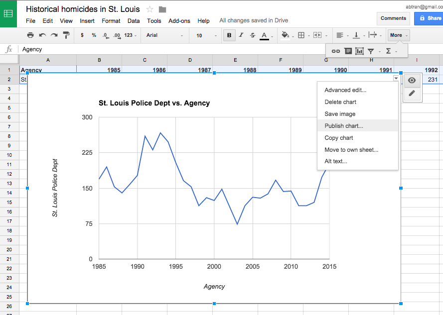
Congrats, you've made a data visualization. You can click the little triangle at the top right and save the chart as an image or you can click Publish and get an iframe code to put into your website. You'll want to change the headline and x Axis label first. To do that, click on the pencil icon next to the little triangle at the top right of the chart.
Now step back, what does this data say?
It appears that generally, homicides has gone down since a high point in the '90s. But murders starting increasing in 2012. The significant jump happened between 2013 and 2015.
Keep in mind, these are raw numbers and not adjusted for population. And figures for 2015 are incomplete since the year isn't over yet.
These are just annual figures. The Ferguson incident happened in August of 2013. We should see if there was a notabale increase in homicides after. But we need to dive deeper and look for monthly data.
Homicides in Baltimore
Let's switch gears and look at Baltimore statistics.
The City of Baltimore has an excellent open data portal.
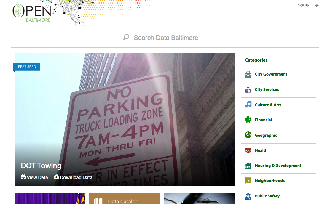
Head over to it and click Public Safety at the right.
What we're looking for is at the top of the results because it's the most looked-up data set: BPD Part 1 Victim Based Crime Data. Click it.
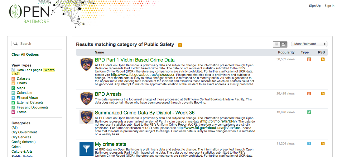
What we're looking for is at the top of the results because it's the most looked-up data set: BPD Part 1 Victim Based Crime Data. Click it.
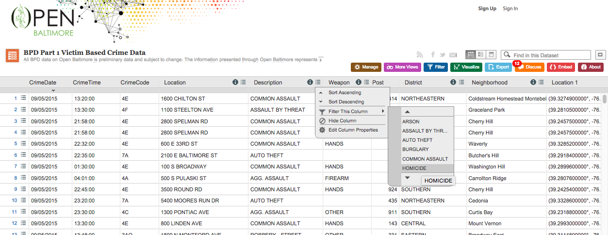
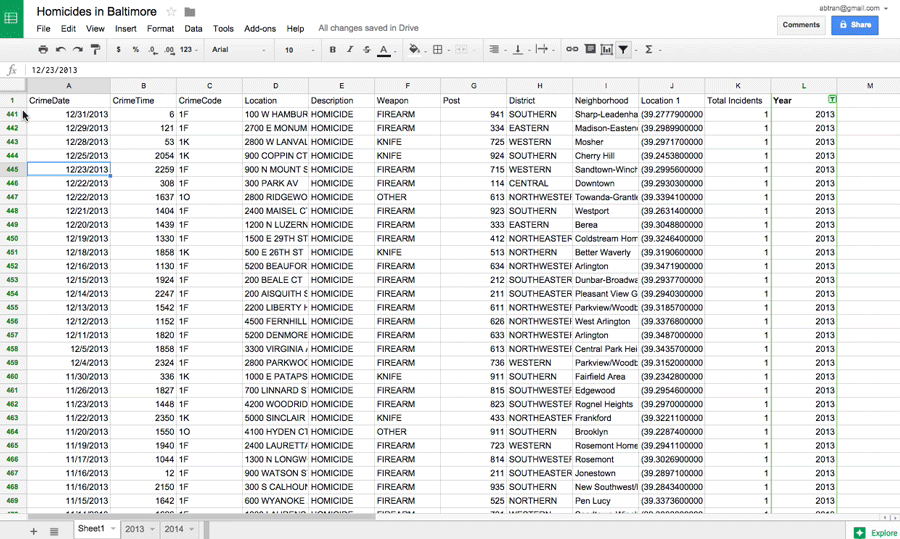
This is a list of every single victim of crime in Baltimore that the police have recorded. We need to filter it down before we export this otherwise we'll have a 37 mb file.
Click on the menu icon next to the i in the Description column. Select Filter this column, scroll to and select HOMICIDE.
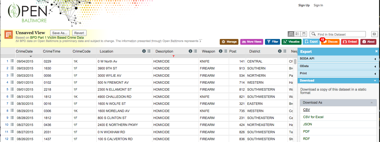
Select the Export button on the top right and then click the Download as CSV link.
Bring that into Google Spreadsheets.
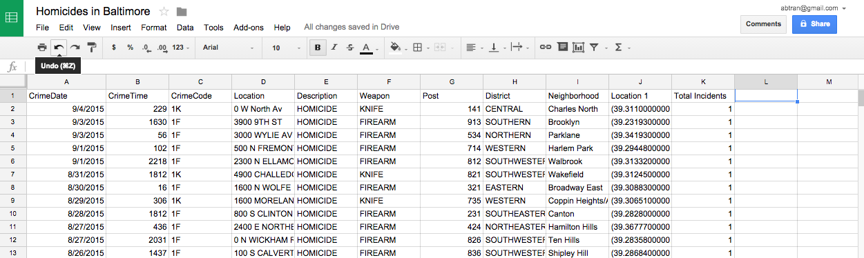
Excellent. Now we need to split it out by year. Unfortunately, there's no standalone column with just the year. You'll have to add it yourself.
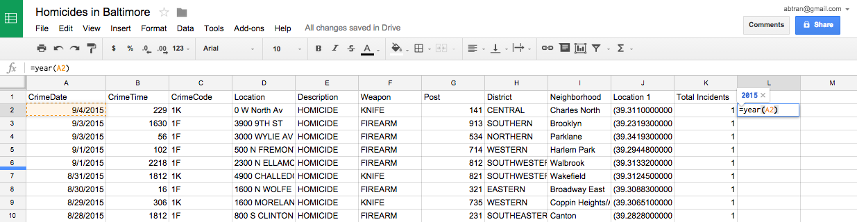
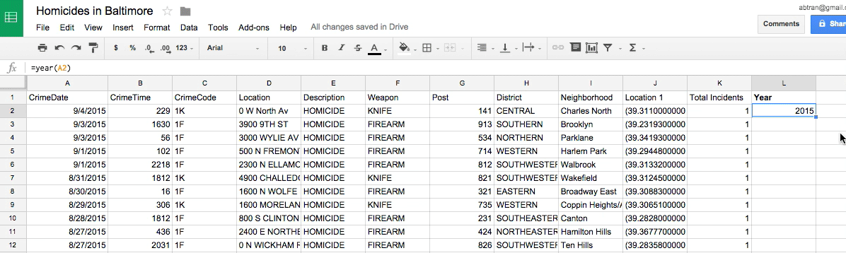
Go to the last column, type in Year into the header. You could manually type in the year yourself by looking at the CrimeDate column on the far left, but we'll use a formula to save you time.
Type in this in the first row beneath the Year header: =Year(A2).
- This is saying convert whatever is in cell A2 into the year.
- This will only work on a cell that looks like a calendar date.
Click the little blue square and drag it to apply the formula to the cells below it.
Or you can double click the little blue square and it'll automatically apply the formula for the rest of the rows in the column.
OK, but now you've got the formula.
It's good practice to replace the formula with the actual data.
So right click the column header to select it all (the L for this column) and select copy and then paste by right clicking and then selecting Paste special > Paste values only. This will strip the formula and leave behind the number.
Next, we need to separate out the 2013 and 2014 data into their own sheets.
Select the column header you want filtered (L) and then click on the funnel/filter button at the top. A mini triangle icon should appear next to Year. Click it and click Clear and select 2013.
Now rows with 2013 in this column will appear in the spreadsheet.
Create some new sheets. At the bottom, select the + button twice. Right click and rename them 2013 and 2014.
Select all the 2013 data (either with ctrl+a or hitting the cell between the first row and the A column), copy it, then click on the 2013 sheet tab at the bottom and Paste special > Paste values only into the new sheet.
Repeat the filter and copy/paste process with 2014 data.
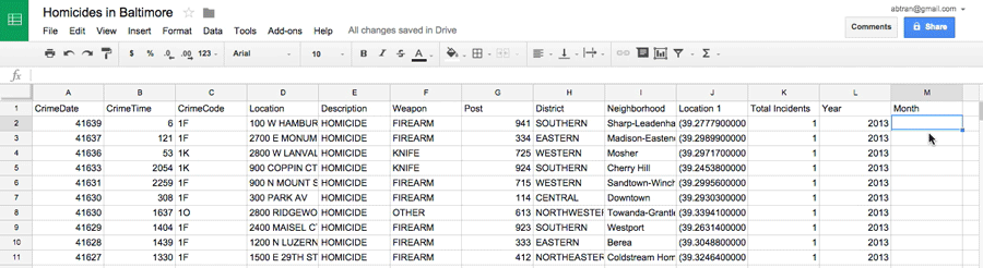
We need to add another column with new information: months.
In the last blank column, type in Month in the header.
Then in the row beneath, we're going to add a formula that extracts the month from the date column.
You could use =month(cell) but that would only give you the numerical value of the month.
For the sake of style and so you can learn another formula, use this to get the spelled-out name of the month: =text(A2, "mmmm").
Apply the formula to the rest of the rows beneath it.
Repeat the month process with data in the 2014 sheet.
OK, let's do some analysis based on the months column we created.
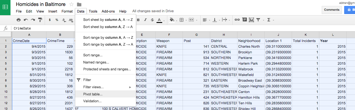
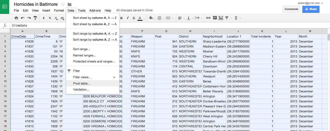
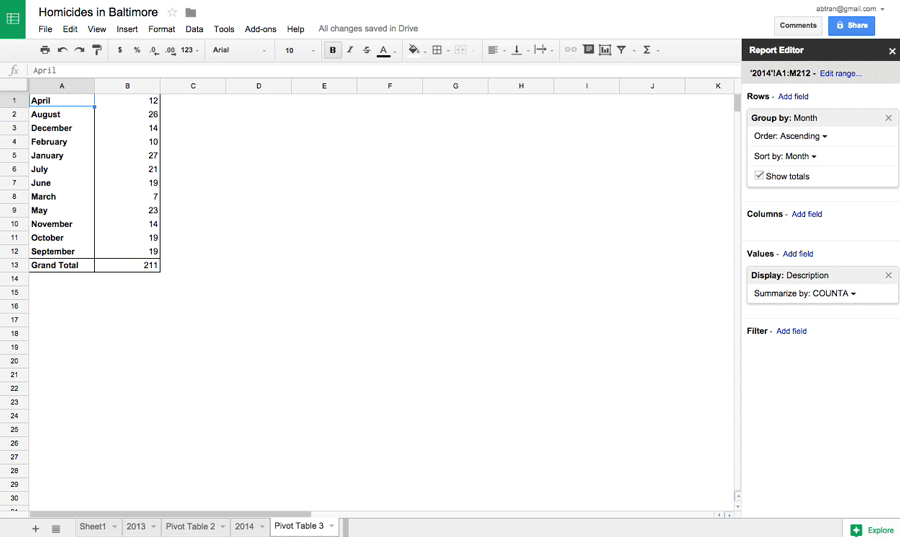
Go to the 2013 sheet and select all the data. Then click Data > Pivot table....
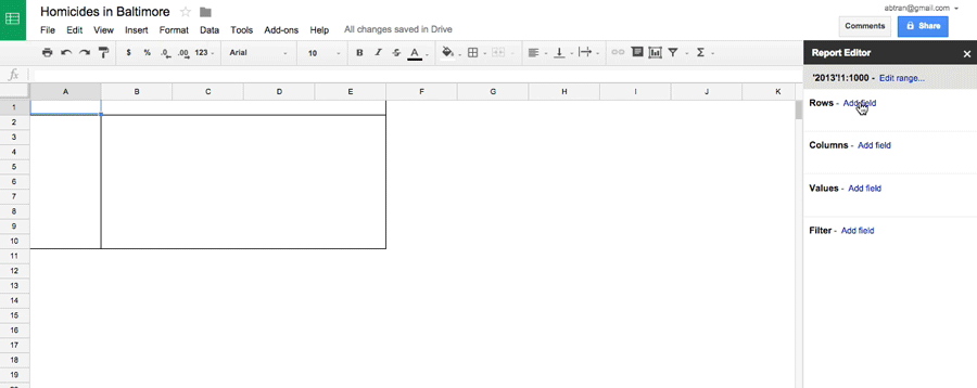
Click Add field by Rows and select Month.
Then click Add field by Values and select COUNTA. This counts the unique instances of homicides and groups them by month thanks to the new column we created.
Click Add field by Rows and select Month.
Then click Add field by Values and select COUNTA. This counts the unique instances of homicides and groups them by month thanks to the new column we created.
Repeat the pivot month process with data in the 2014 sheet.
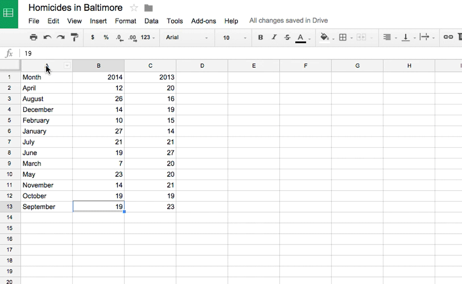
Now that you've got two new data sets (one for 2013 and one for 2014), it's time to bring them together.
Copy and paste (remember to use paste special > values only— it's a good habit to get into now) the results into a new sheet.
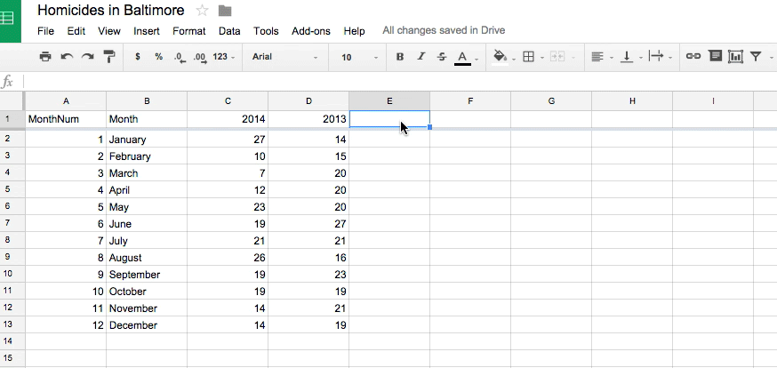
Structure the data with labels for each column. Month, 2014, and 2013.
Wait, wait, wait.
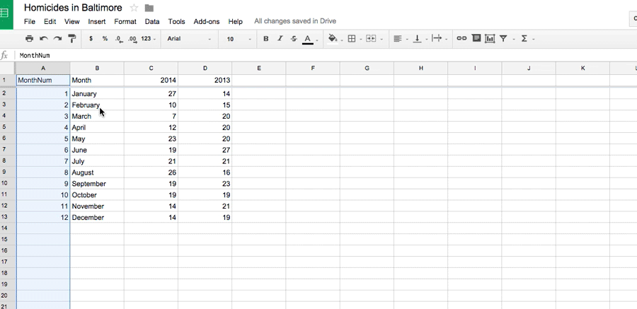
Before we proceed, we need to put the months in chronological order.
If we sort the month column now, it will just do it alphabetically.
So we have to add another column on the left and assign a number to the corresponding month. Label it MonthNum.
Then select the row with the header information (like MonthNum, Month, etc) click View > Freeze > 1 row so when we sort it again, the header labels don't get accidentally included in the sort.
Click the little triangle in the dark gray row above the column header and click Sort Sheet A - Z
Now you're good to go.
Now we can visualize it.
Select all the data, then click the Insert chart... icon.
It looks a little weird, right? We need to adjust it a bit.
Click on the Chart type and it appears that the Use row 1 as headers was unchecked. So what happened was the 2013 and 2014 was considered a data point and charted. We don't want that.
Uncheck that and select the line chart option. Click Insert.
Don't forget to add a headline.
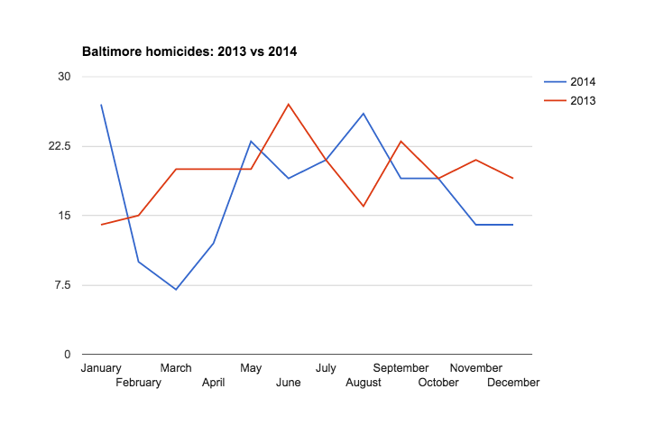
What does comparing 2013 homicides to 2014 show us?
It looks relatively similar, right? Except for some fluctuation in the spring months.
Let's dig deeper.
We should calculate the ratio of 2014 homicides as compared to 2013 homicides.
Move the chart out of the way.
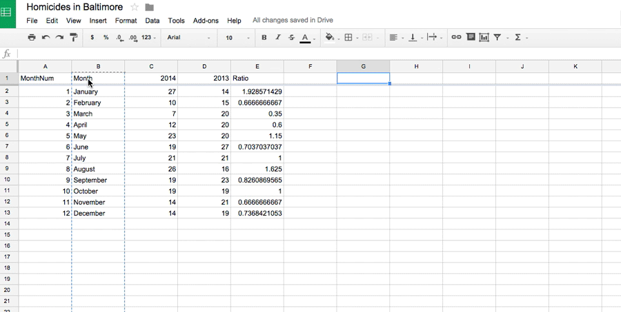
Let's create a column for the ratio of the difference between 2014 homicides compared to 2013.
In the new column, type in Ratio.
Underneath, type in the formula that will divide the 2014 value with the 2013 value (=C2/D2).
Apply that value to the rest of the rows.
Now, let's chart it out.
First, we have to structure the data correctly.
We need to copy and paste the Month column into a new one and the copy and paste values of the ratio column next to it.
Wait!
Here's something interesting. Leave a blank column between the Month and the Ratio and next to the August row, type in "Ferguson incident". Because that was the month the shooting and subsequent protests occurred.
Now select all the data and click the Insert chart... button.
Click the Chart type tab and select the line chart option. Then Insert
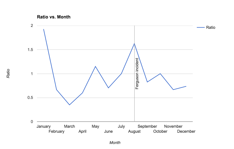
So what does this chart say?
The ratio for homicides was up in August in 2014 compared to 2013. But then it appears that it went down after.
This goes against the theory that the Michael Brown killing in Ferguson and riots that occurred afterward had the effect of increased homicides. At least in Baltimore in 2014.
Now try it with the St. Louis homicide data. Is there any evidence in that town to support the theory?
Here's where you can find the data, from the Post-Dispatch or the St. Louis police department.