How to Lie, Cheat, Manipulate, and Mislead using Statistics and Visualizations
Andrew Ba Tran
September 9, 2015
But also how to do it right
We'd NEVER lie, right?

Statistics
Collection of Data
In order to analyze and interpret data, we must first collect it.
The data that is collected is known as a sample.
The sample is collected from a population.

Ocean tempearture sampling
- We wanted to analyze San Diego ocean temperatures.
- Our population was the ocean off the coast of San Diego.
- Our sample, was the temperatures recorded by Buoy100 over the last 9 years.

How to Lie, Cheat, Manipulate, and Mislead through poor sampling
Or you could just skip the bother of taking the time sample for data at all

Biased Sampling
Area bias
Area bias example
Polar bears
You need to look at the whole picture to get the whole story

Polar bears
Leading question bias
Social desirability bias
Analyzing data
How to Lie, Cheat, Manipulate, and Mislead with poor Analysis

How to Lie, Cheat, Manipulate, and Mislead with poor Analysis
How to Lie, Cheat, Manipulate, and Mislead with poor Analysis
How to Lie, Cheat, Manipulate, and Mislead with poor Analysis

Other ways to Lie, Cheat, Manipulate, and Mislead with Averages
How?
Wait... what?

Visualizations
If your goal is to lie, cheat, manipulate, or mislead, visualizations are your friend…

How to Lie, Cheat, Manipulate, and Mislead with poor Visualizations
How to Lie, Cheat, Manipulate, and Mislead using Chart Adjustments

This is real data. The top graph shows the cosmic radiation rate in neutrons per hour. The lower is the temperature change since 1975.
How to Lie, Cheat, Manipulate, and Mislead using Bar Charts
Here, the data is the same but by changing the axis labels, someone was able to really suggest that the difference in population was much greater than it was.

It's even more dramatic to use volume instead of bars...

Once again, both of these charts show the same information if you ONLY look at the HEIGHT of the frogs. The volume of an image is a great way to lie, cheat, manipulate, or mislead…
Examples of good visualizations
- Easy to read, Lots of useful information, Well labeled.
- Correct comparison of percentages rather than raw numbers!

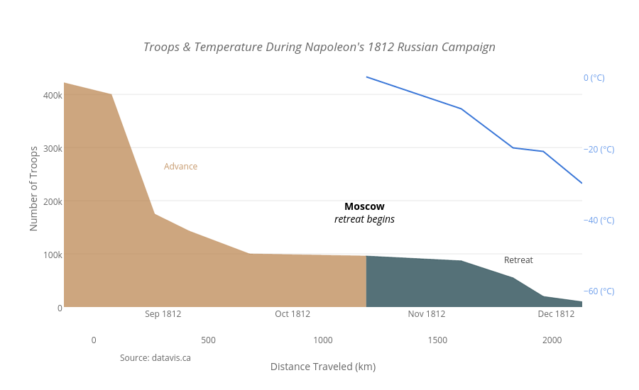
Famous and excellent visualization of information

Famous and excellent visualization of information

Famous and excellent visualization of information
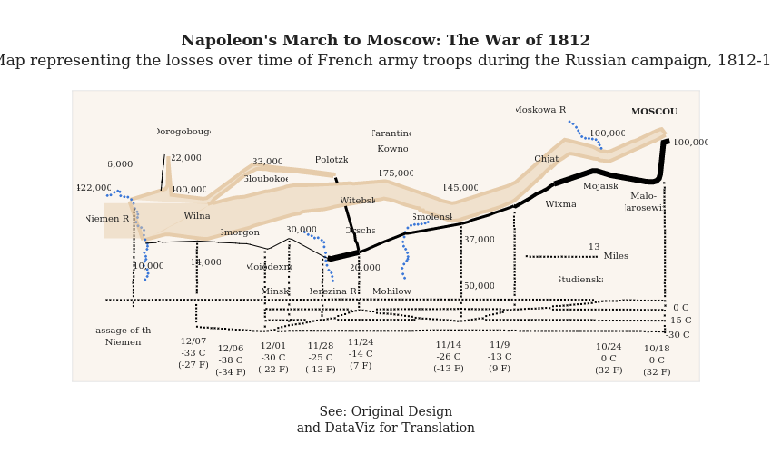
Famous and excellent visualization of information