NICAR 2019: Mapping with R - Sinclair Case Study
Andrew Ba Tran
3/8/2019
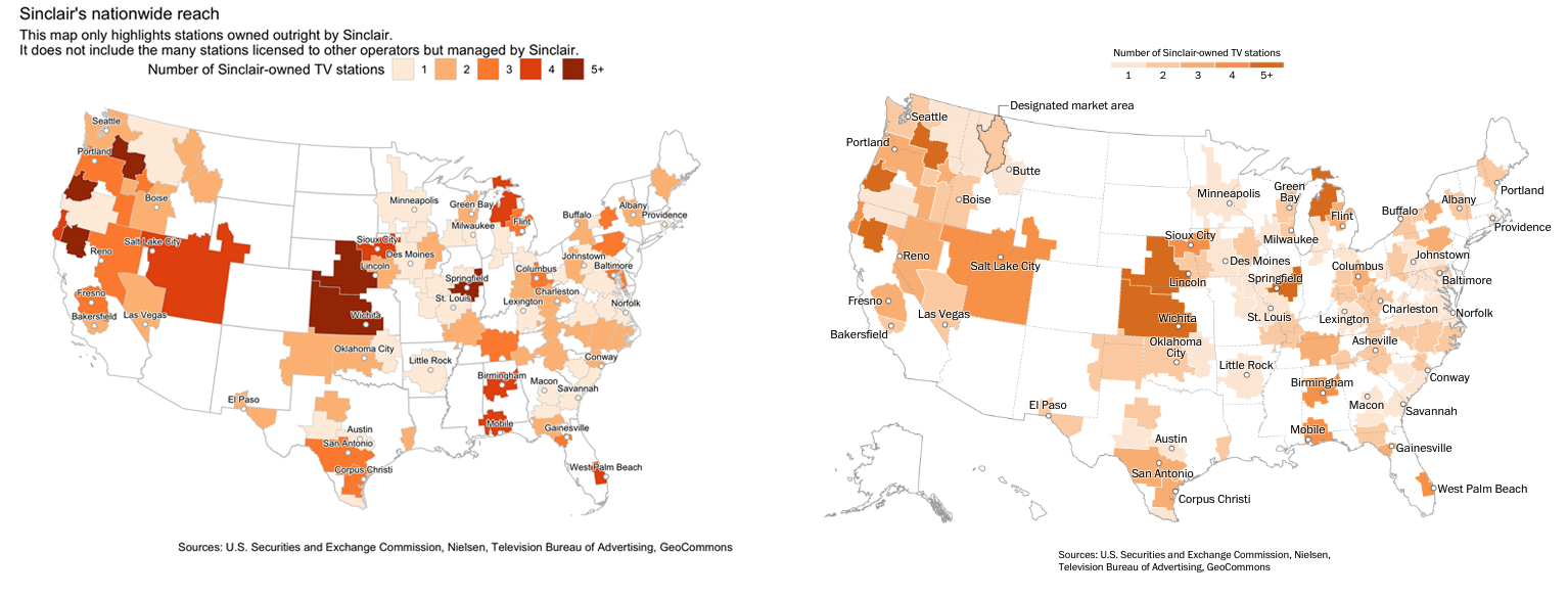
We’re going to recreate the graphic from The Washington Post [story about Sinclair Broadcasting]((https://www.washingtonpost.com/graphics/2018/lifestyle/sinclair-broadcasting/):
Sinclair Broadcasting
Graphics editor Chris Alcantara used a mix of R, Excel, QGIS, and Illustrator to create this map.
We’re going to try to stick to R exclusively with the help of some packages like
- jsonlite
- tigris
- dplyr
- ggplot2
- sf
- ggrepel
- shadowtext
Finding the data
There’s a map on Sinclair’s website showing off all their stations.
Grab the json URL that’s running the map.
Scraping the data
We’ll use the jsonlite package
library(tidyverse)
library(stringr)
library(jsonlite)

json_url <-"http://sbgi.net/resources/assets/sbgi/MetaverseStationData.json"

# json_url <- "data/MetaverseStationData.json"

stations <- fromJSON(json_url)
Turning the JSON into a clean data frame
Turning the JSON into a clean data frame
Let’s focus on Primary stations and extract the latitude and longitude data
primary_stations <- stations %>%
  filter(Channel=="Primary") %>%
  mutate(
    Location=str_replace(Location, "Point \\(", ""),
    lon=str_replace(Location, " .*", ""),
    lat=str_replace(Location, ".* ", ""),
    lat=str_replace(lat, "\\)", ""))
What have we got
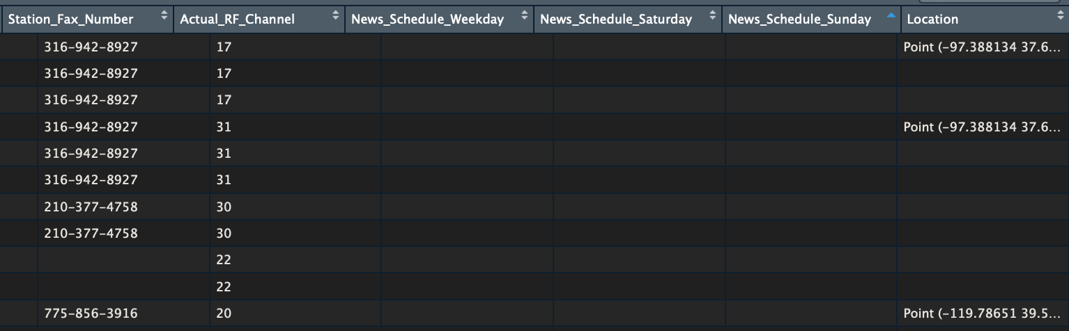
glimpse(primary_stations)## Observations: 192
## Variables: 28
## $ Call_Letter <chr> "KAAS", "KAAS-LD", "KABB", "KAEF", "KAME"…
## $ Logo_List <chr> "", "", "kabb_fox.jpg", "/resources/asset…
## $ Logo_Map <chr> "", "", "kabb_fox_map.jpg", "/resources/a…
## $ Web_1st_URL <chr> "http://www.foxkansas.com", "http://www.f…
## $ Web_Address <chr> "http://www.foxkansas.com", "http://www.f…
## $ Station <chr> "KAAS", "KAAS-LD", "KABB", "KAEF", "KAME"…
## $ Channel <chr> "Primary", "Primary", "Primary", "Primary…
## $ Affiliation <chr> "FOX", "FOX", "FOX", "ABC", "Nevada Sport…
## $ DMA <chr> "Wichita - Hutchinson, KS", "Wichita - Hu…
## $ DMA_Code <chr> "678", "678", "641", "802", "811", "820",…
## $ DMA_Short <chr> "Wichita_KS", "Wichita_KS", "San Antonio_…
## $ DMA_Rank <int> 76, 76, 31, 195, 109, 22, 57, 122, 122, 1…
## $ Station_Status <chr> "O&O", "O&O", "O&O", "O&O", "JSA", "O&O",…
## $ Station_Address <chr> "316 North West Street, Wichita, KS 67203…
## $ Station_City <chr> "Wichita", "Wichita", "San Antonio", "Eur…
## $ Station_State <chr> "KS", "KS", "TX", "CA", "NV", "OR", "AR",…
## $ Station_Zip <int> 67203, 67203, 78229, 95501, 89502, 97232,…
## $ Station_Logo <chr> "sbg_noimage", "sbg_noimage", "kabb_fox",…
## $ Station_URL <chr> "http://www.foxkansas.com, http://www.fox…
## $ Station_Phone_Number <chr> "316-942-2424", "316-942-2424", "210-366-…
## $ Station_Fax_Number <chr> "316-942-8927", "316-942-8927", "210-377-…
## $ Actual_RF_Channel <chr> "17", "31", "30", "22", "20", "43", "22",…
## $ News_Schedule_Weekday <chr> "", "", "0500-0900, 1100-1200, 2100-2200"…
## $ News_Schedule_Saturday <chr> "", "", "2100-2200", "", "", "0700-0900,1…
## $ News_Schedule_Sunday <chr> "", "", "2100-2200", "", "", "0700-0900,0…
## $ Location <chr> "-97.388134 37.68888)", "-97.388134 37.68…
## $ lon <chr> "-97.388134", "-97.388134", "-98.569649",…
## $ lat <chr> "37.68888", "37.68888", "29.490196", "40.…What can we do with this data?
There are two data points that we can extract from this data set:
- latitude and longitude for each station
- the DMA, or Designated Market Area, each station is assigned to
We can map out the station locations quickly using the sf package to visualize latitude and longitude of each one on top of a map of the country downloaded using the tigris package.
Single out the stations
station_latlon <-
  select(primary_stations, DMA_Short, Location, lon, lat) %>%
  unique() %>%
  mutate(lon=as.numeric(lon)) %>%
  mutate(lat=as.numeric(lat)) %>%
  filter(!is.na(lon))

glimpse(station_latlon)
## Observations: 121
## Variables: 4
## $ DMA_Short <chr> "Wichita_KS", "San Antonio_TX", "Eureka_CA", "Reno_NV"…
## $ Location <chr> "-97.388134 37.68888)", "-98.569649 29.490196)", "-124…
## $ lon <dbl> -97.38813, -98.56965, -124.16704, -119.78651, -122.643…
## $ lat <dbl> 37.68888, 29.49020, 40.80141, 39.51247, 45.52701, 34.7…Download map of state boundaries
library(sf)
library(tigris)

options(tigris_class = "sf")

states <- states(cb=T)

# states <- readRDS("backup_data/stats.rds")


glimpse(states)
Refining the data
Filter out some territories and states from the data and set the Projection
states <- filter(states, !STUSPS %in% c("AK", "AS", "MP", "PR", "VI", "HI", "GU"))

# Converting the projection to Albers
states <- st_transform(states, 5070)

# Changing the projection of station_latlon so it matches the states sf dataframe map

station_latlon_projected <- station_latlon %>%
  filter(!is.na(lon)) %>%
  st_as_sf(coords=c("lon", "lat"), crs = "+proj=longlat") %>%
  st_transform(crs=st_crs(states)) %>%
  st_coordinates(geometry)

station_latlon <- cbind(station_latlon, station_latlon_projected)
Map it
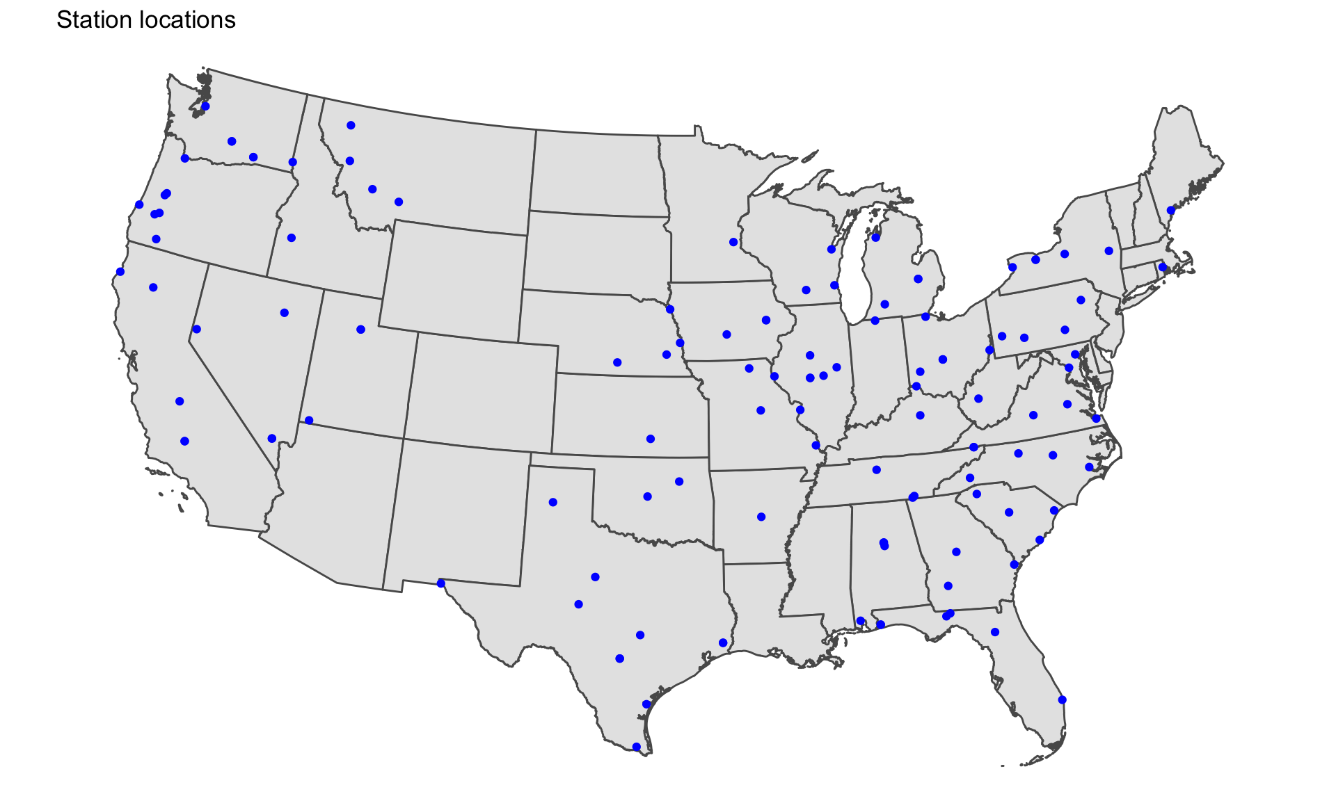
ggplot(states) +
  geom_sf() +
  geom_point(data=station_latlon, aes(x=X, y=Y), color="blue") +
  theme_void() +
  theme(panel.grid.major=element_line(colour="transparent")) +
  labs(title="Station locations")
We’ve added a new map layer on top of the states boundaries map with the function: geom_point()
Map it
Next, figure out the scope
# Fixing a bad data point
primary_stations$DMA_Code <- ifelse(primary_stations$DMA_Short=="Lincoln_NE", 722, primary_stations$DMA_Code)

## Summarizing by DMA
dma_totals <- primary_stations %>%
  group_by(DMA, DMA_Code) %>%
  count() %>%
  arrange(desc(n)) %>%
  ungroup() %>%
  rename(dma_code=DMA_Code) %>%
  mutate(dma_code=as.numeric(dma_code))

head(dma_totals)
## # A tibble: 6 x 3
## DMA dma_code n
## <chr> <dbl> <int>
## 1 Eugene, OR 801 6
## 2 Lincoln - Hastings - Kearney, NE 722 6
## 3 Wichita - Hutchinson, KS 678 6
## 4 Champaign - Springfield - Decatur, IL 648 5
## 5 Chico-Redding 868 5
## 6 Yakima - Pasco - Richland - Kennewick, WA 810 5What’s the DMA footprint for each station?
Check around on the internet and you’ll find sources for the DMA shapefile.
Here’s one from Harvard’s Dataverse.
I’ve already downloaded it to our project folder.
We’ll read it in using the st_read() function from the sf package.
Mapping DMAs
geo <- st_read("data/dma_2008/DMAs.shp")

# It doesn't have a CRS so we'll assign it one
st_crs(geo) <- 4326

# Converting the projection so it's Albers
geo <- st_transform(geo, 5070)

ggplot(geo) +
  geom_sf(color="red") +
  coord_sf()
Mapping DMAs
geo <- st_read("data/dma_2008/DMAs.shp")

# It doesn't have a CRS so we'll assign it one
st_crs(geo) <- 4326

# Converting the projection so it's Albers
geo <- st_transform(geo, 5070)

ggplot(geo) +
  geom_sf(color="red") +
  coord_sf()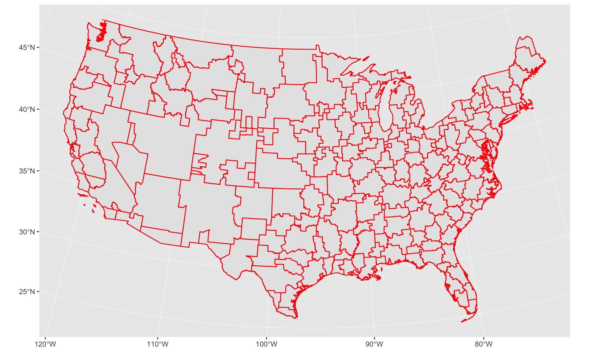
Mapping Sinclair DMAs
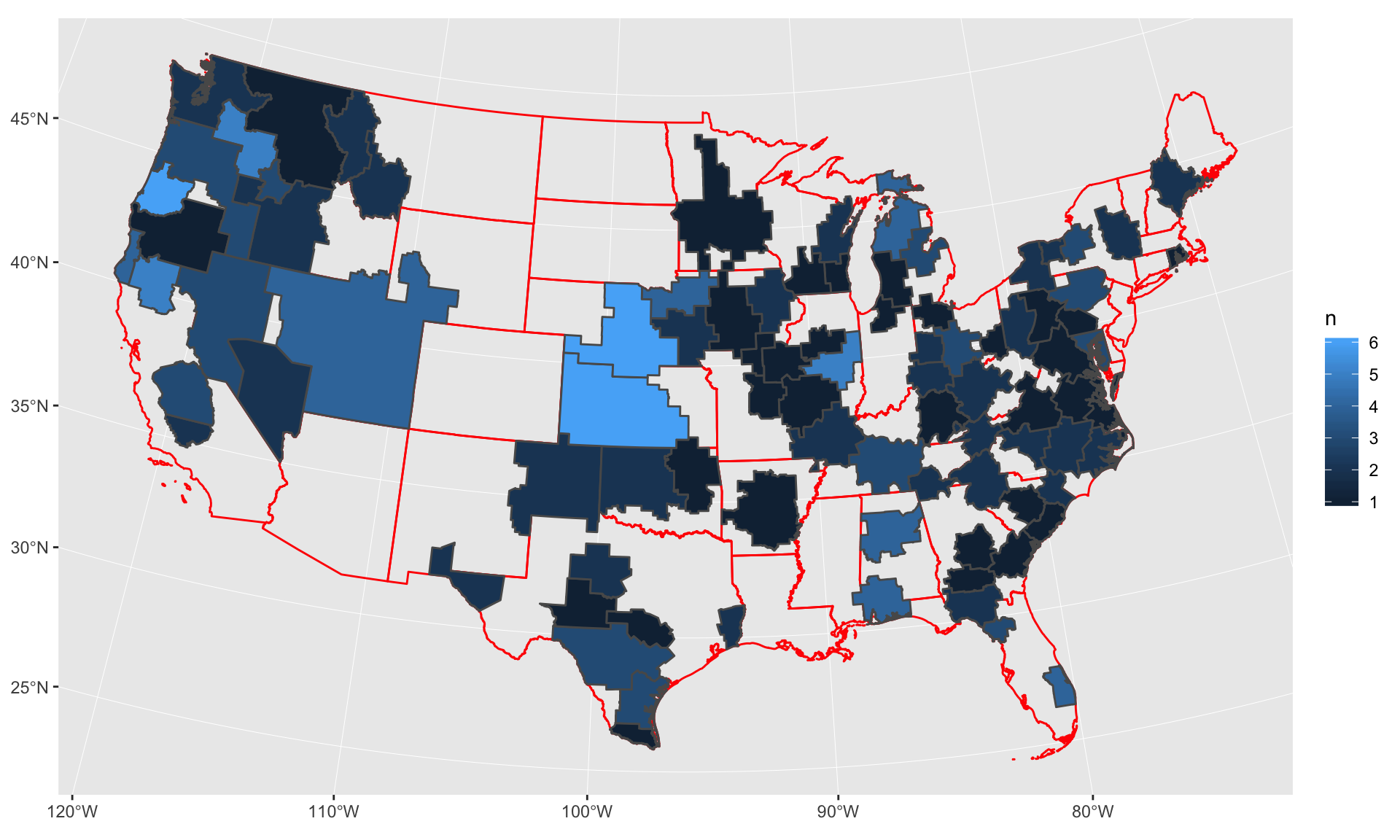
Join the DMA station count to it so we can visualize it.
# Prepping a column name to join on
geo <- geo %>%
  mutate(dma_code=as.numeric(as.character(DMA)))

geo <- left_join(geo, dma_totals, by="dma_code") %>%
  filter(!is.na(n))

ggplot() +
  geom_sf(data=states, color="red", fill=NA) +
  geom_sf(data=geo, aes(fill=n)) +
  coord_sf()
Mapping Sinclair DMAs
Data prep
# Filtering out locations based on map
cities <- c("Portland", "Seattle", "Butte", "Boise", "Reno", "Fresno", "Bakersfield",
            "Reno", "Salt Lake City", "Las Vegas", "El Paso", "Austin", "San Antonio",
            "Corpus Christi", "Oklahoma City", "Wichita", "Lincoln", "Sioux City",
            "Minneapolis", "Green Bay", "Milwaukee", "Des Moines", "Springfield",
            "St. Louis", "Little Rock", "Flint", "Columbus", "Lexington", "Birmingham",
            "Mobile", "Macon", "Asheville", "Charleston", "Buffalo", "Johnstown", "Baltimore",
            "Norfolk", "Conway", "Savannah", "Gainesville", "West Palm Beach", "Albany",
            "Providence", "Portland")

station_latlon_filtered <- station_latlon %>%
  mutate(DMA_Short= gsub("_.*", "", DMA_Short)) %>%
  mutate(DMA_Short= gsub("Bozeman", "Butte", DMA_Short)) %>%
  mutate(DMA_Short= gsub("Champaign", "Springfield", DMA_Short)) %>%
  mutate(DMA_Short= gsub("Myrtle Beach", "Conway", DMA_Short)) %>%
  mutate(DMA_Short= gsub("West Palm", "West Palm Beach", DMA_Short)) %>%
  filter(DMA_Short %in% cities) %>%
  group_by(DMA_Short) %>%
  filter(row_number()==1)
Data prep
glimpse(station_latlon_filtered)## Observations: 41
## Variables: 6
## Groups: DMA_Short [41]
## $ DMA_Short <chr> "Wichita", "San Antonio", "Reno", "Portland", "Little …
## $ Location <chr> "-97.388134 37.68888)", "-98.569649 29.490196)", "-119…
## $ lon <dbl> -97.38813, -98.56965, -119.78651, -122.64375, -92.2710…
## $ lat <dbl> 37.68888, 29.49020, 39.51247, 45.52701, 34.74508, 35.3…
## $ X <dbl> -121246.74, -249168.34, -2005457.33, -2054419.36, 3385…
## $ Y <dbl> 1628840.1, 716202.8, 2084644.2, 2794219.9, 1304925.7, …Style prep
geo <- geo %>%
  mutate(bin=case_when(
    n == 1 ~ "1",
    n == 2 ~ "2",
    n == 3 ~ "3",
    n == 4 ~ "4",
    n >= 5 ~ "5+"
  ))

library(ggrepel)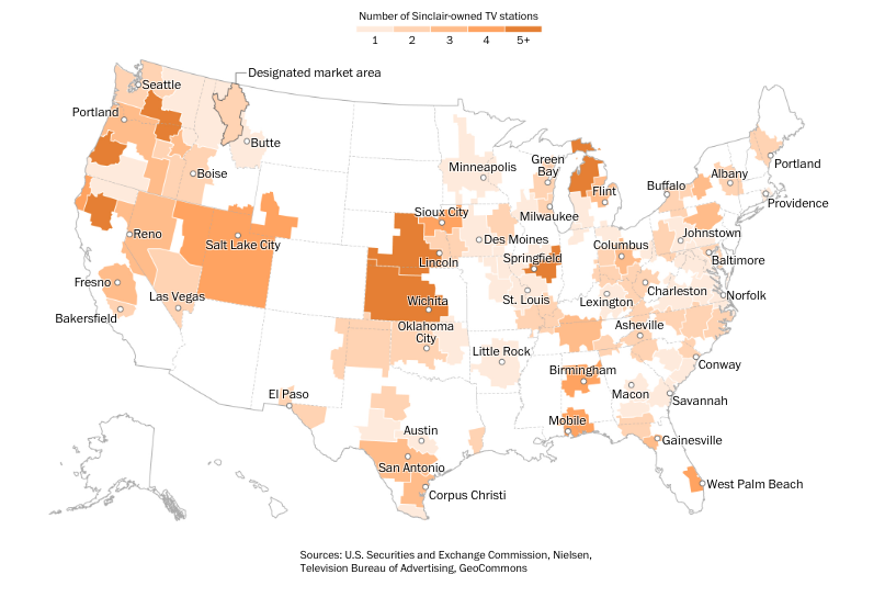
library(shadowtext)Final map
We’re layering our different shape files:
- The state borders
- The DMA borders we combined with the counts of them from the summarized Sinclair JSON file
- The locations of a few dozen stations we also extracted from the Sinclair JSON file
And we’re adding a bunch of functions in there for styling, like scale_fill_brewer() and geom_shadowtext() and geom_text_repel() and various theme options.
Final map
ggplot() +
  geom_sf(data=states, color="gray", fill=NA, size=.3) +
  geom_sf(data=geo, aes(fill=bin), color="light gray", size=.2) +
  scale_fill_brewer(palette = "Oranges", name="Number of Sinclair-owned TV stations") +
  geom_point(data=station_latlon_filtered, aes(x=X, y=Y),
             color="dark gray", fill="white", shape=21) +
  geom_shadowtext(data=station_latlon_filtered, aes(x=X, y=Y, label=DMA_Short),
             color="black", bg.color="white", vjust=-1, size=2.5) +
  geom_text_repel() +
  coord_sf() +
  theme_void() +
  theme(panel.grid.major = element_line(colour = 'transparent'),
        legend.position="top", legend.direction="horizontal") +
  labs(title="Sinclair's nationwide reach",
       subtitle="This map only highlights stations owned outright by Sinclair.
It does not include the many stations licensed to other operators but managed by Sinclair.",
       caption="Sources: U.S. Securities and Exchange Commission, Nielsen, Television Bureau of Advertising, GeoCommons")

ggsave("sinclair_ggplot.png", width=10, height=6, units="in")
Final map
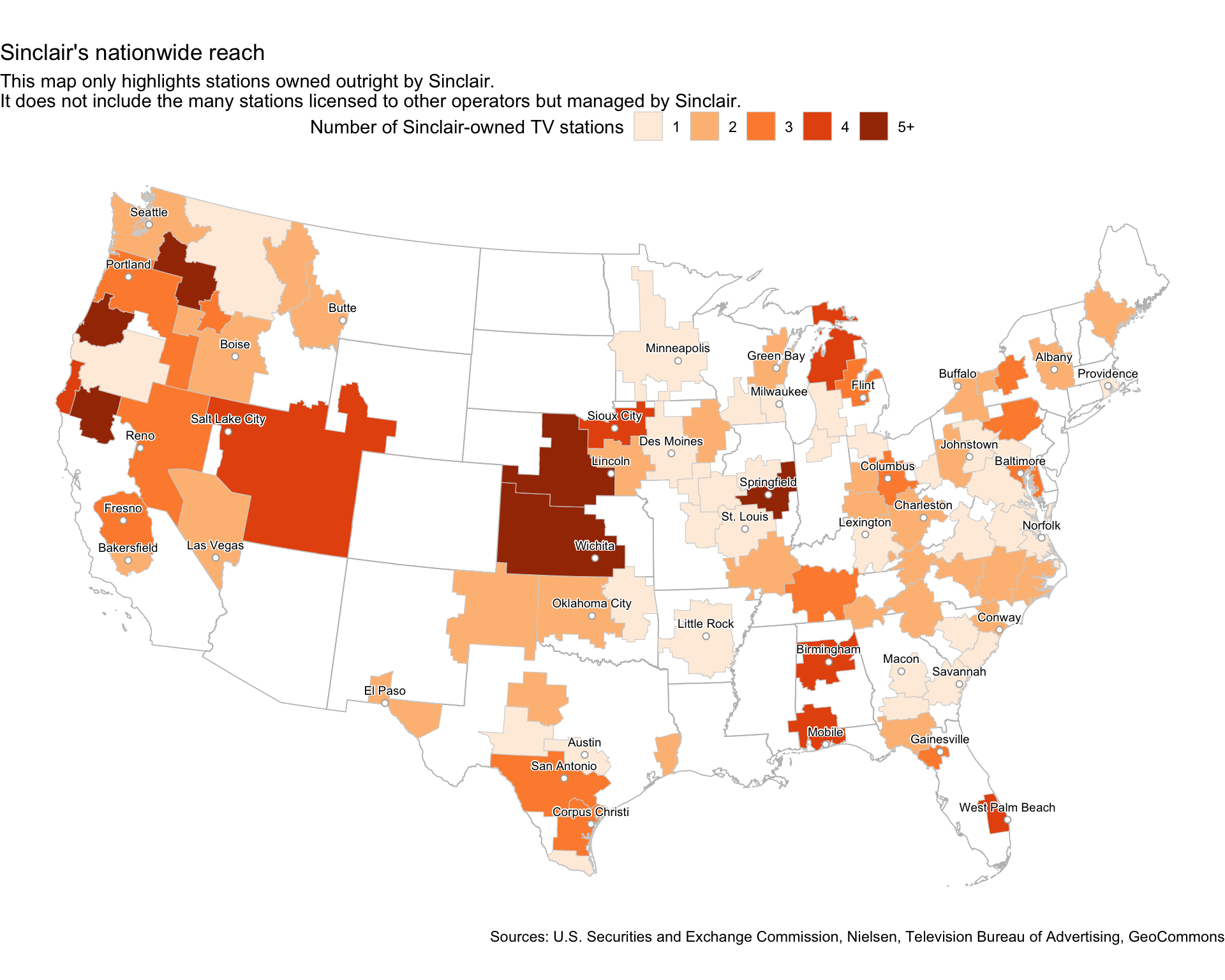
How does it compare?