Intro to CartoDB walkthrough
We've done some mapping using Google Fusion Table but now we're going to try it in a fairly new mapping service called CartoDB. It's a free but you get a limited amount of space (50 mb). But since you're a student, you can get that boosted to about 100 mb.
Let's get you signed up and logged in.
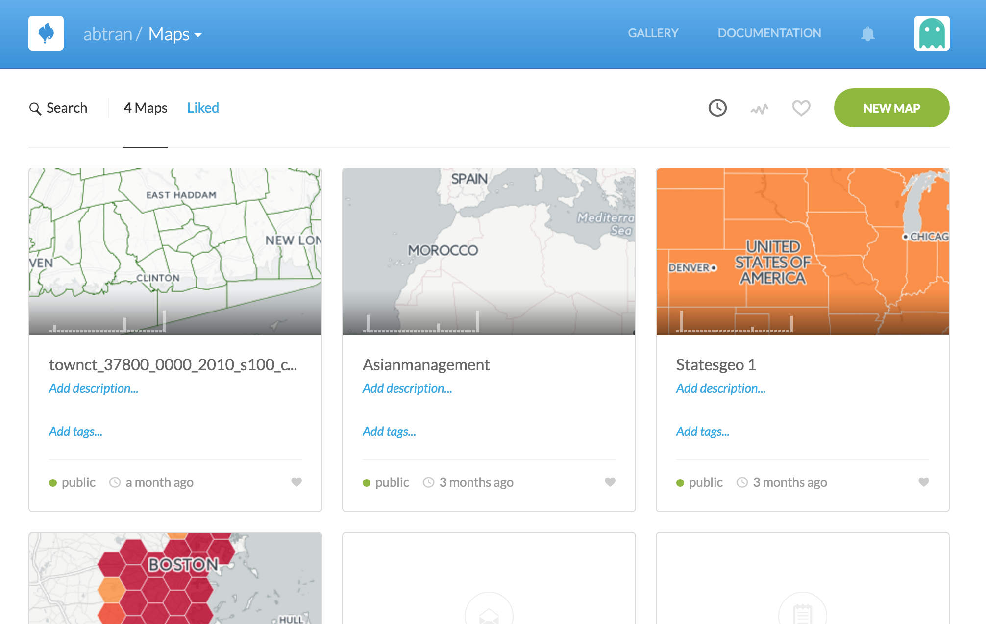
Your main page has two sections, Maps and Datasets.
Click over to the Datasets section of the website and click New Dataset. (You might need to click on the arrow next to Maps to see the Datasets link.)
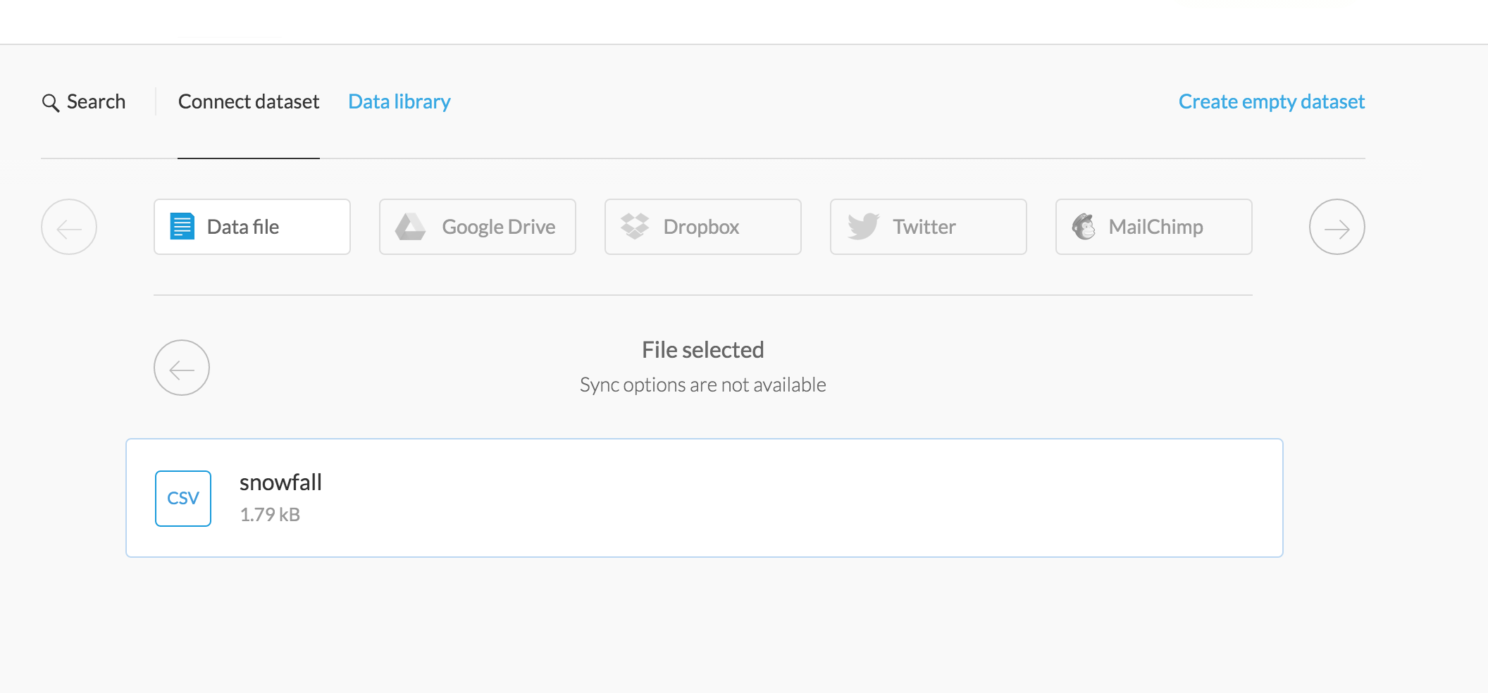
Click on the Connect dataset tab.
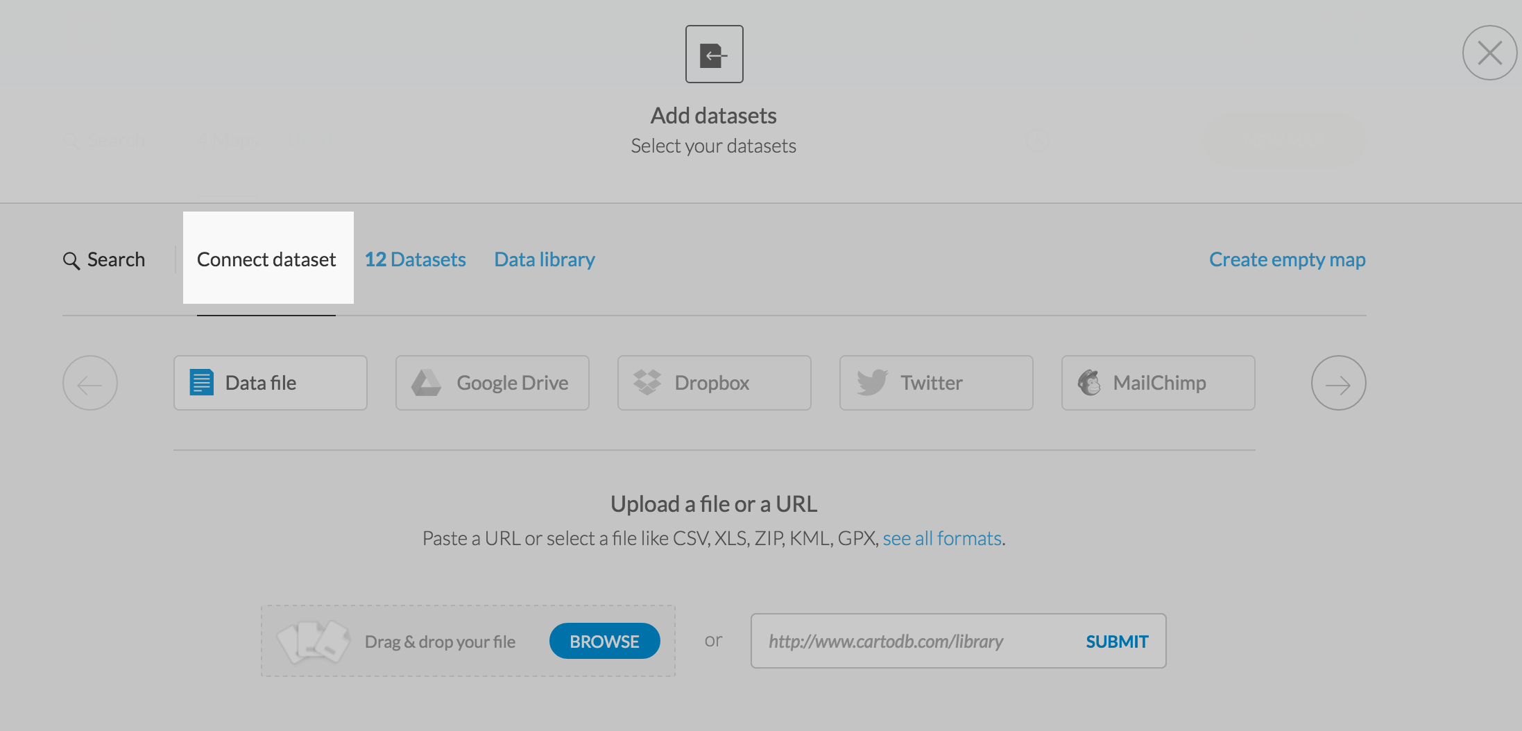
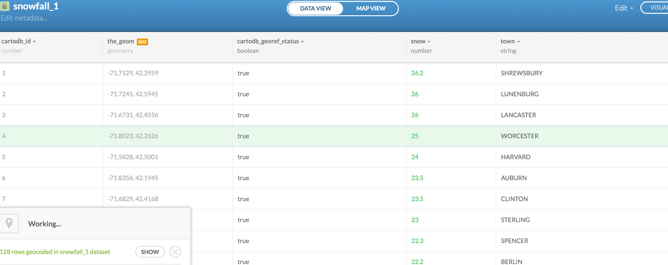
Download this Massachusetts town snowfall totals dataset. And upload it via the Browse button.
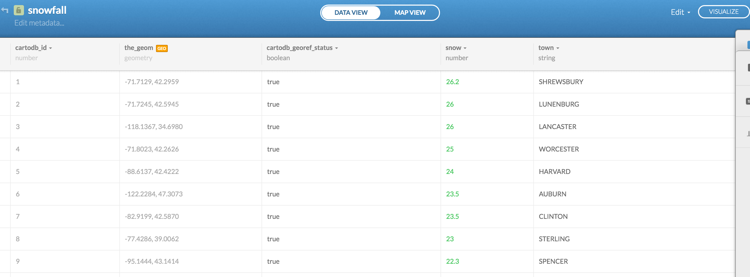
CartoDB will process your data and pop up this viewer. Notice the orange GEO button in a new column called the_geom.
What happened here was CartoDB guessed the column with the location data and automatically looked up the latitude and longitude of each one and added a new column with that information. Pretty cool feature.
Dots
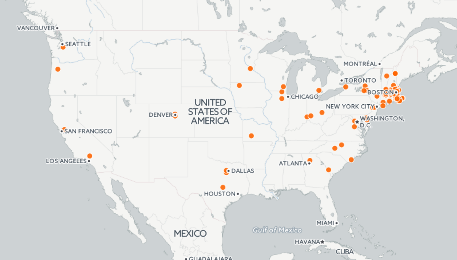
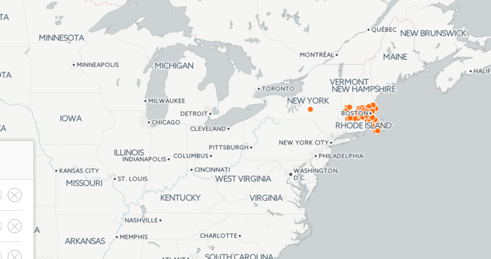
Now click on the Map View button at the top.
Well, a lot of this data is outside of Massachusetts, so that's problematic. That's because the original dataset just listed town names without the context of the town being in Massachusetts. Remember we had this issue with Google Fusion Tables, too?
Go back to Data View and click the little arrow next to town and select Georeference.
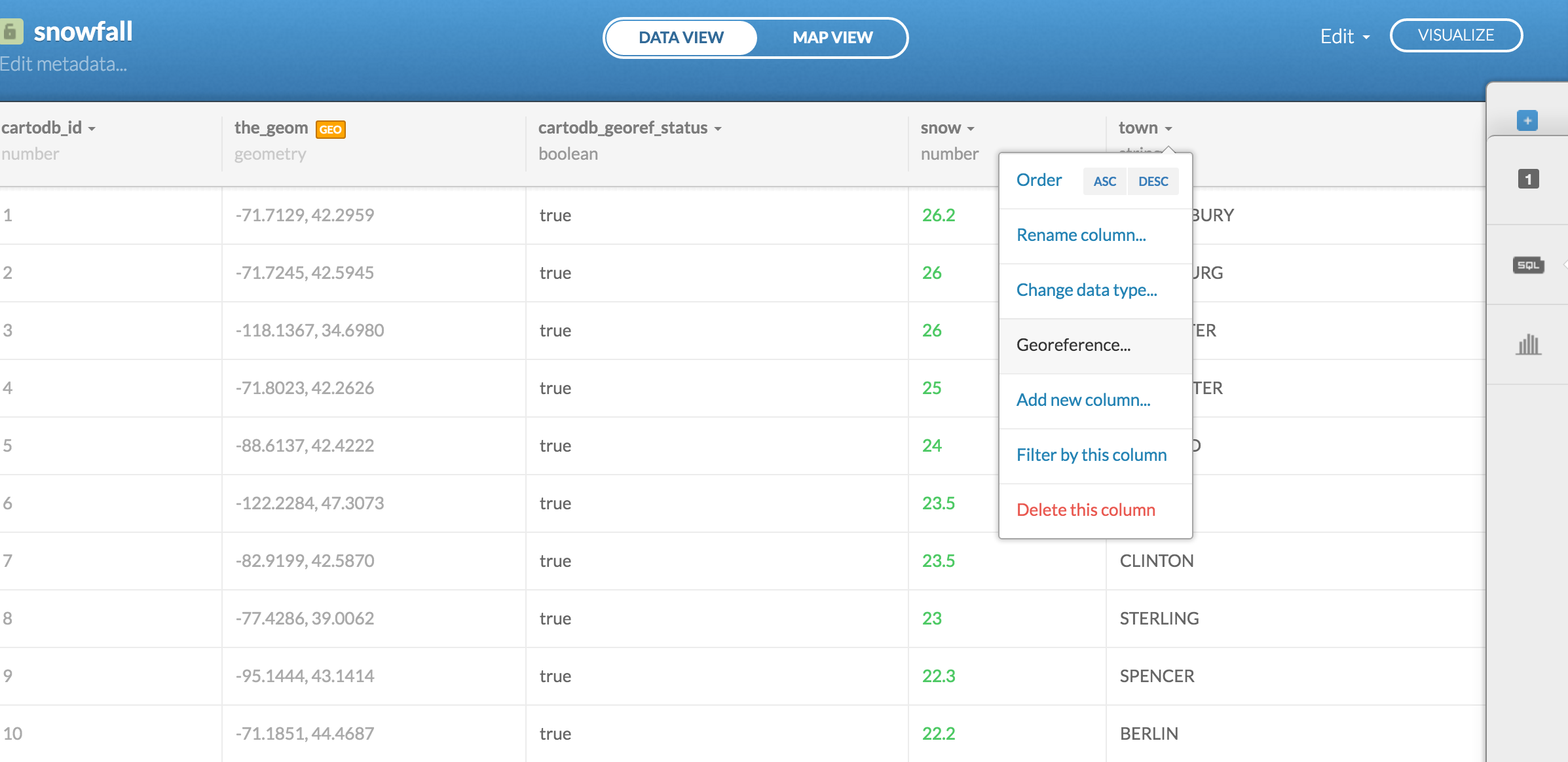
Here is where you give more specific instructions to CartoDB on what type of location data you have.
Click the link called City Names because that's the type of data we have.
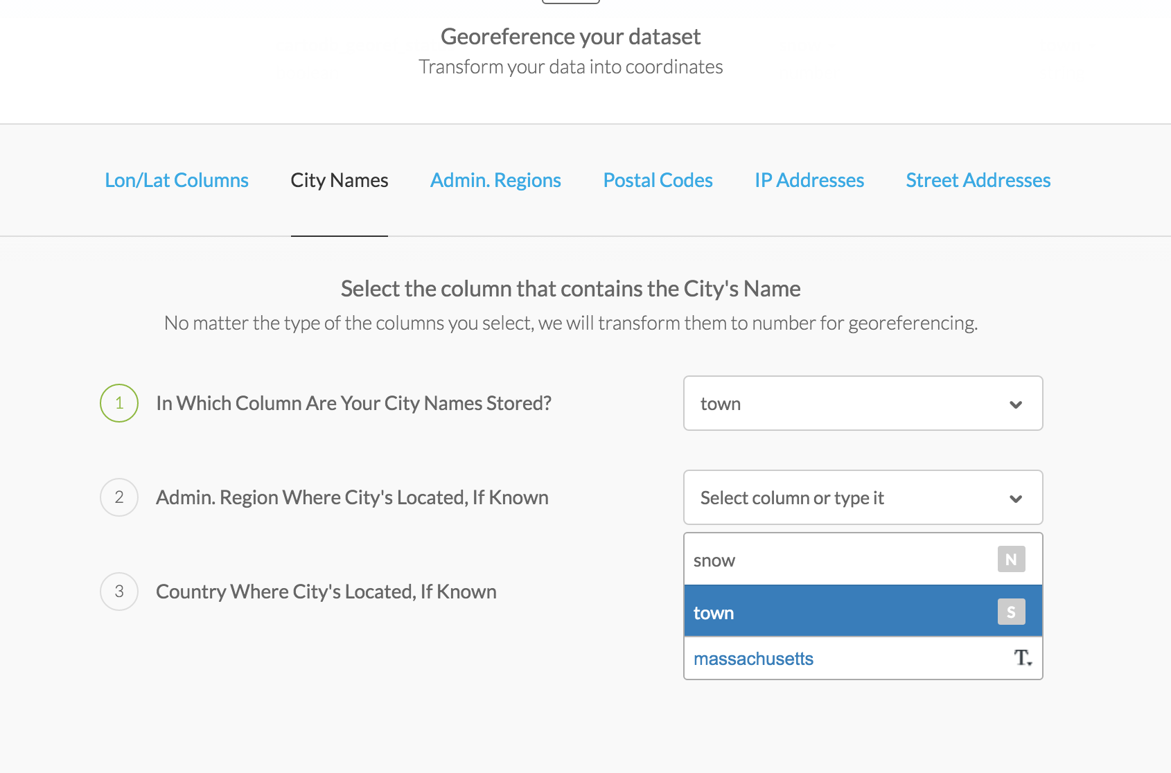
Here, we can specify which column CartoDB should be looking at to figure out the location.
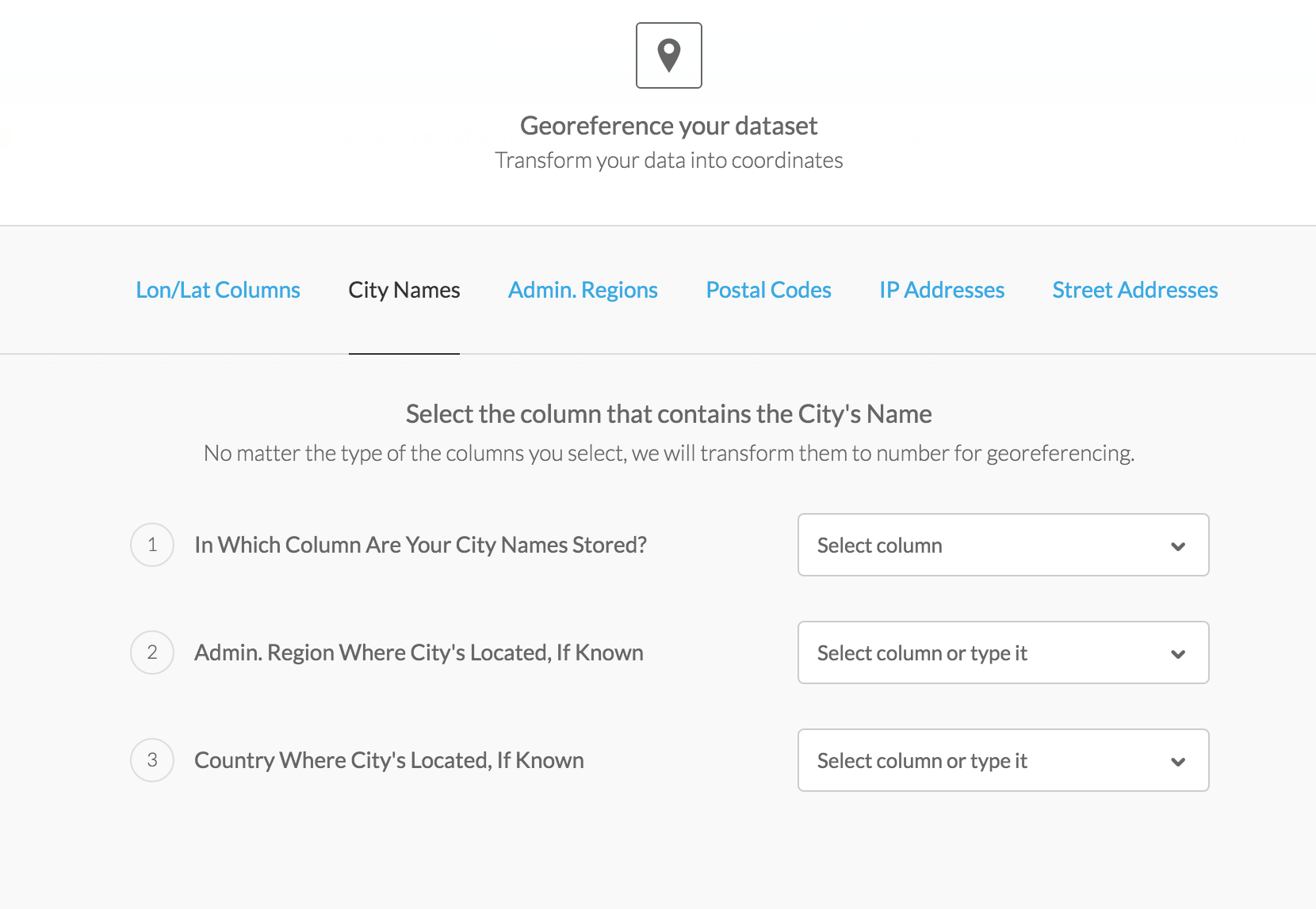
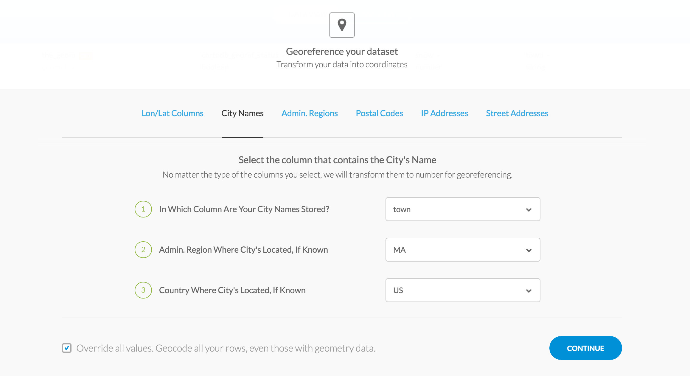
Then we can type in the state and country to limit the search for town names.
Be sure to check the box Override all values. Geocode all your rows, even those with geometry data.
This is to reset the process and get rid of those towns out in the middle of the country.
Click Continue.
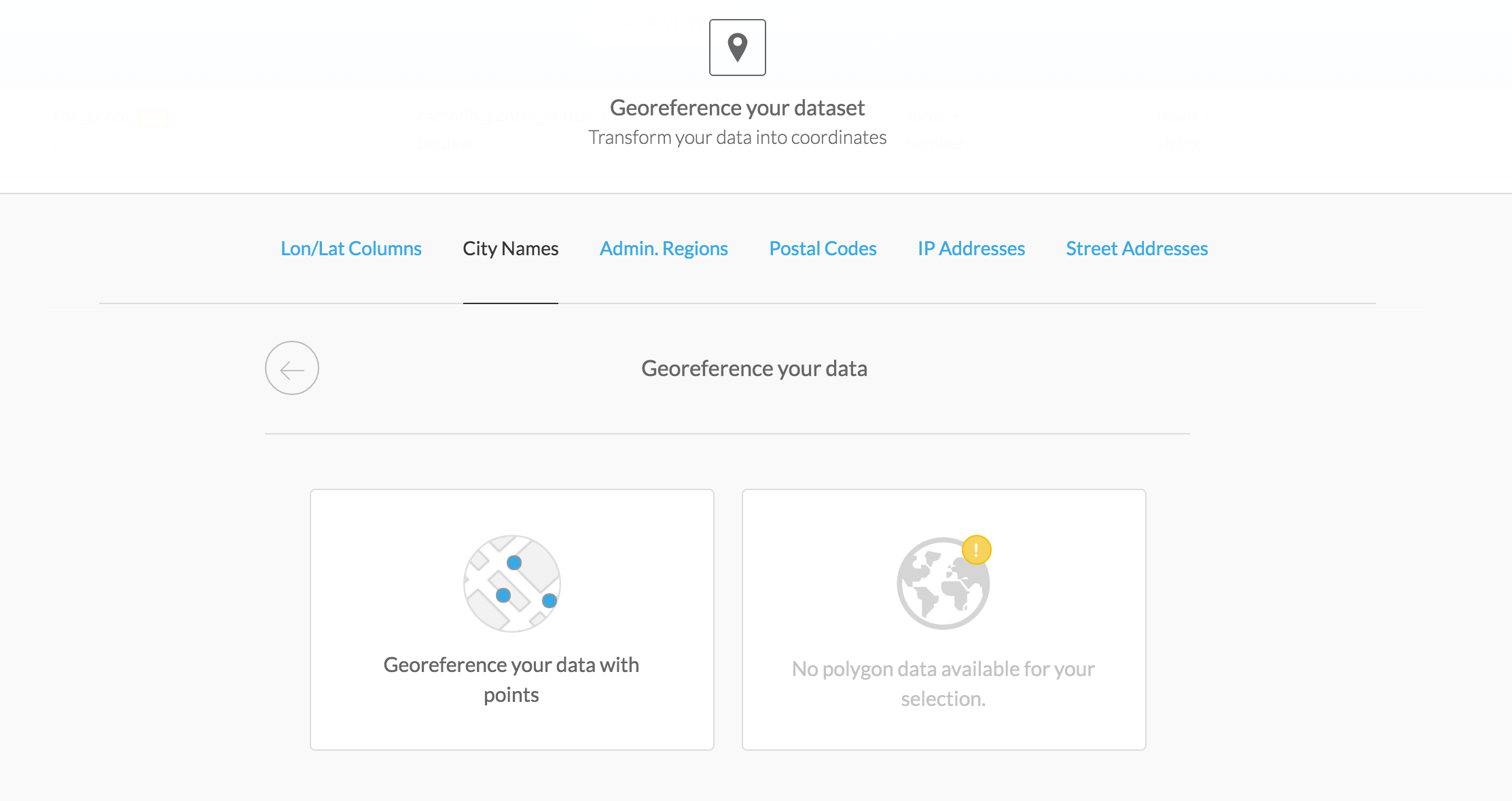
It will make sure you want dots and not polygon (shapes) rendered.
Go ahead and click Georeference your data with points.
Looks like the_geom column has some new data. Compare it to the original view above and you can see the latitudes and longitudes are more within the -71 and 42 numeric range.
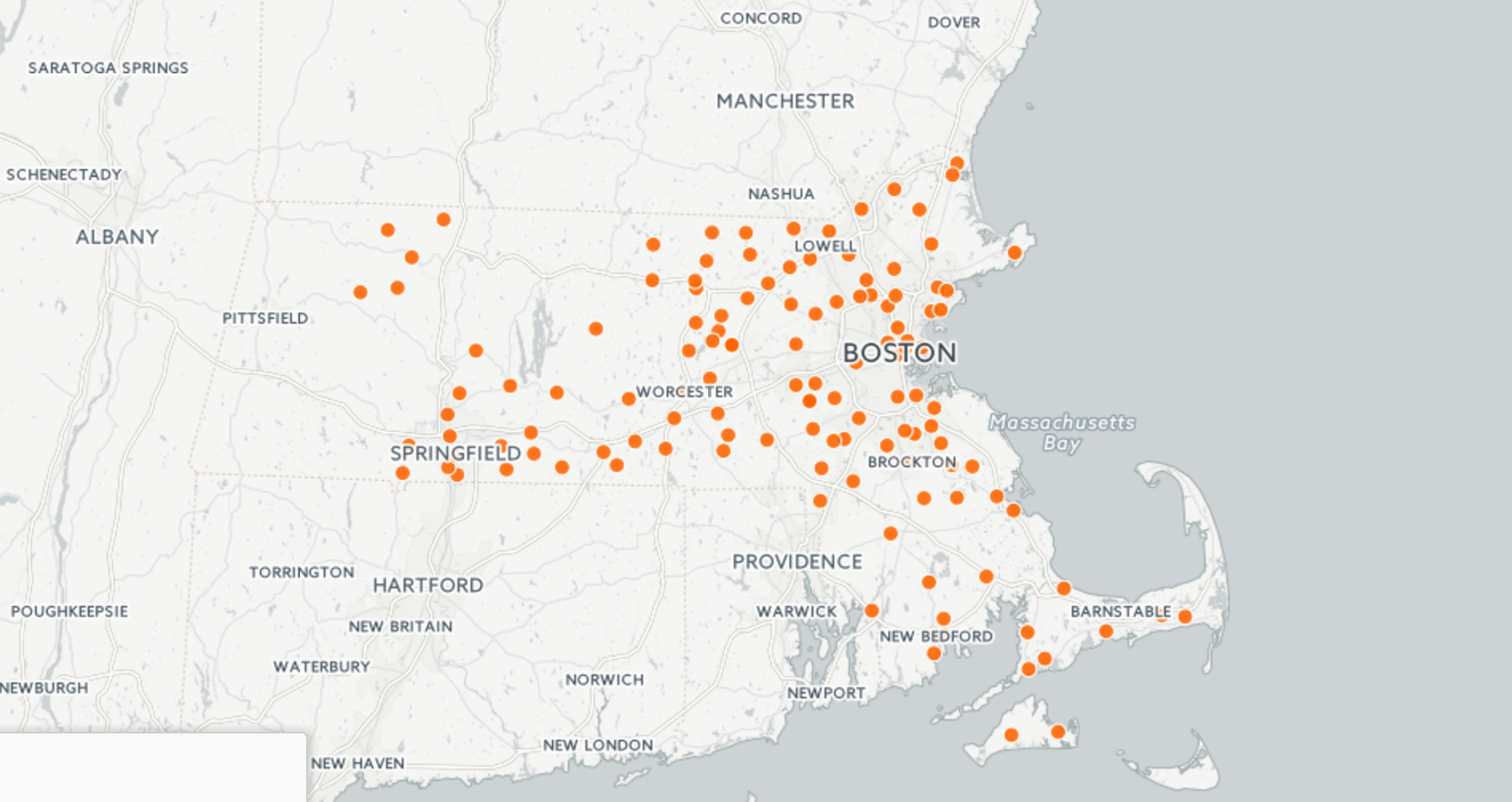
Click on the Map View and zoom in on Massachusetts.
Looks like there's a few dots that still didn't render correctly.
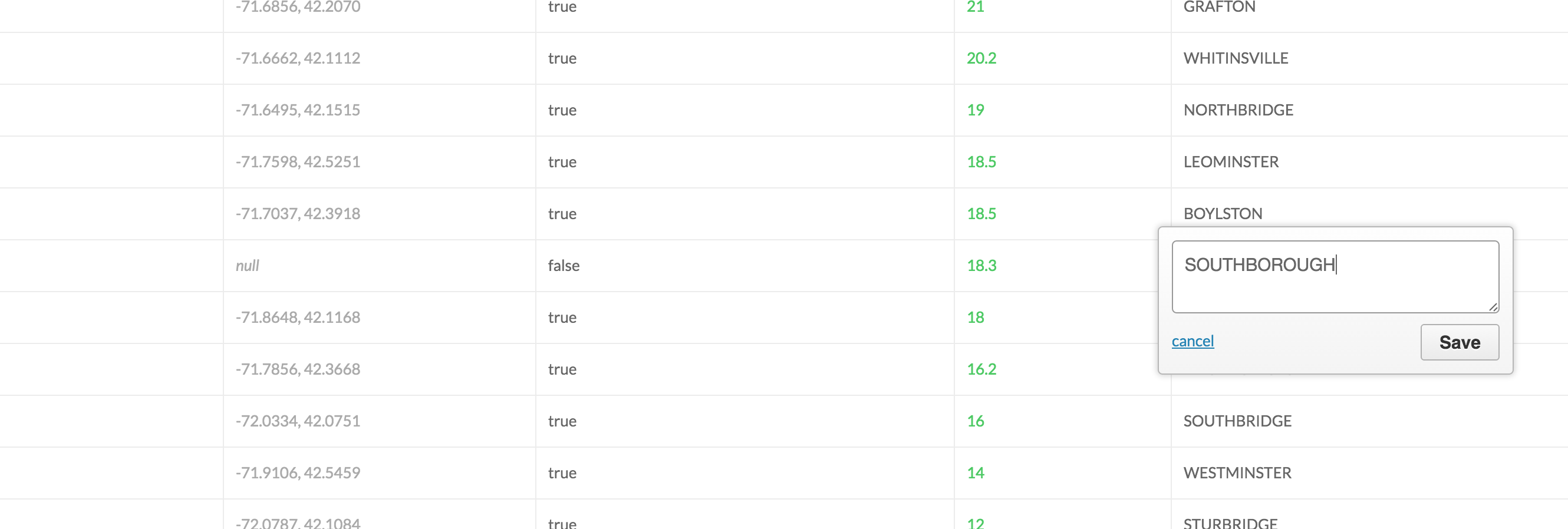
If you want, you can go back to the Data View and track down the errant towns and fix those manually.
It's probably because of typos or maybe unique town name spellings. (Southboro versus Southborough)
Zoom into Massachusetts. Lots of dots.
But we want to do more than just have dots.
We want them to represent quantified data.
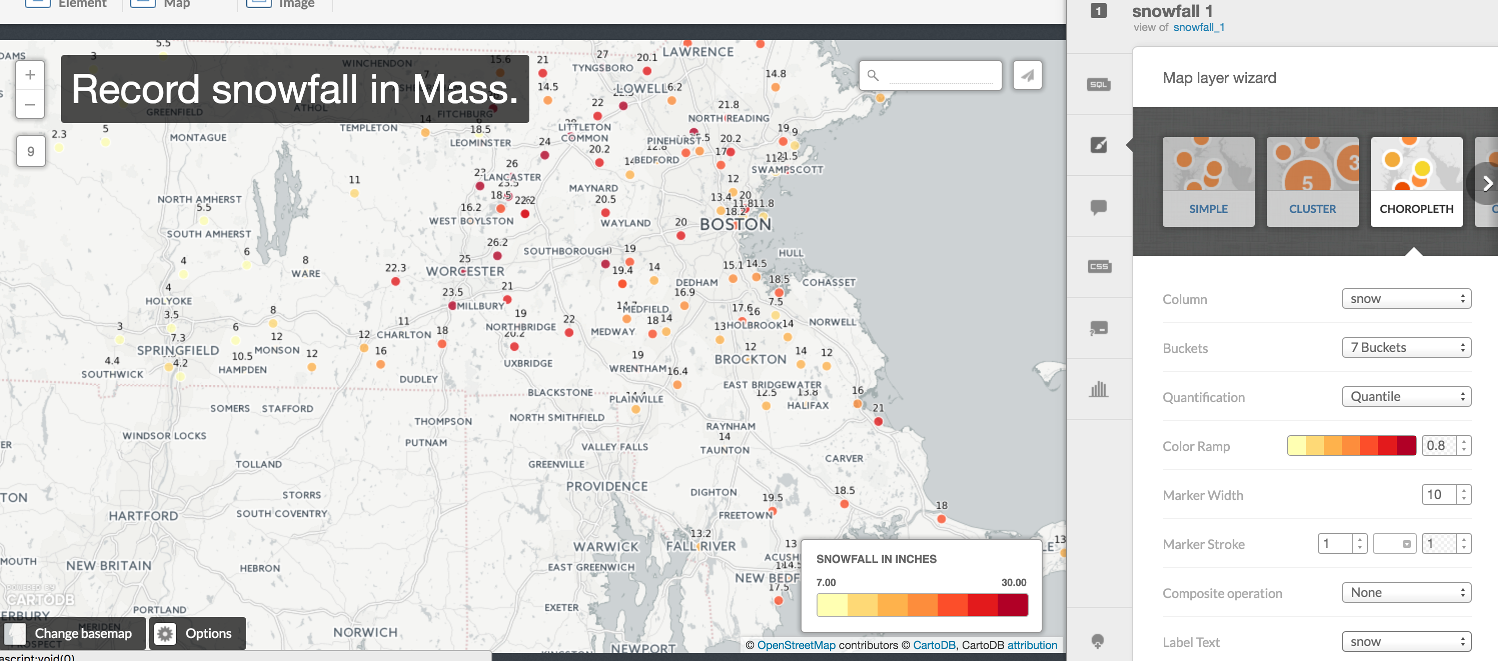
Bubble map
Click on the paintbrush on the right for Wizard.
Scroll left or right until you can click on the Bubble option.
If you have to, select snow in the Column option.
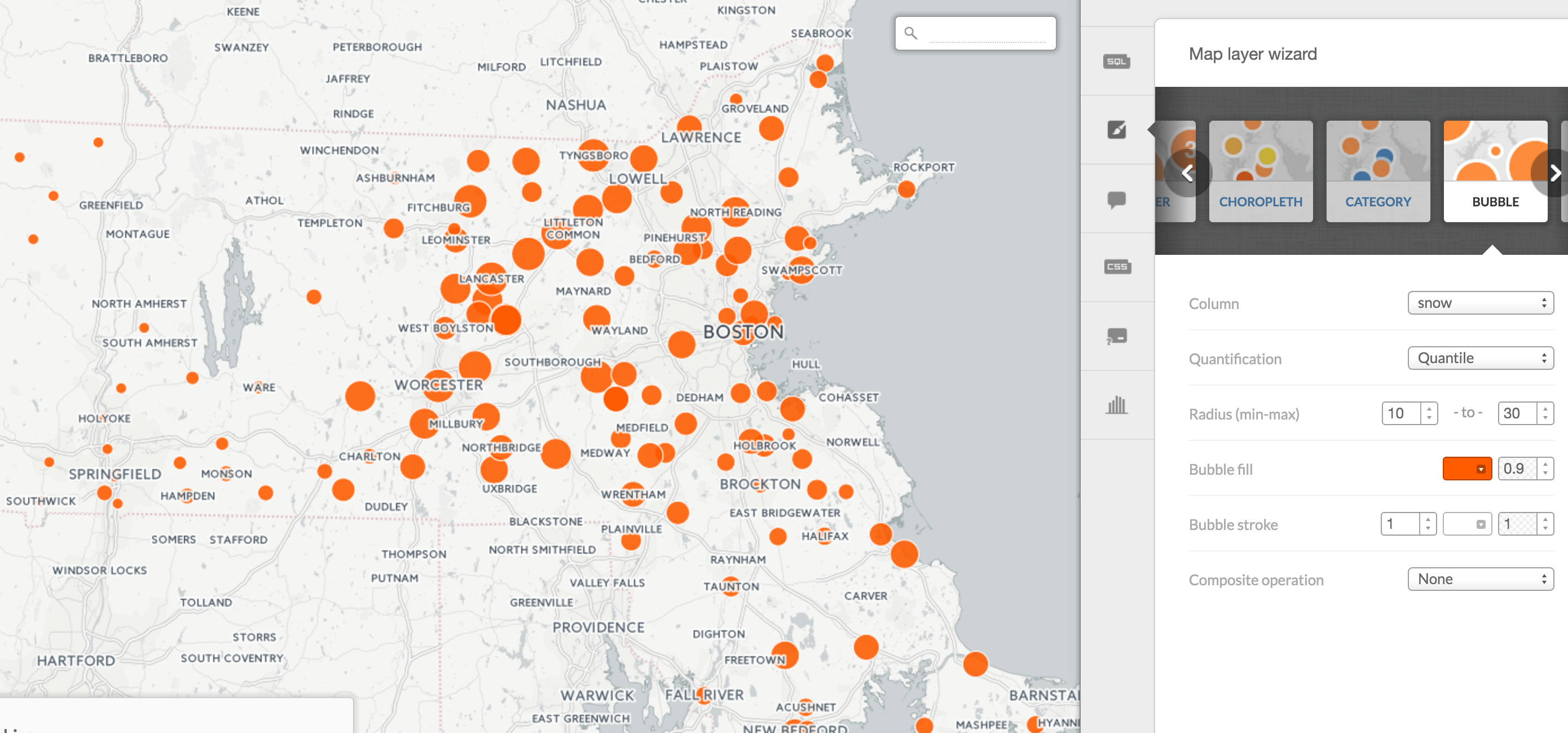
What we've done is set it so the size of the circle is based on the number in the snow column.
The higher the snowfall, the larger the circle over the town.
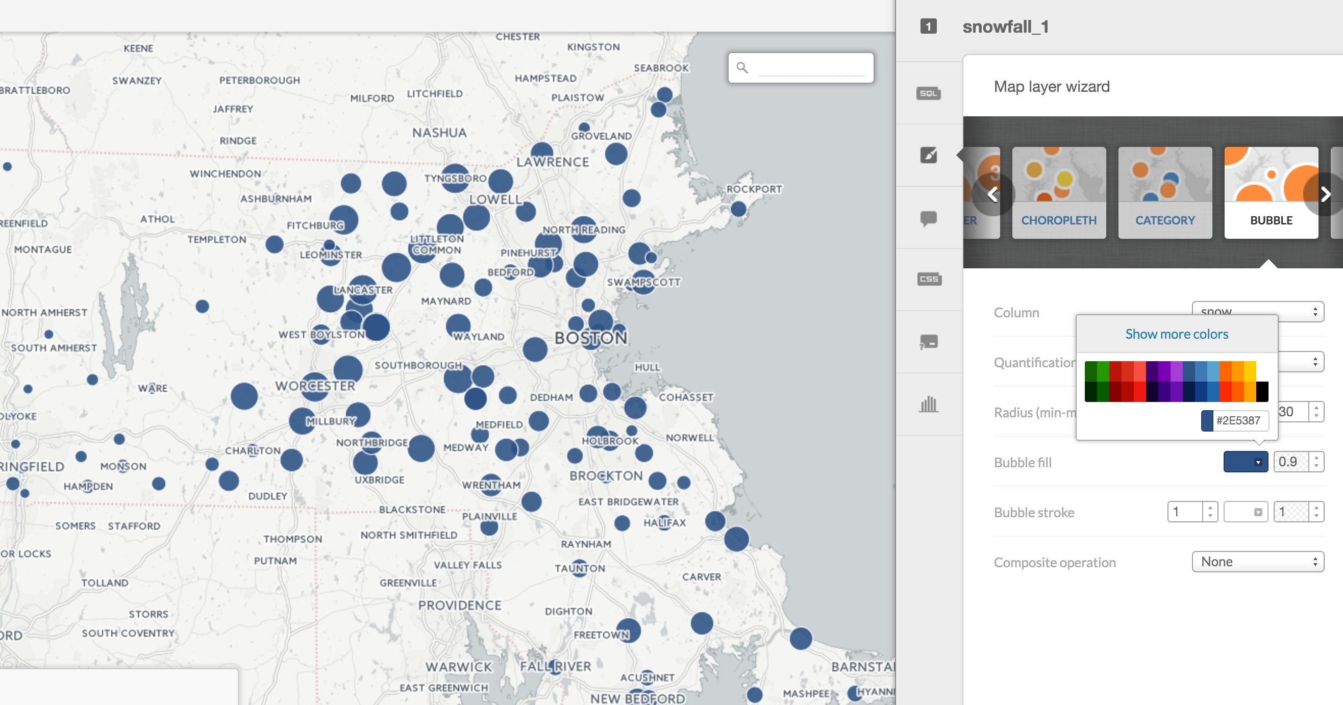
Click on Bubble fill to change the style of the circle, like color and color outside the circle.
Click on Composite operation to play around with how overlapping circles look.
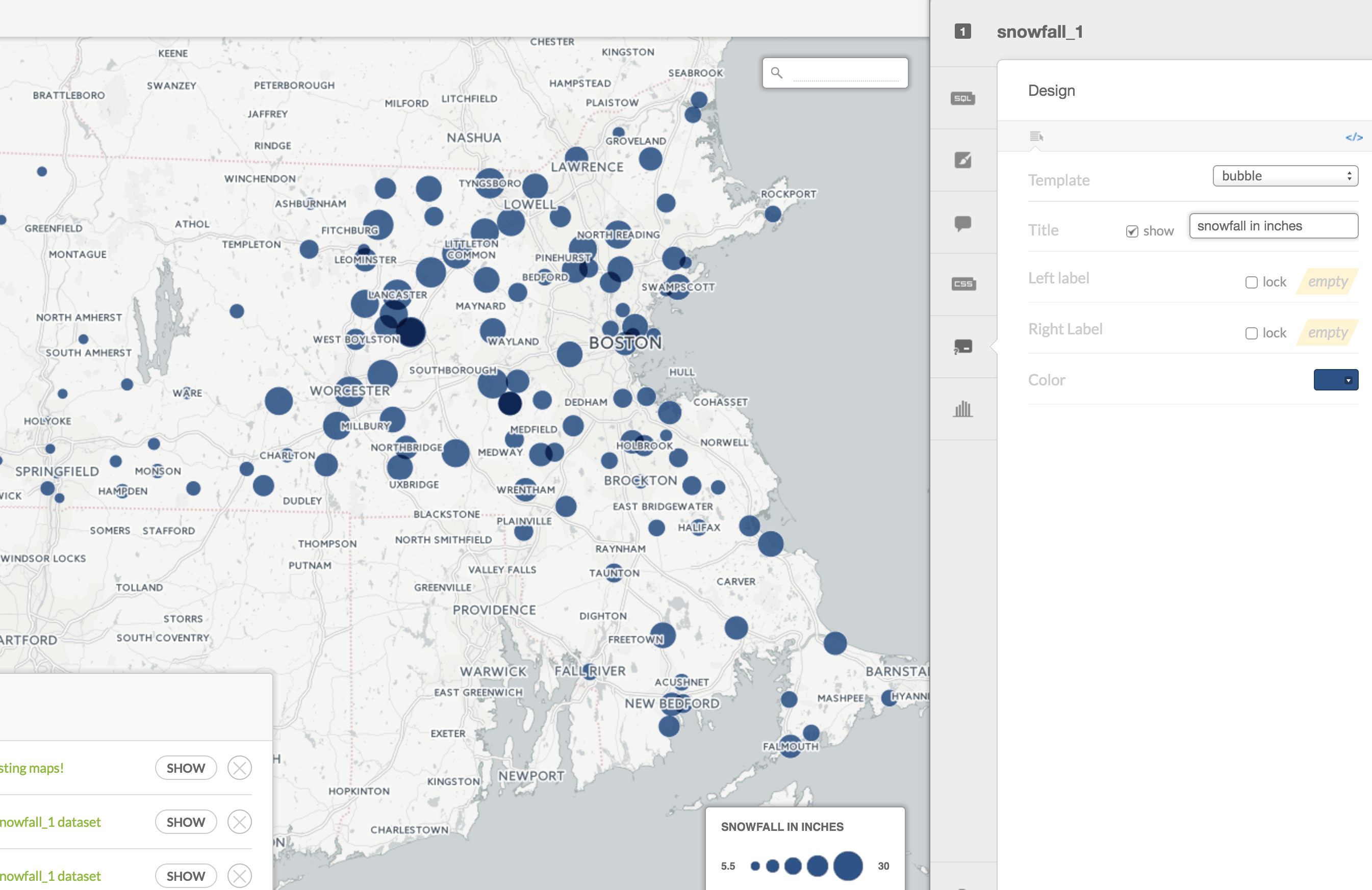
Click on the Legend option and you can add text and legend information to indicate what the size of the circles represent.
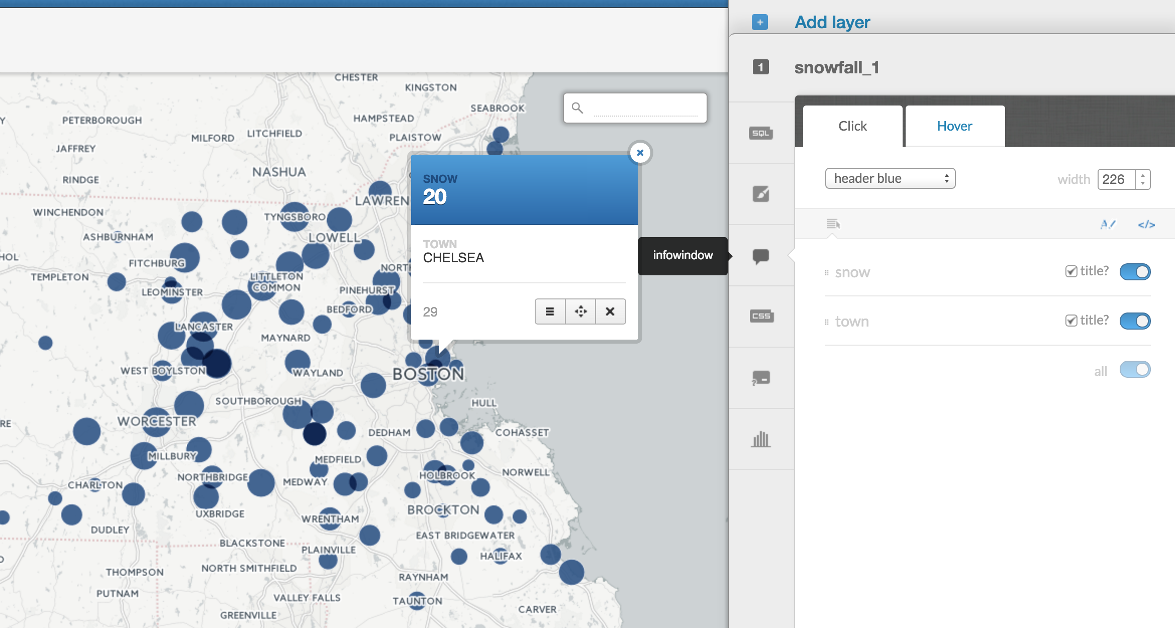
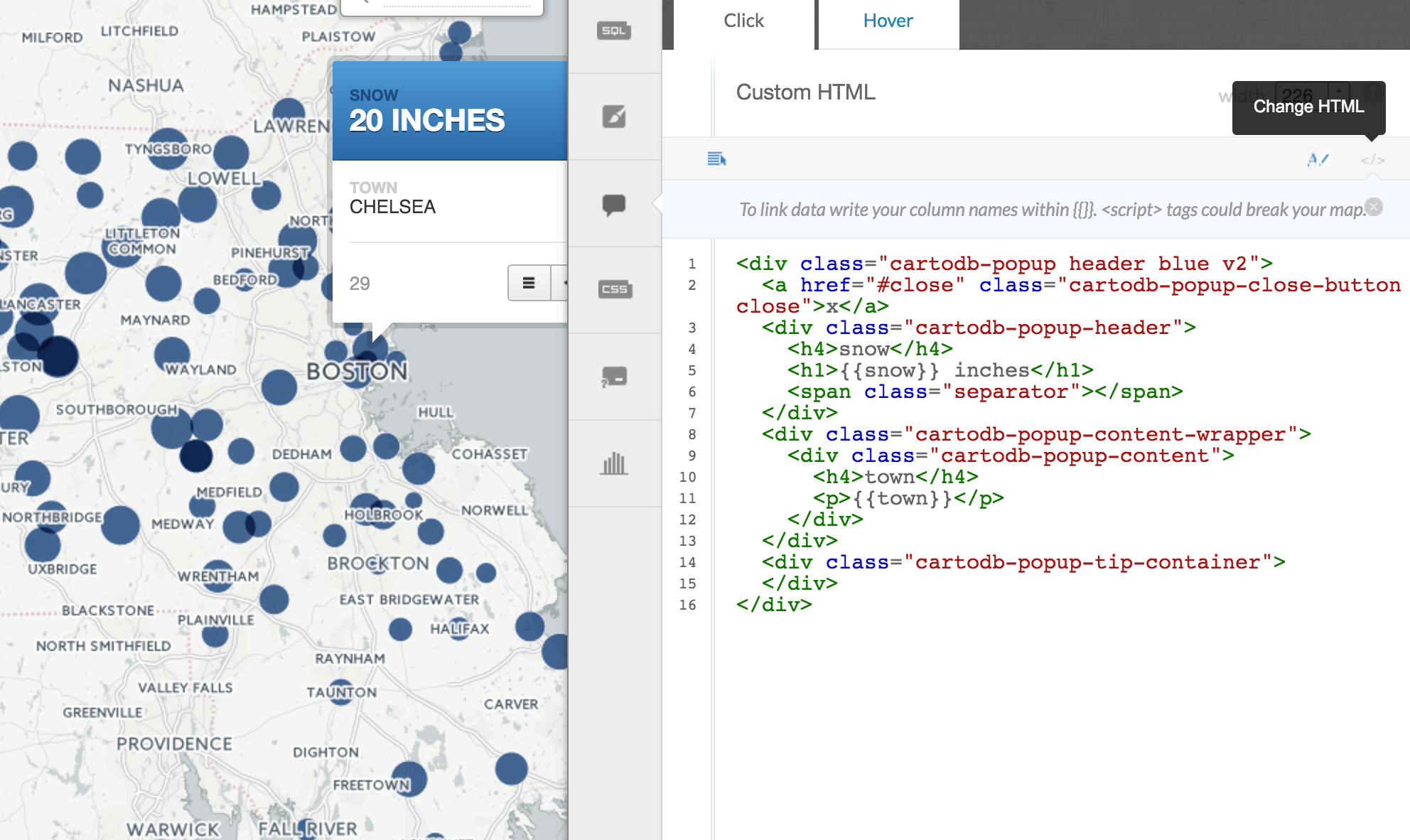
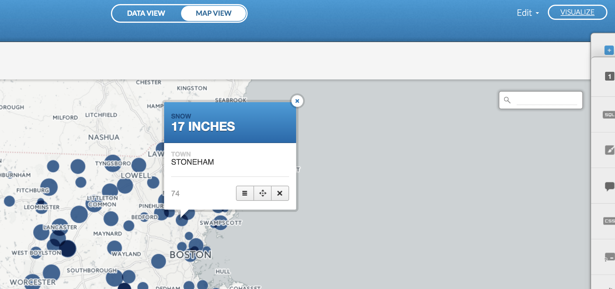
Click on Info window to have information pop up when a user clicks on a dot.
Toggle snow and town on to have that data appear.
You can also add a header if you want in the pulldown menu.
You can modify it even more by clicking the Change HTML button on the right (it's the gray </>sign).
This should look familiar for those who've messed around with infowindows in Google Fusion Tables and for those who've coded with HTMl and CSS.
Here you can have more manual control over how the information is displayed. You can move the order of information, like Town above Snow total. You can also add "inches" after the number.
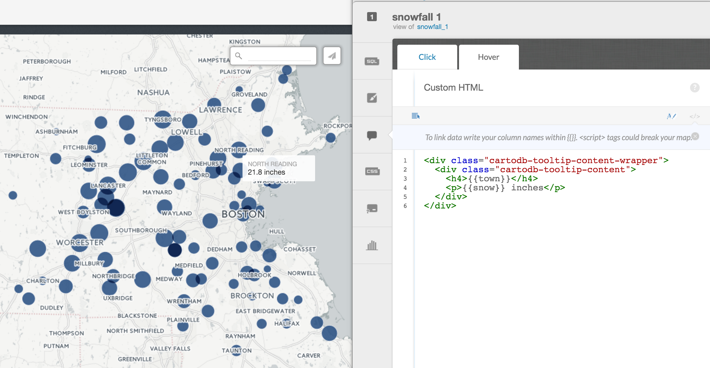
Click on the Hover tab. You can also make the information show up by hovering over a dot with your mouse instead of just clicking.
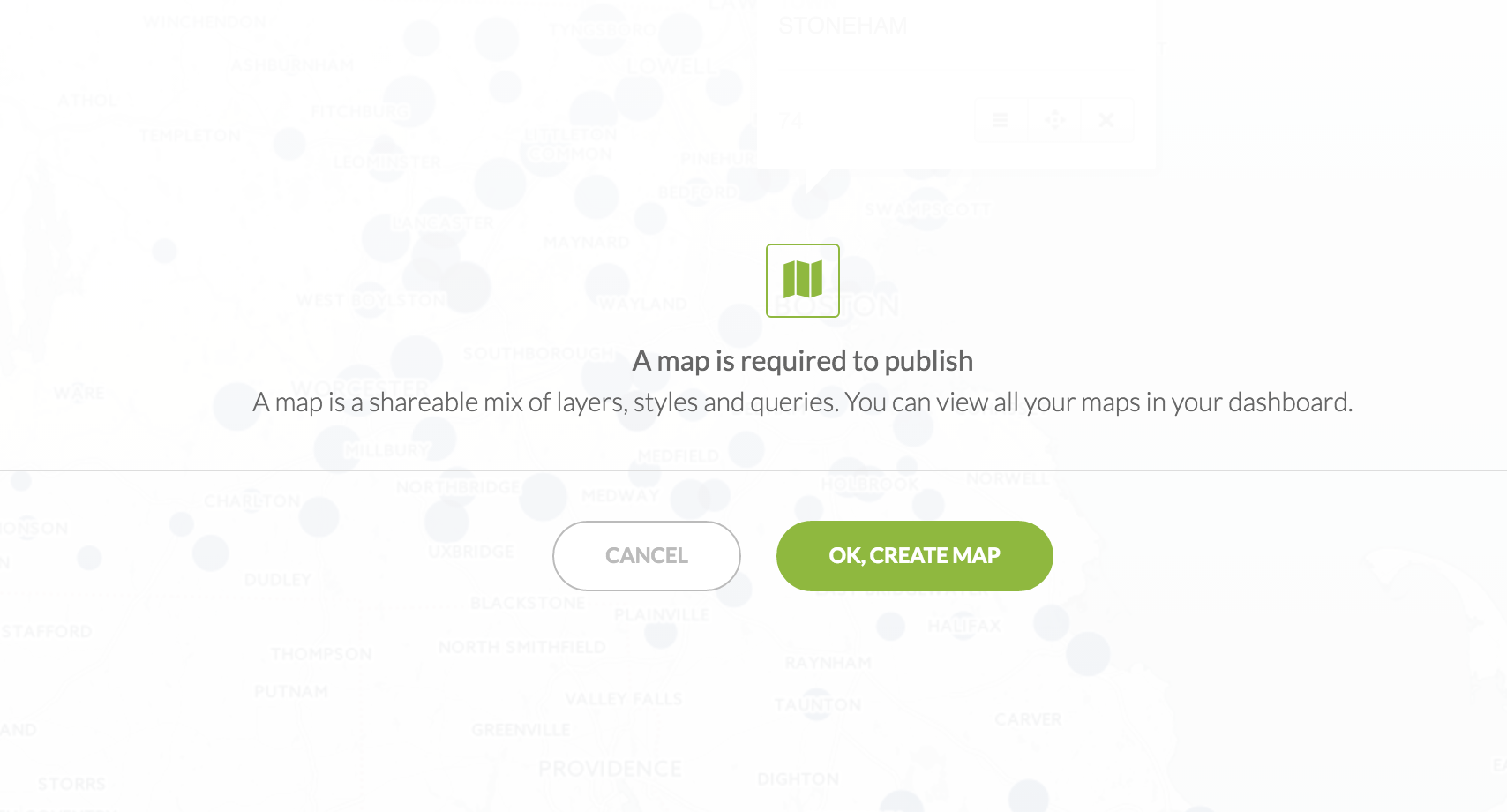
Click on Visualize at the top right.
This is officially making a map and storing it in your CartoDB account.
Click OK, create map.
Some new options will appear, Add Element, Preview Map, and Export Image.
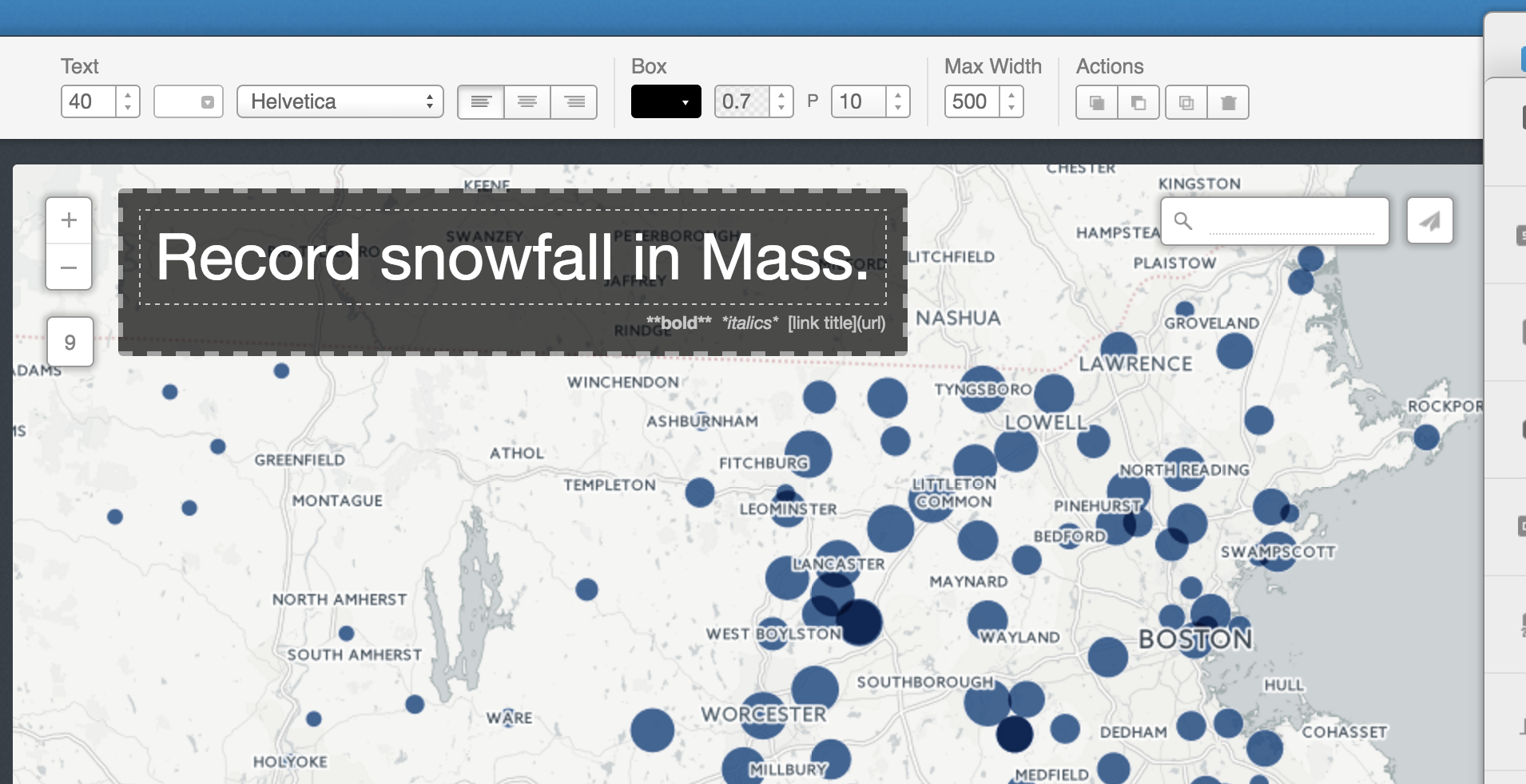
Click on Add Element and then Add title item.
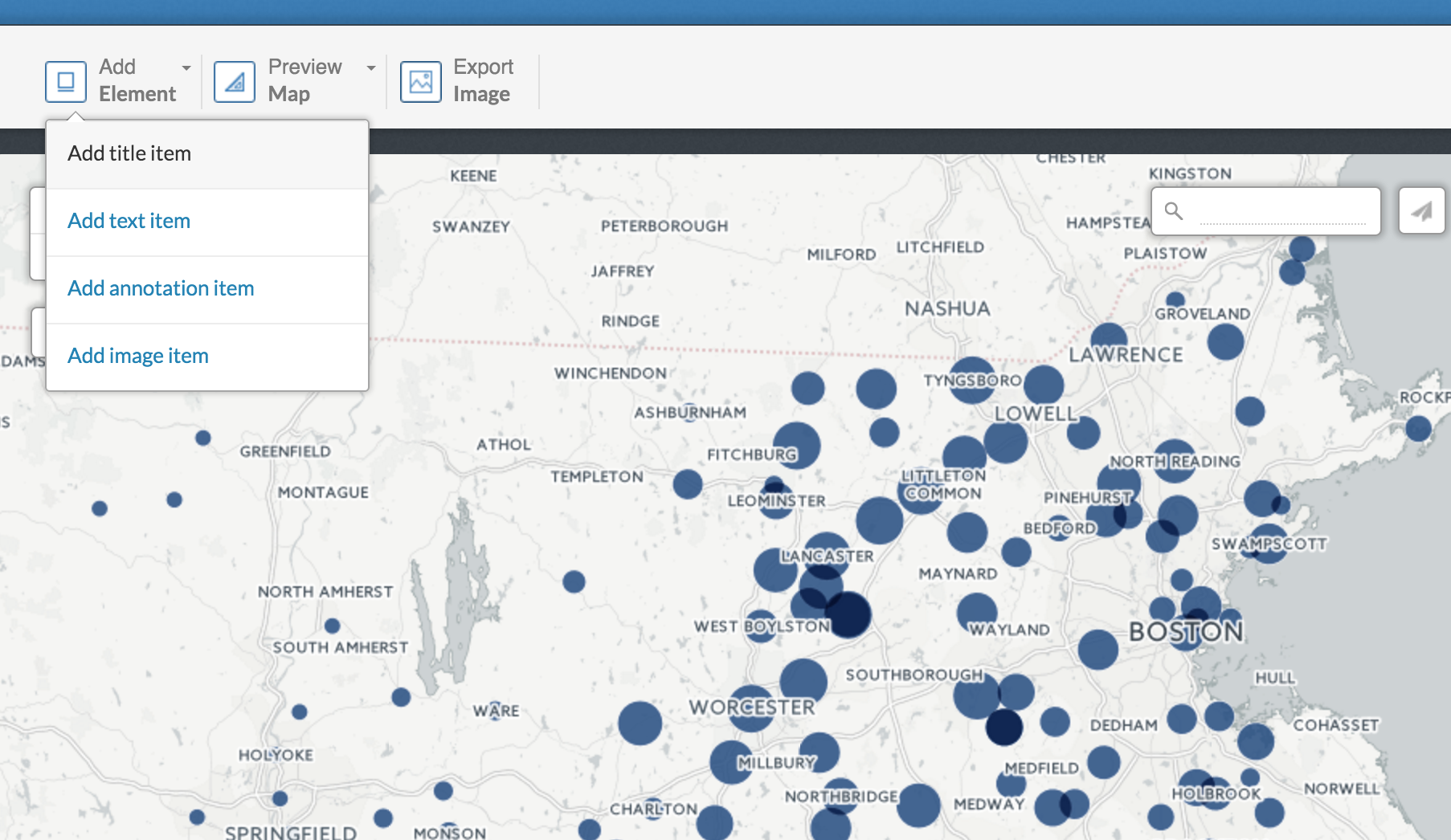
Put in a title.
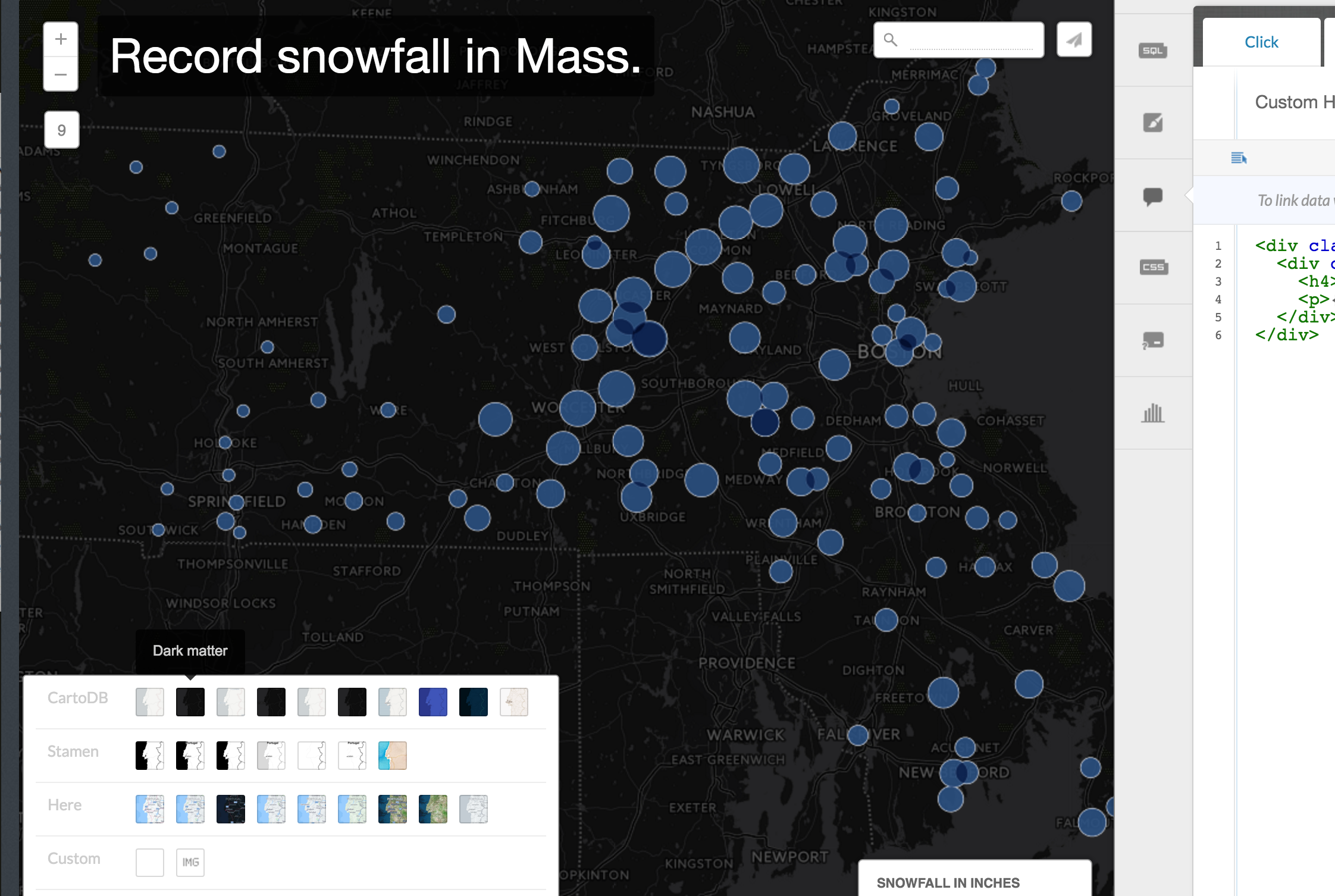
At the bottom of the window, you can change the base layer of the map by clicking on Change basemap.
Play around with it if you want, but let's stick with the default for now.
Let's look at another way to visualize the data.
Choropleth dots
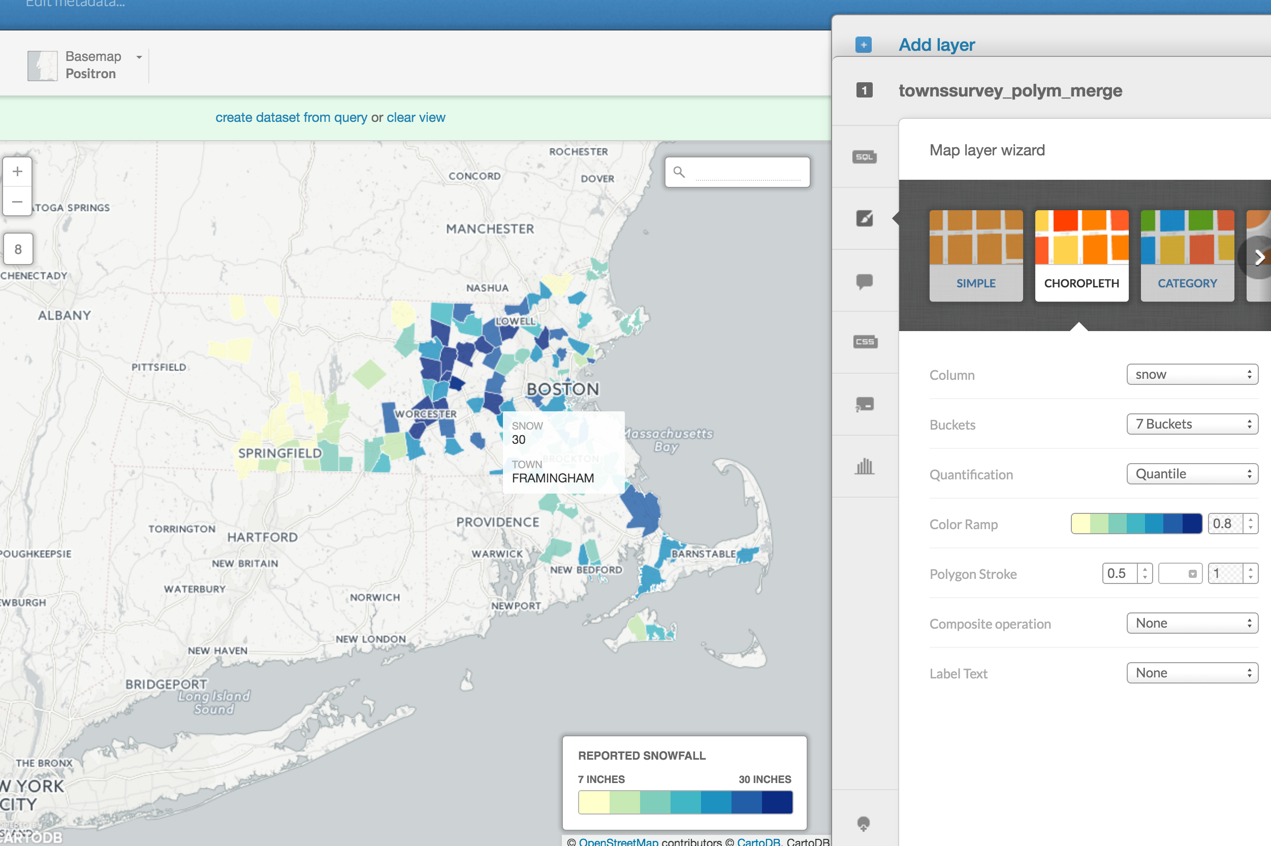
Click on the Map layer wizard again and this time scroll to Choropleth.
Select snow in Column.
Now the darker the hue of red, the higher snowfall.
Which is better? It's up to you.
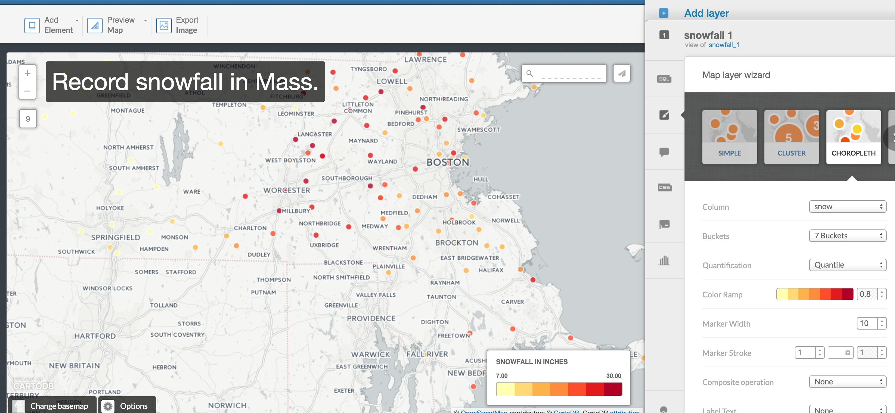
You can also select snow in Label Text and the number will appear next to the dots.
Just another option to consider. Is it redundant with the color or is it better for specificity?
Let's try another way to visualize this data.
Choropleth map
Instead of dots and bubbles, we want to use the geographic borders of every town in Massachusetts.
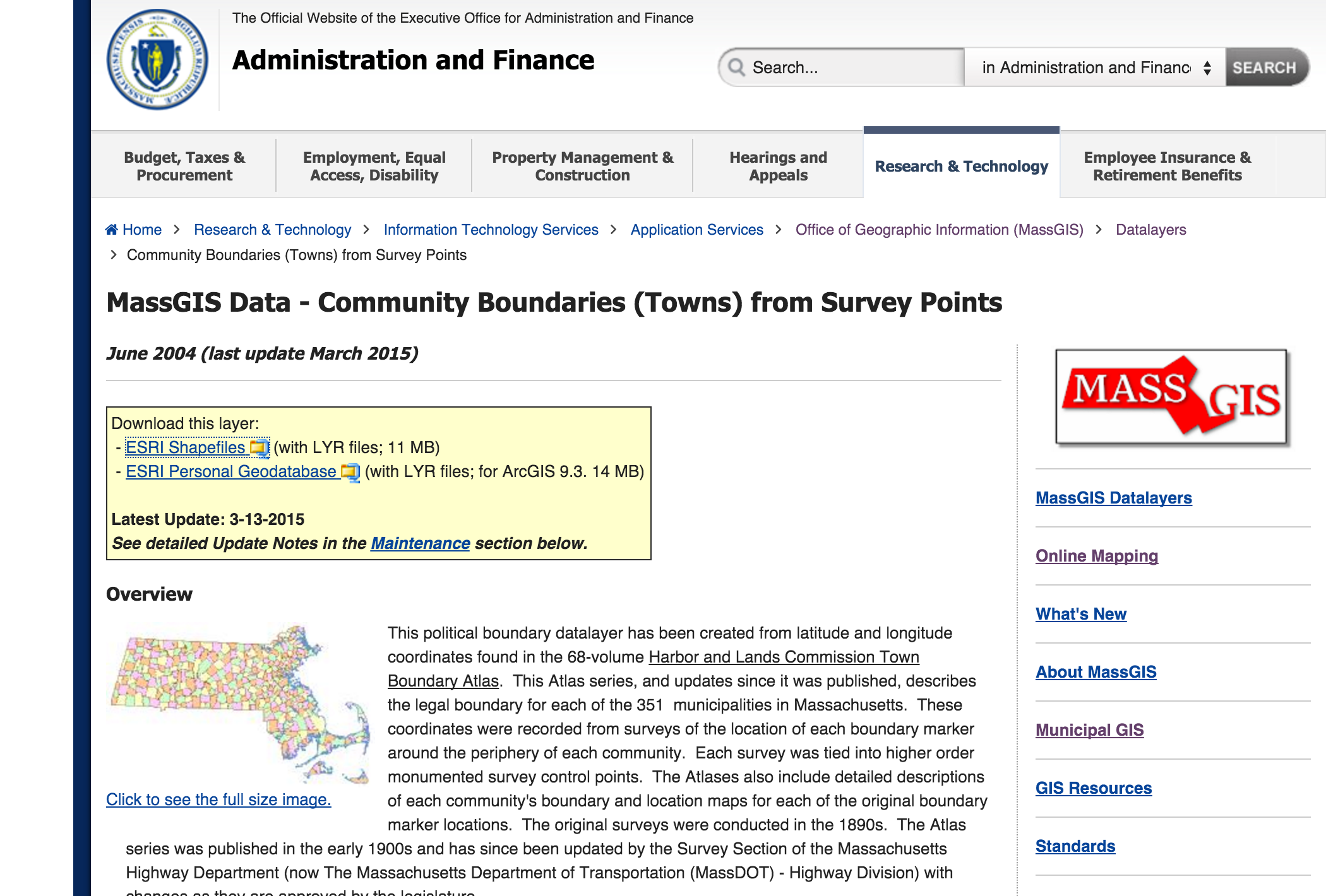
First, we need to find the shapefile.
Every state government has a department that keeps track of the this data for planning.
I've done the hard work of Googling for you. Here's where you can get the shapefile: The Massachusetts Office of Geographic Information
Download ESRI Shapefiles
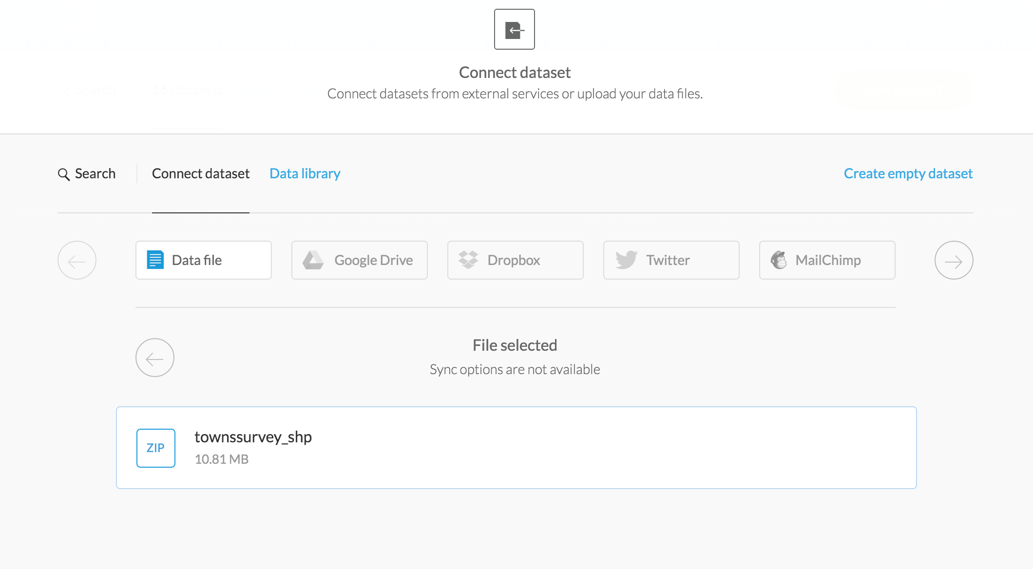
Go back to CartoDB's main Datasets page and click New Dataset.
Select the townsurvey_shp zip file.
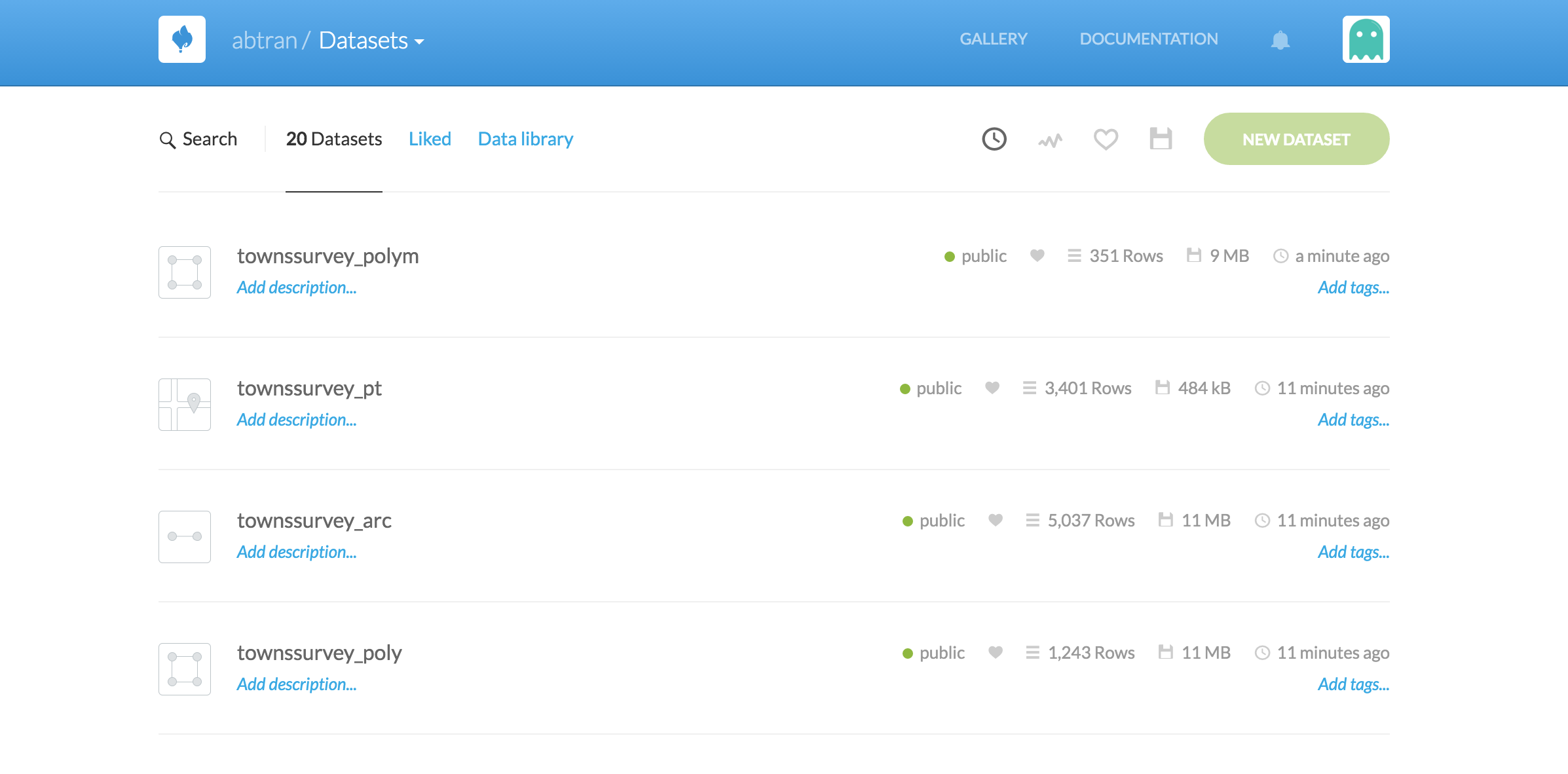
CartoDB will bring in all the files within the zip. There's a lot of extra stuff. Points and lines and polygons as represented in the box next to the name of the file.
We want to just focus on the polygons.
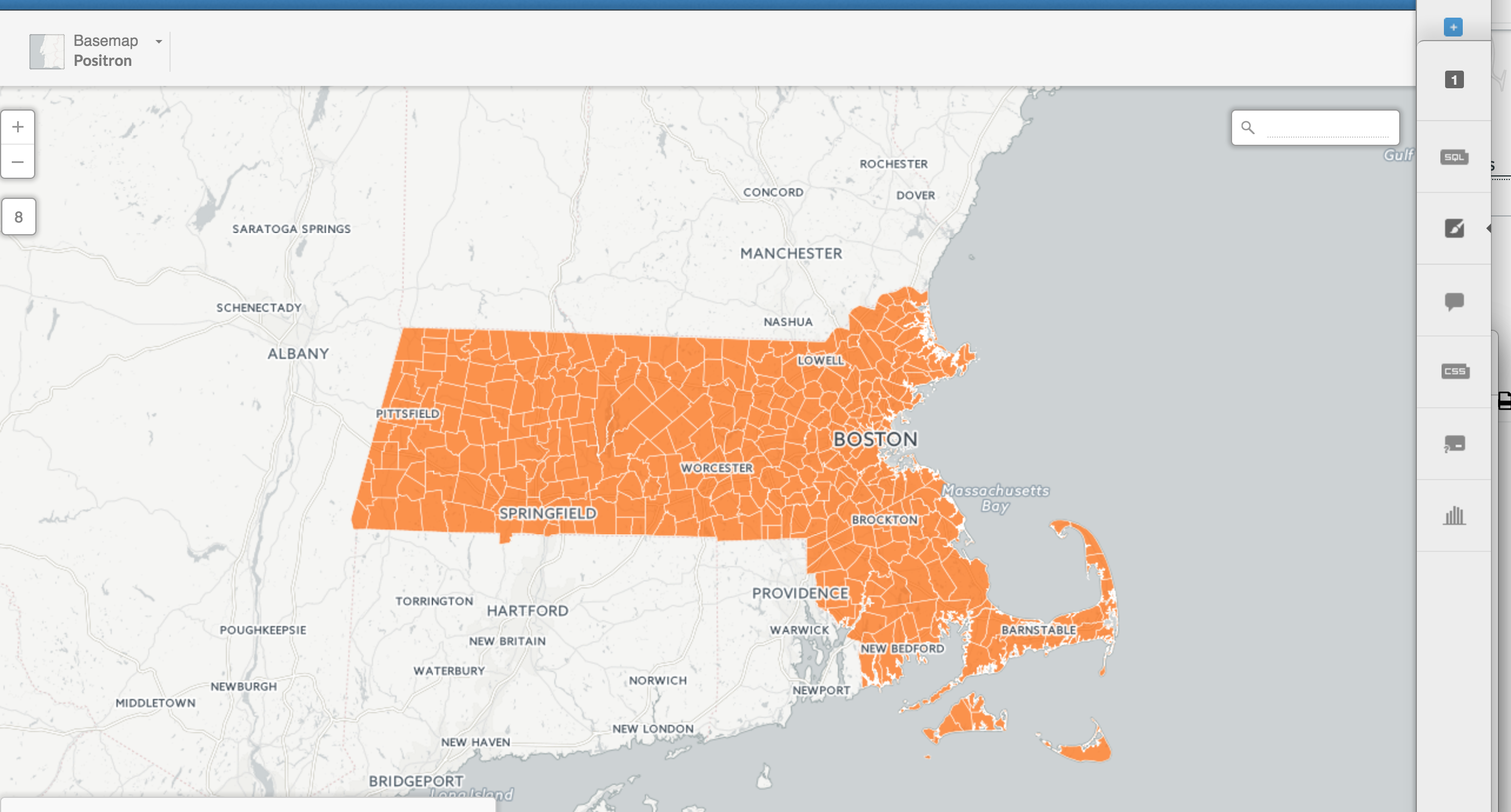
Click on Map view
Click into townsurvey_poly and take a look at what the data looks like.
There's a column with Town names. Perfect.
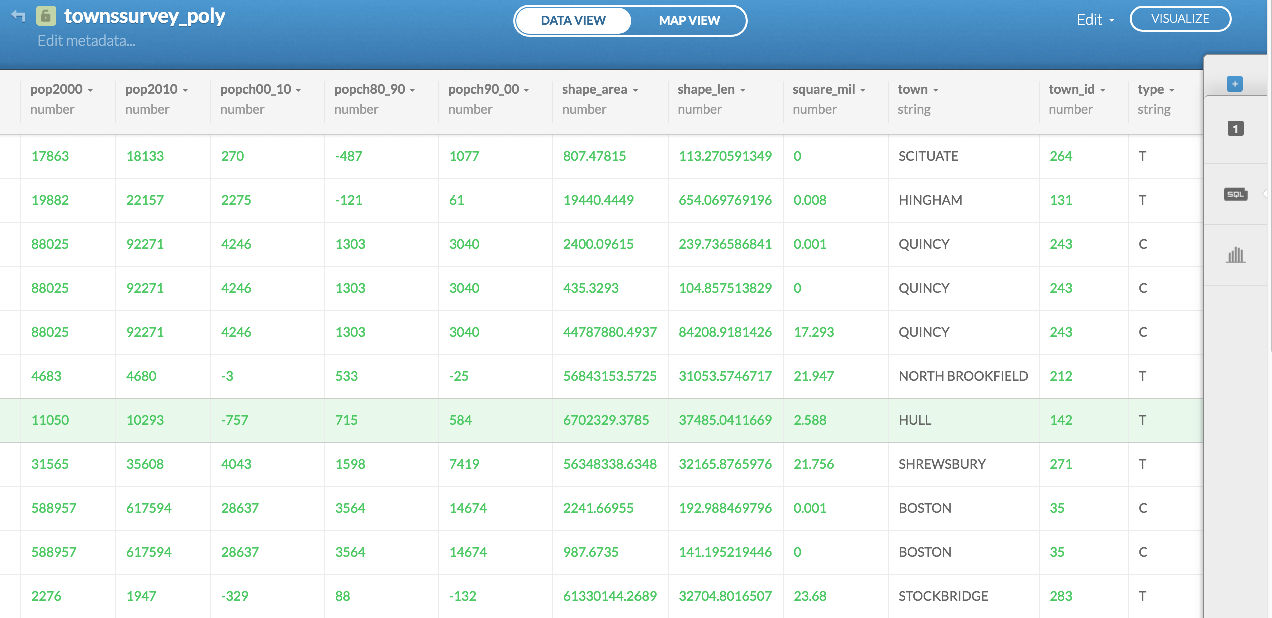
Yup, those are towns fully rendered.
Now we just need to join this data with the previous snowfall data set we were looking at.
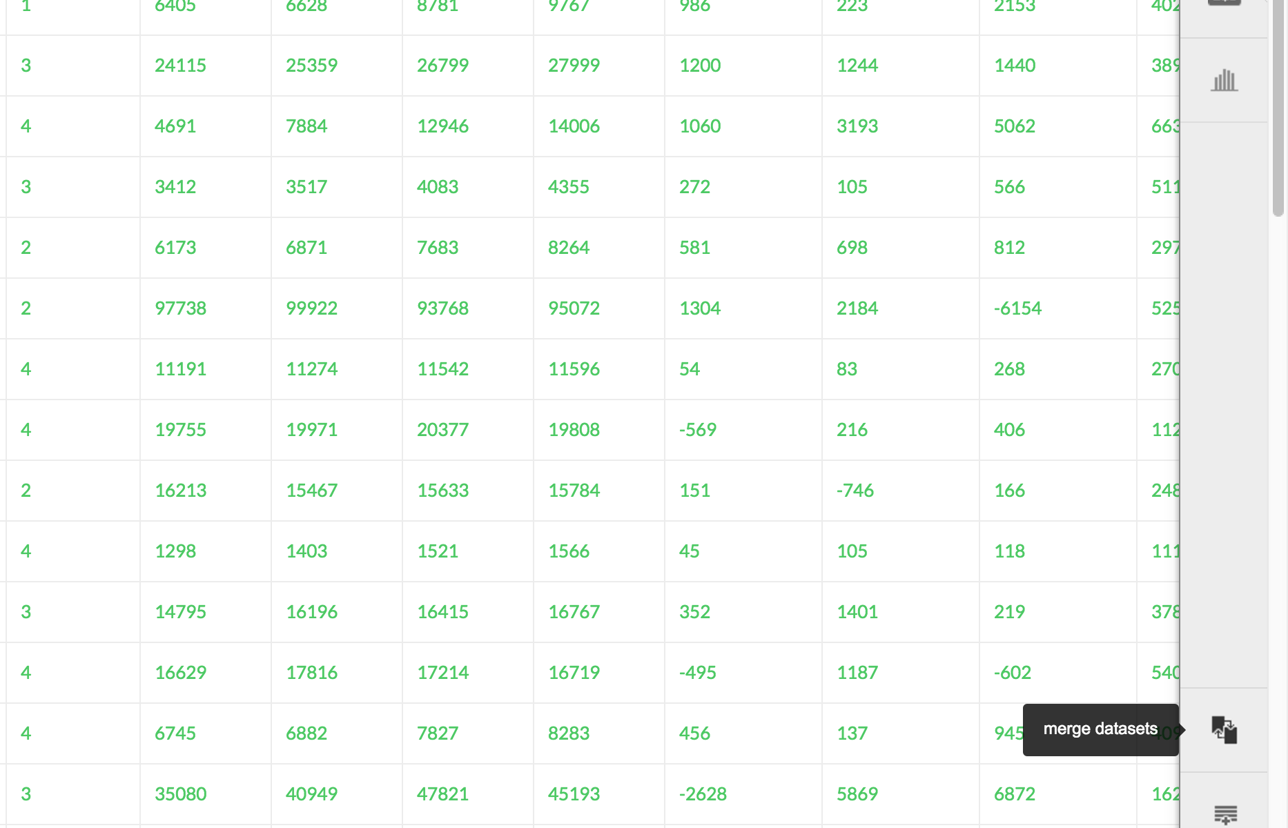
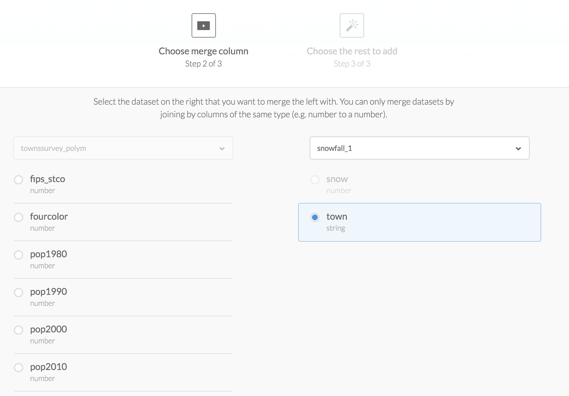
Go back to Data view and on the bottom right, click on the button Merge datasets.
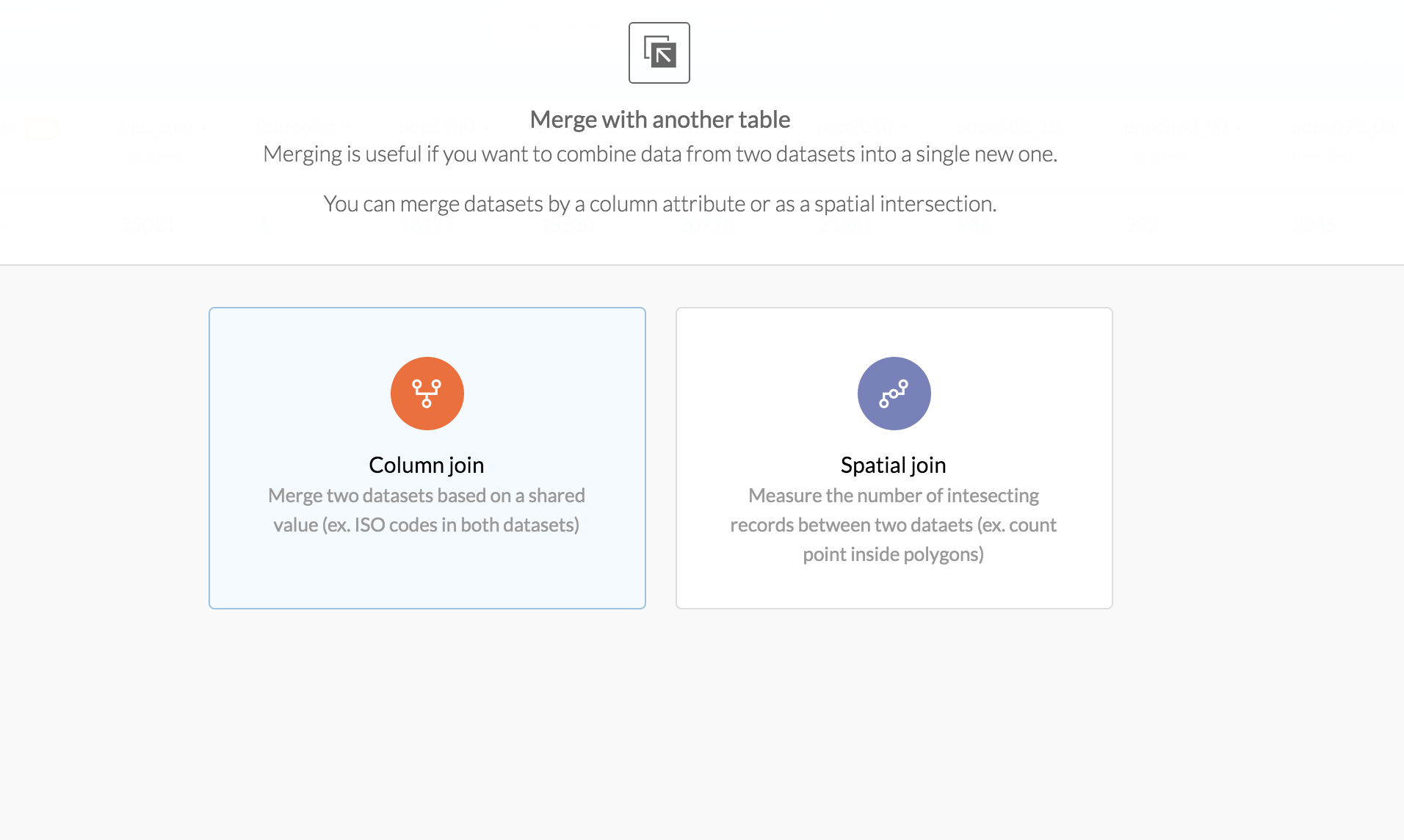
It'll ask you what type of join you want.
For this example we want to just do Column join
OK, select the column you want to join on, which is town and the dataset you want to join with, which is snowfall.
Be sure town and town are both selected, otherwise the join will fail.
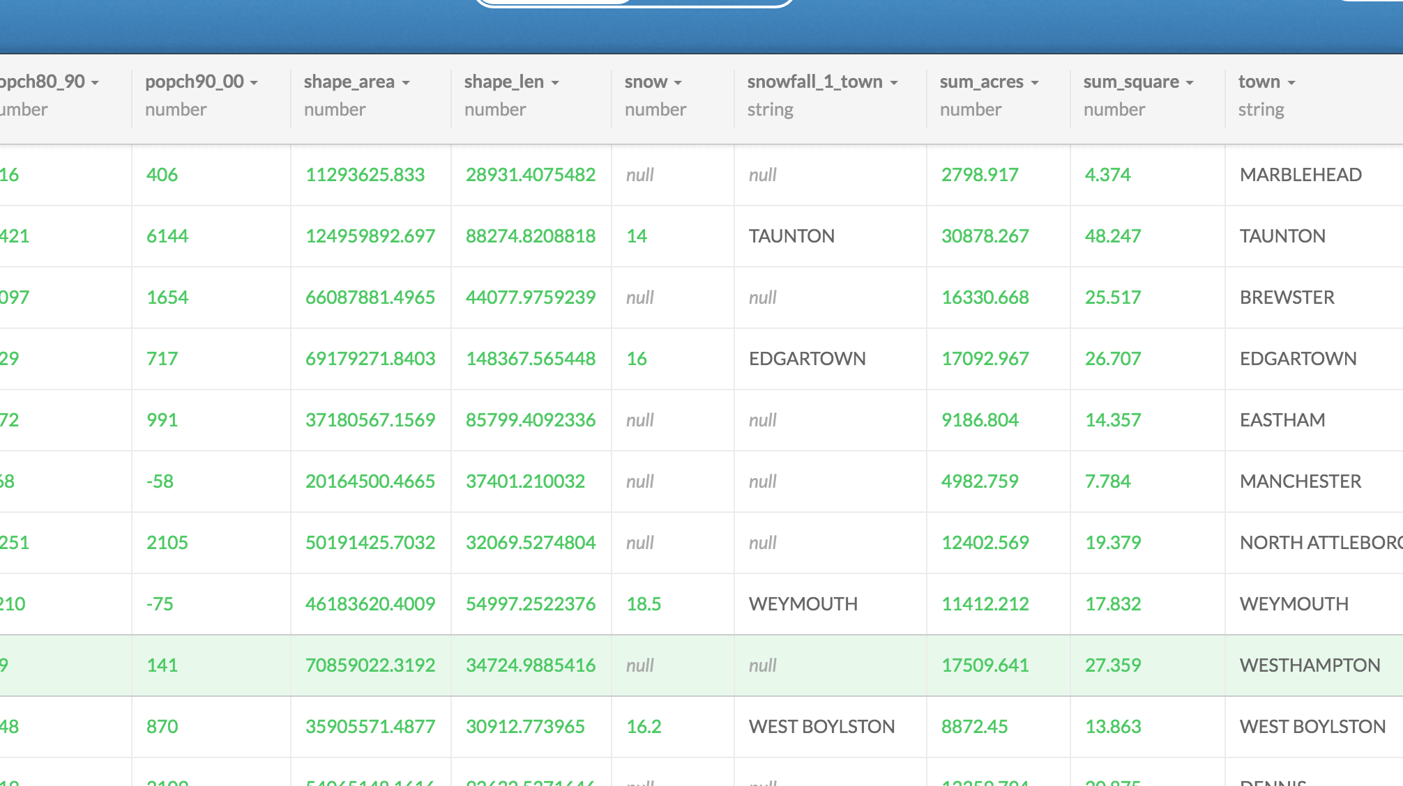
Alright, a new dataset will be created. Look at the data and scroll around.
There are quite a few null values. Either because the names did not match (remember Southboro versus Southborough?) or because there was no numbers reported for that town.
We'll move on for now but if this was for publication, you'd want to go back to make sure towns matched exactly and that nothing was missing.
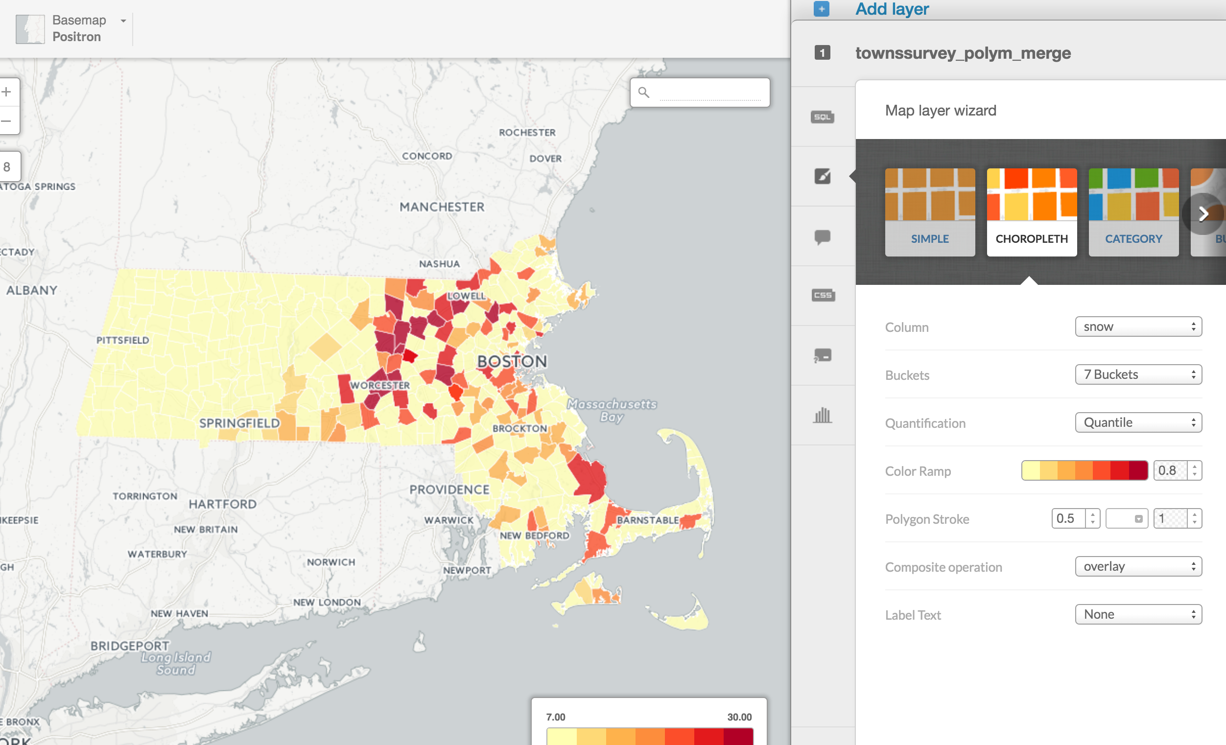
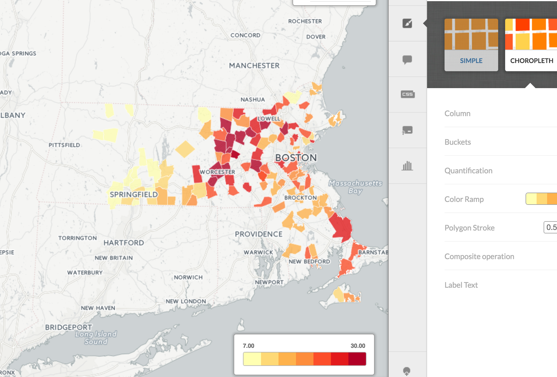
Click on Map view and select Choropleth from the Map Layer Wizard.
Select snow in Column so the numbers are reflected in the color.
There's a lot of yellow. That's because the states with null are included.
We should get rid of them.
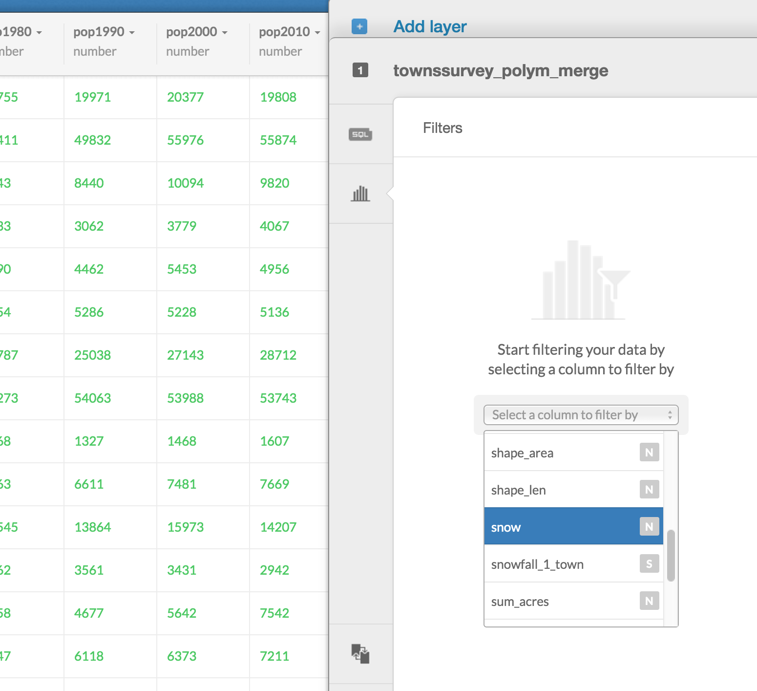
Go back to Data View and click on the Filter button on the right.
Select snow from the pulldown menu.
This will make sure only rows with numeric values in the snow column appear in the dataset.
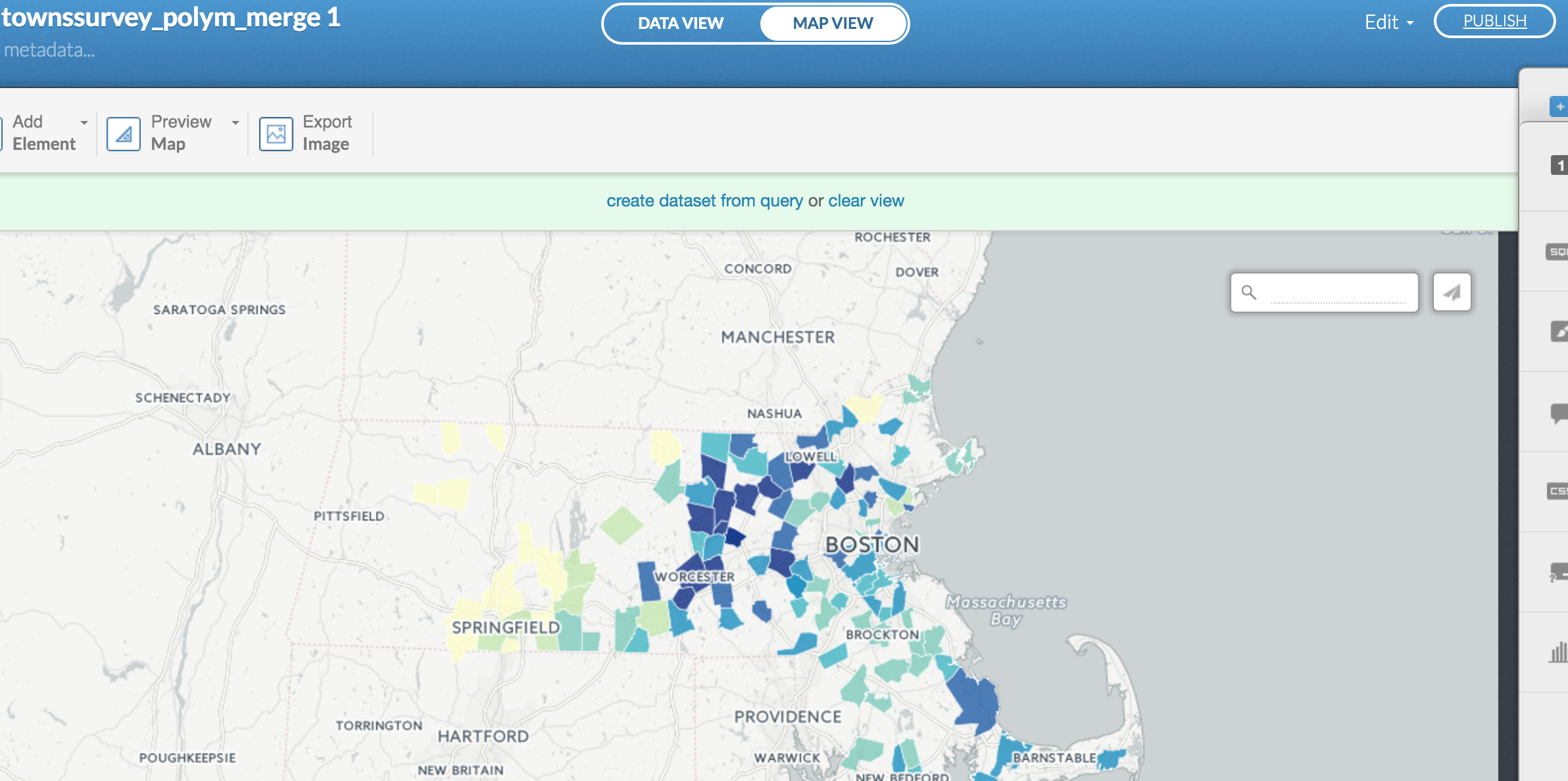
Go back to Map view
Looks much cleaner.
This way, we don't confuse the towns with no values with the towns with minimum values.
Click Color Ramp if you want to change range of colors.
You can also add more information in the Legend option and Info window.
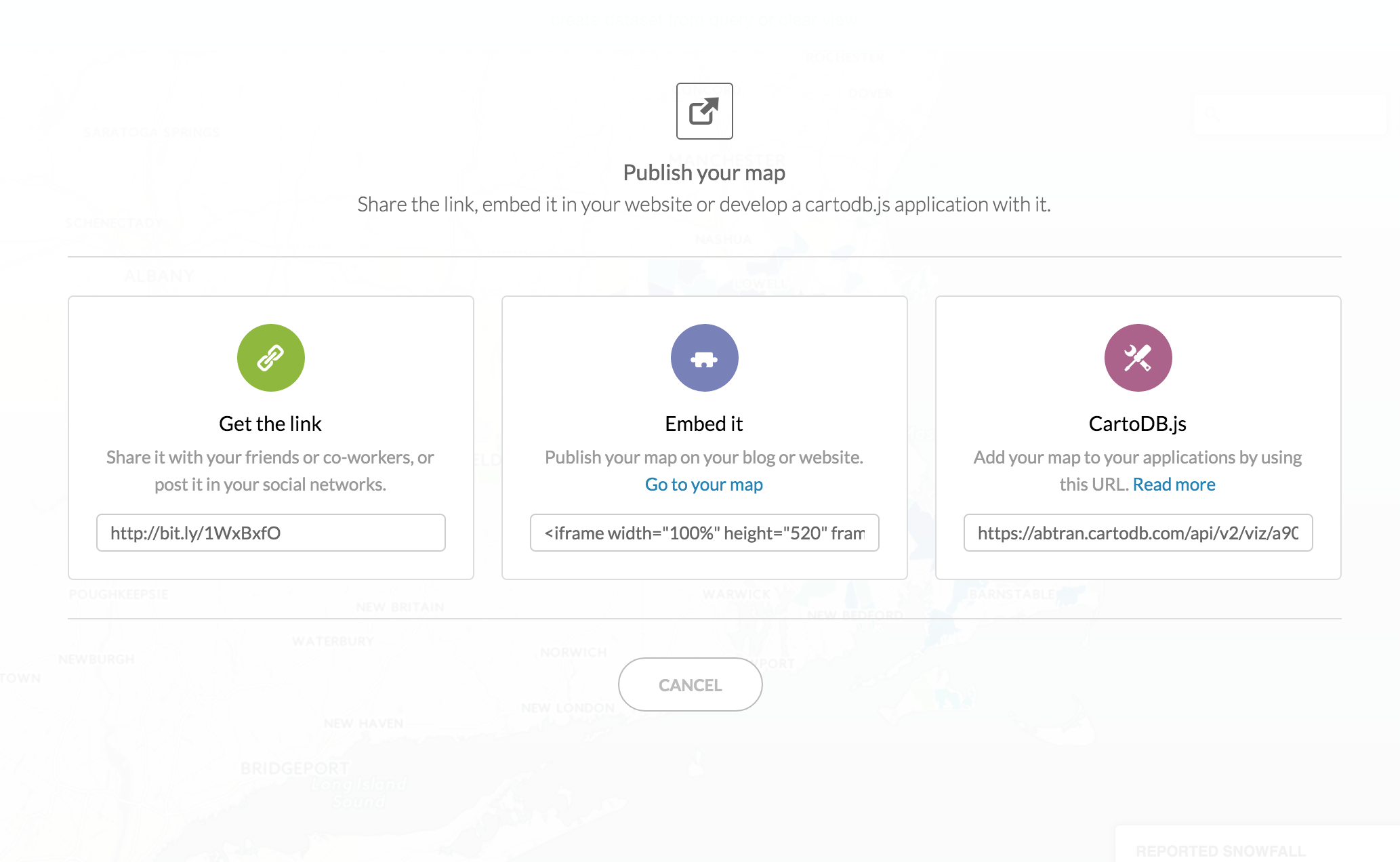
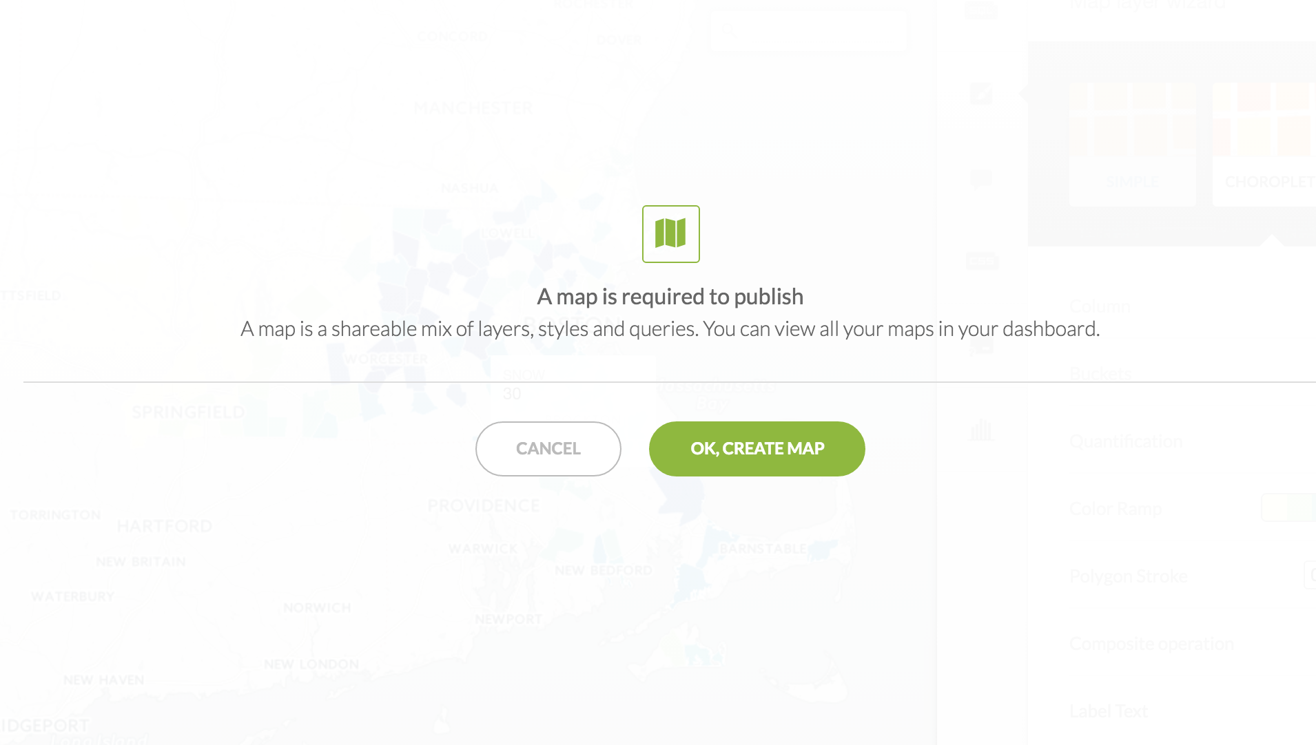
When you're done, click on Publish at the top right of the window.
Click OK, create map.
Now you've got some options.