Intermediate CartoDB walkthrough
You've made it through the Introduction to CartoDB and made some basic dot, bubble, and choropleth maps.
Now, we're going to try something a bit more complicated.
An animated timelapse map.
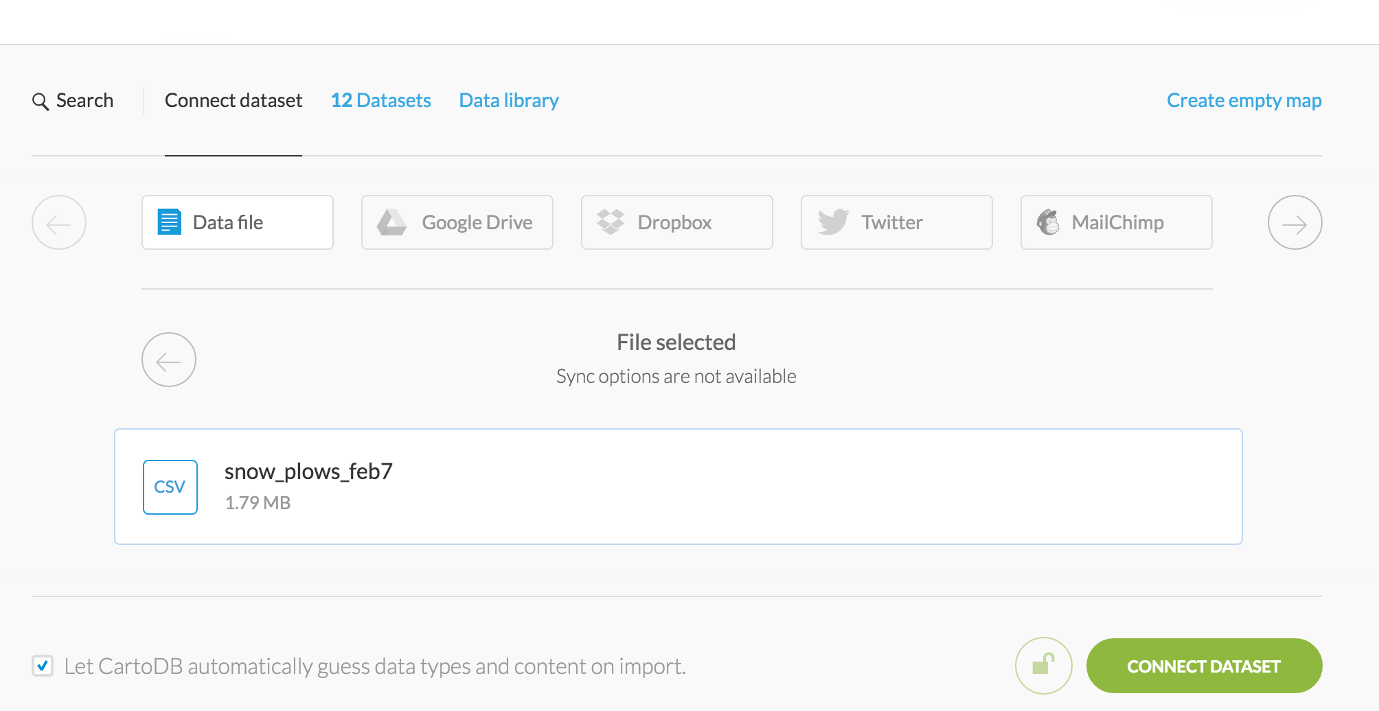
First, download this dataset of snowplows in Boston on a single day in February during the blizzard of 2015.
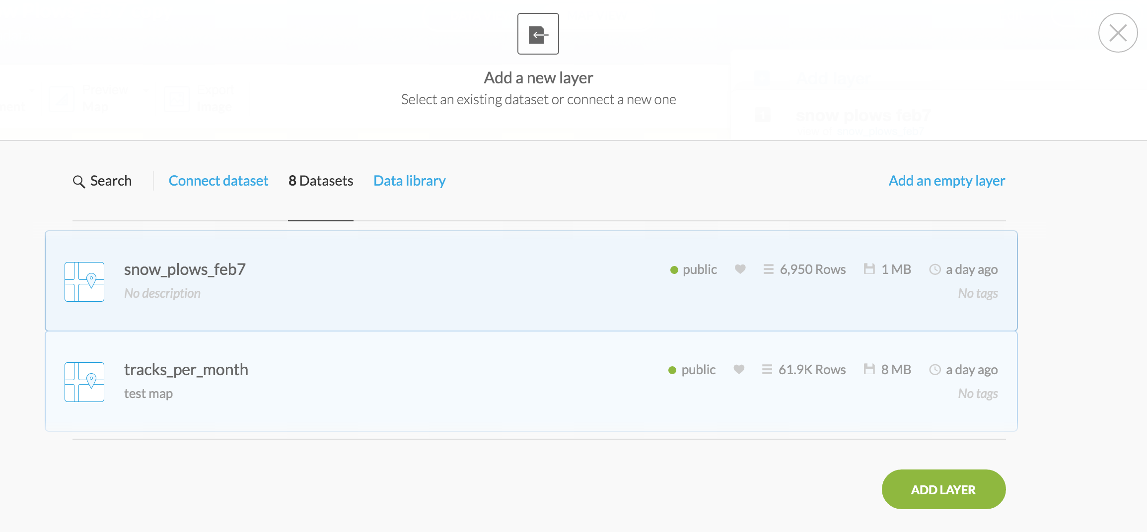
Bring it into your CartodB Data library.
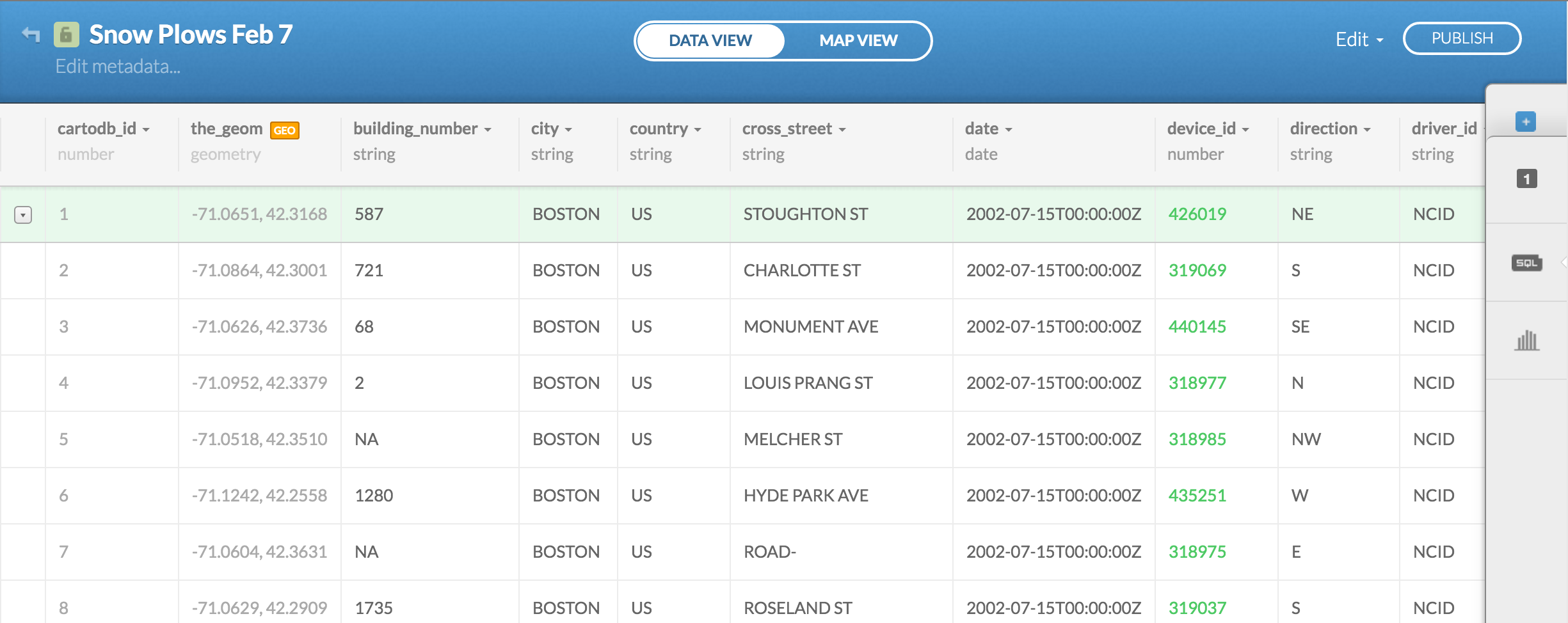
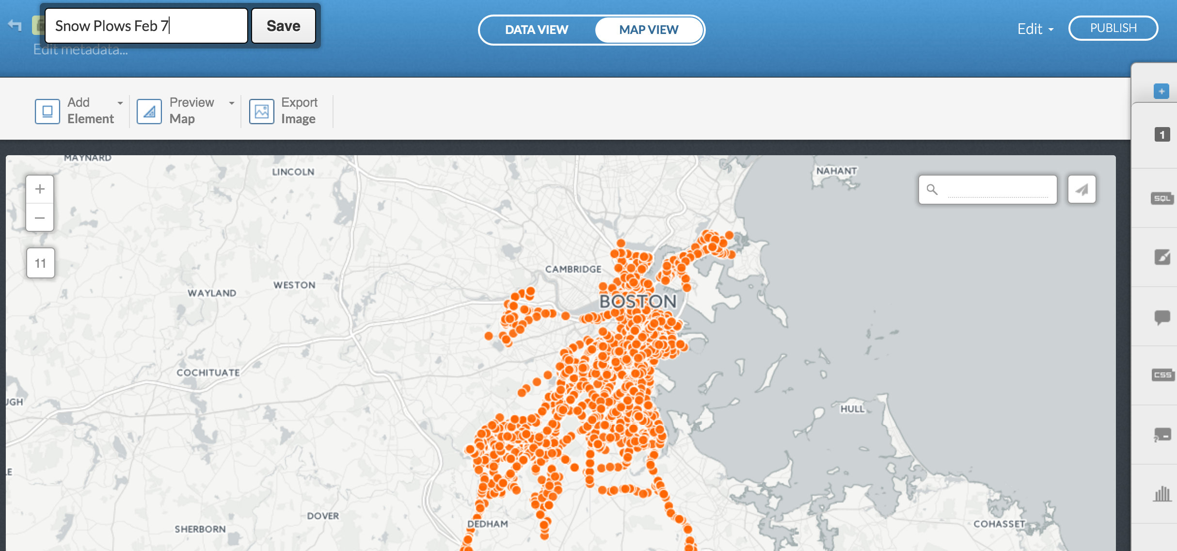
This is what the data looks like. Browse it over.
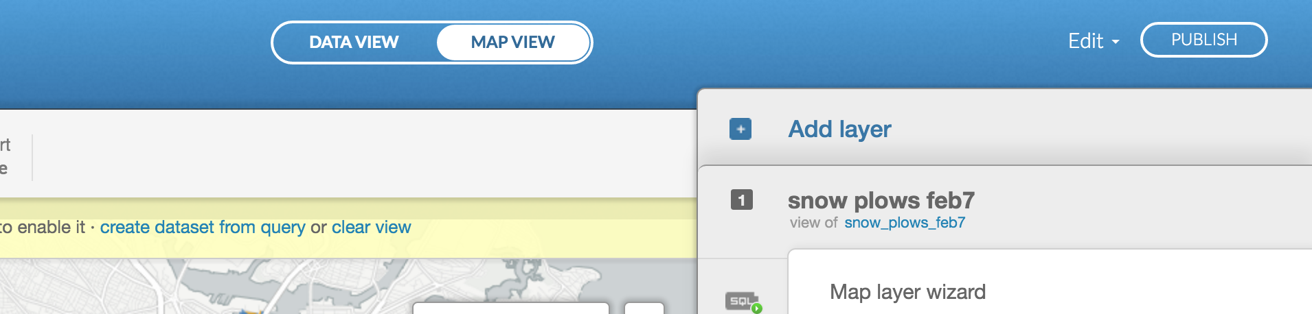
Click over to Map view.
Go ahead and rename it Snow Plows Feb 7.
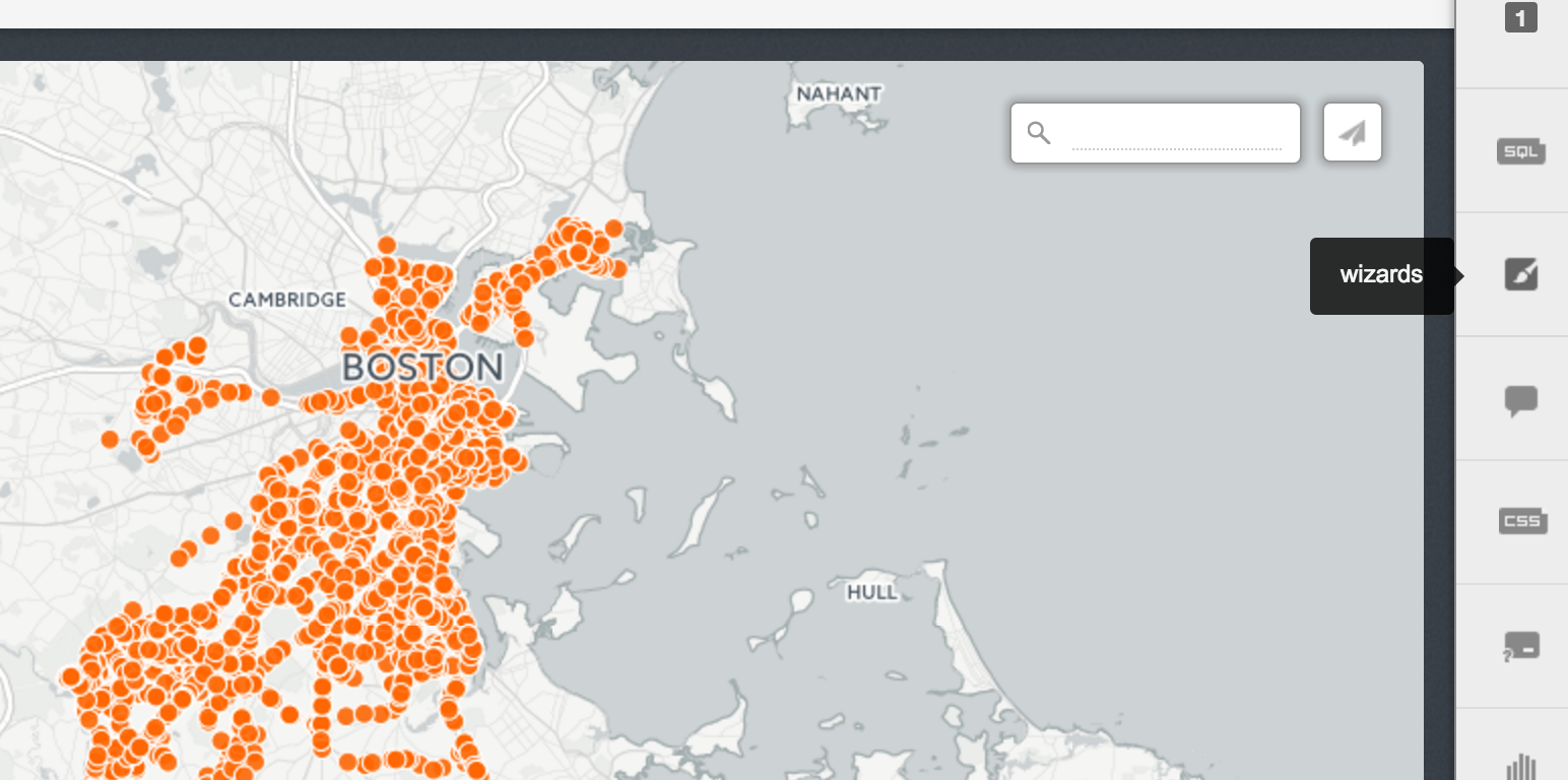
Click on Wizards on the right.
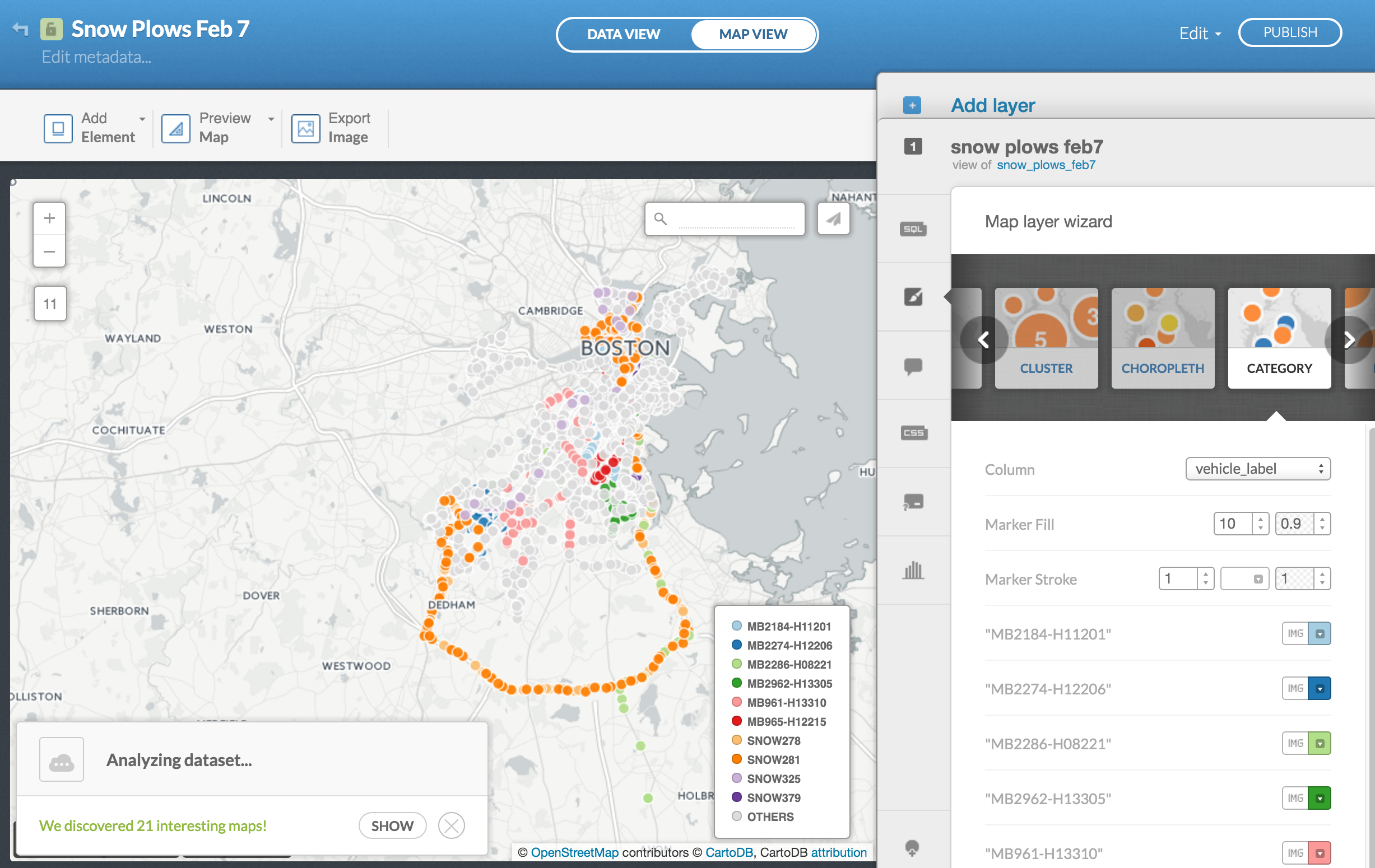
Scroll over to Category and select vehicle_label in Column.
Looks like there's a limit to how many vehicles it can display.
It'll show just 10 and then group up the rest into Others.
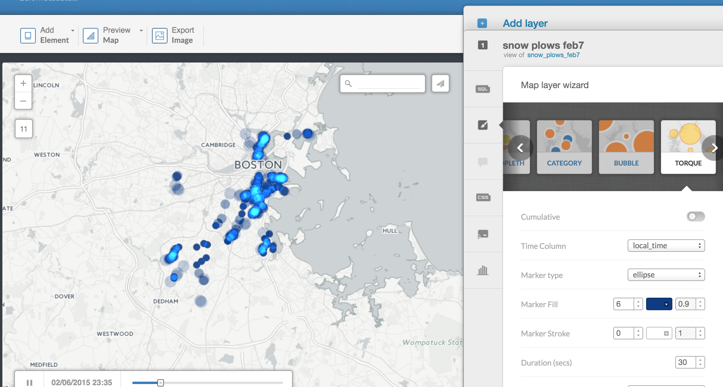
Scroll over to Torque and set local_time in Time Column.
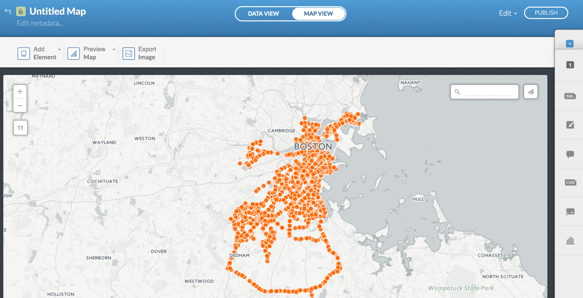
This might take some time to render, but eventually dots will appear and disappear based on the timestamp.
Looks cool right?
Except it's really hard to tell anything about it, right?
It's just a bunch of blipping dots.
What can you learn from this?
Let's try to make things more distinct.
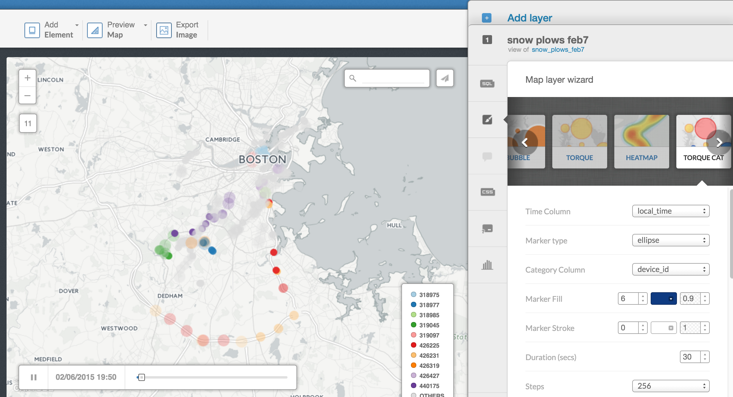
Scroll over to Torque Cat and select local_time in Time Column and device_id in Category Column.
Now we see a bit more. We can sort of see where specific plow trucks are going.
If you want, you can change Duration and Steps to slow down or quicken the animation.
Let's try another way.
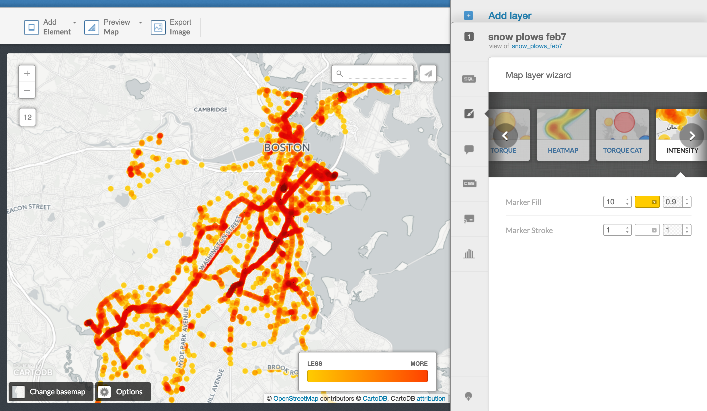
Scroll over to Intensity.
Ok, now we can see which areas seem to be focused on more than other streets.
If we wanted to analyze which neighborhoods where more emphasized over others, this might be a good way to go.
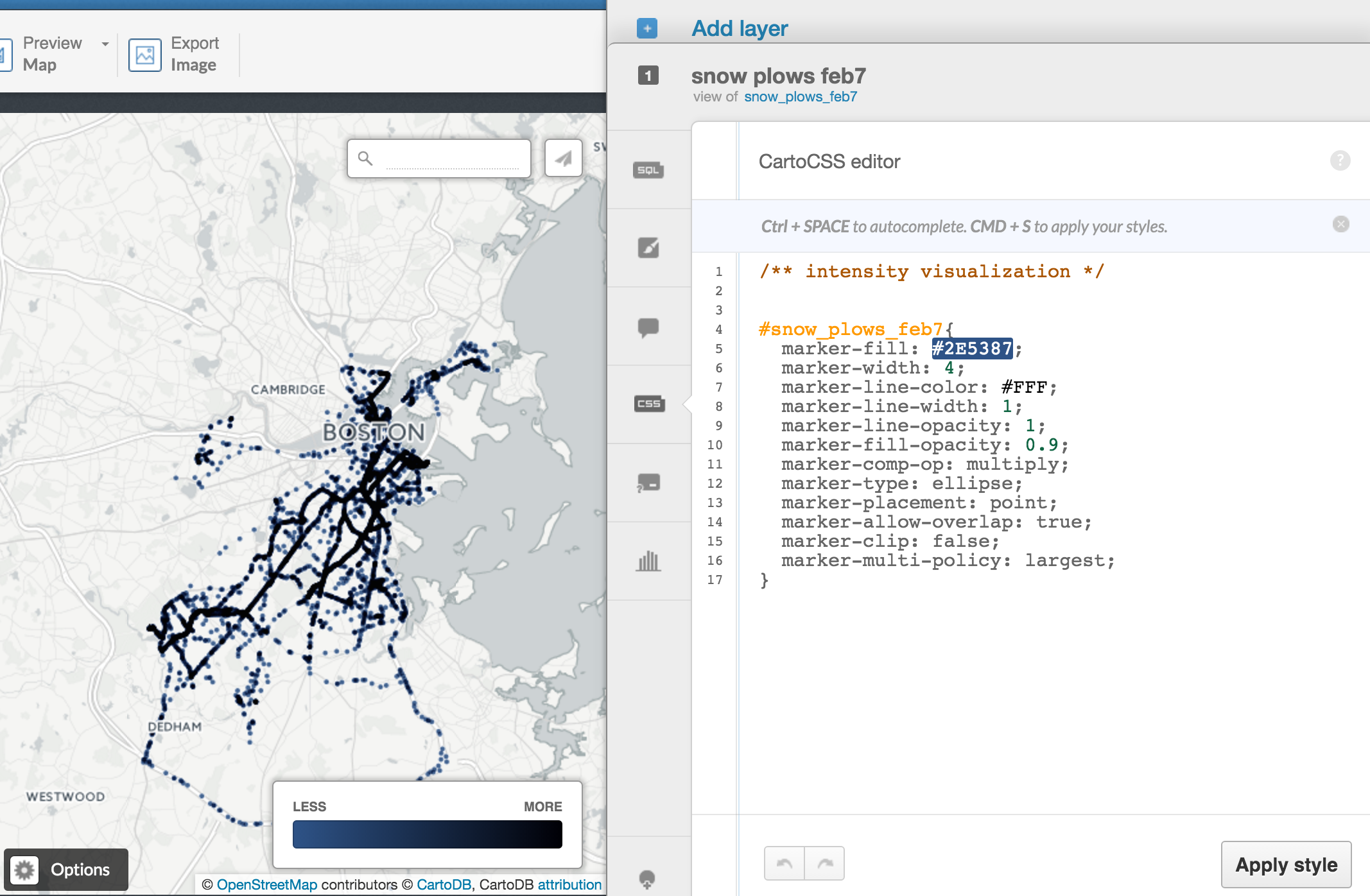
Click on the CSS button on the right.
This is the mechanics of what's going on to render this map online.
This is called CartoCSS which is very similar to CSS.
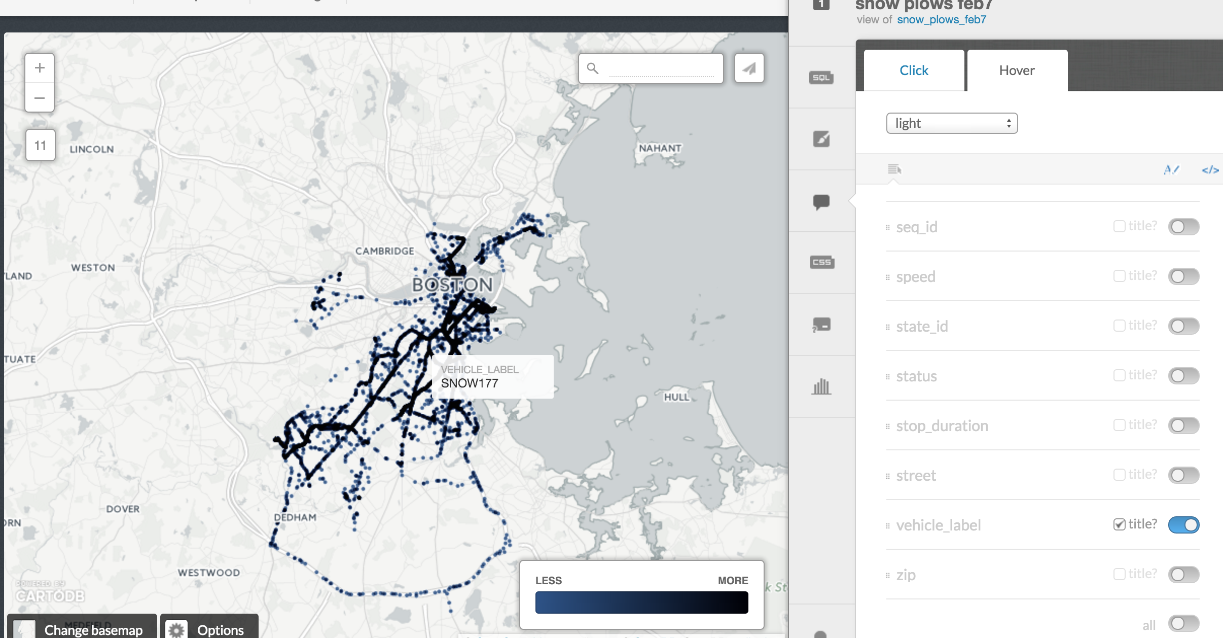
Click back over to Infowindow and you can select Hover info options if you want.
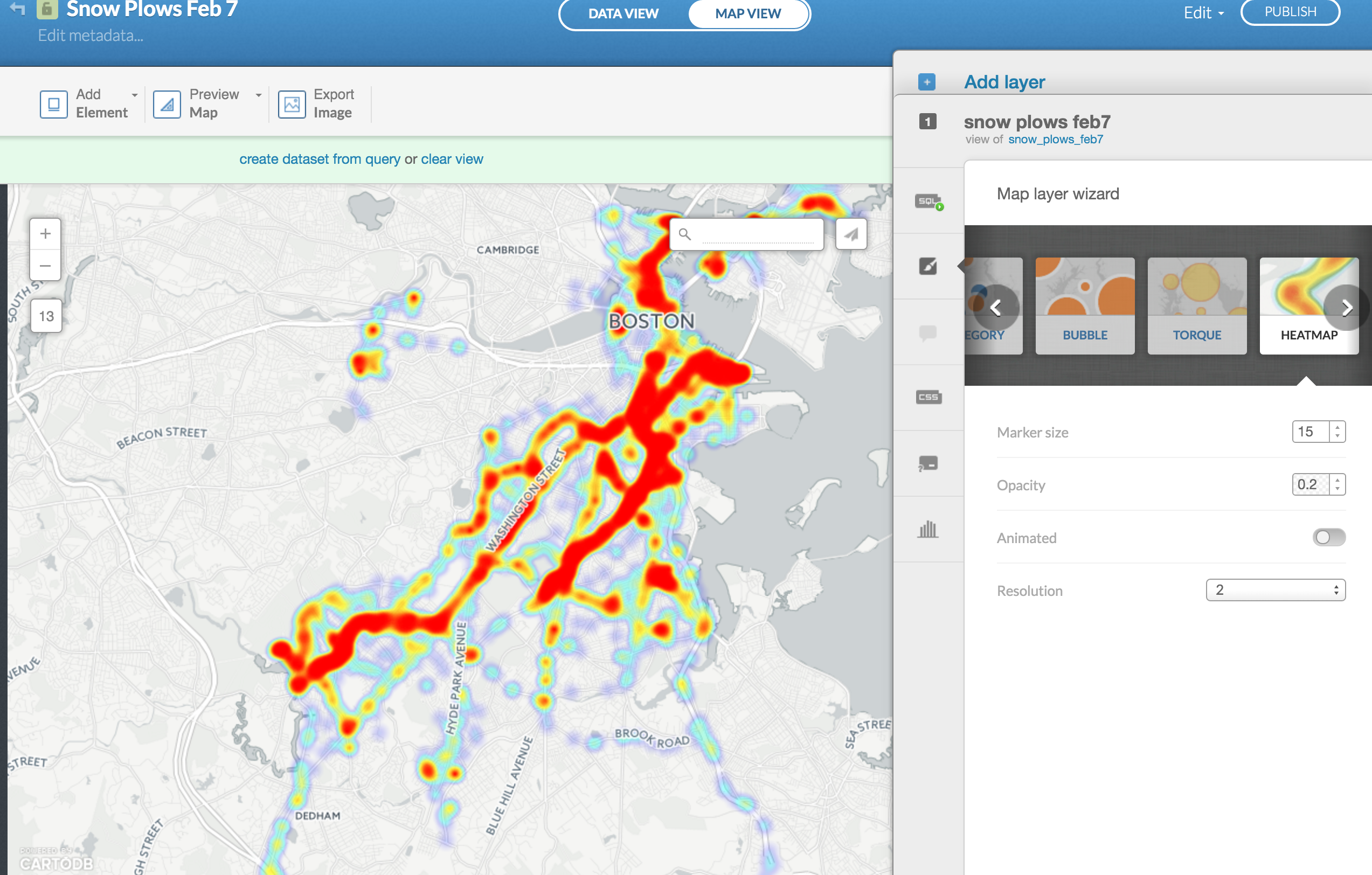
Scroll over to Heatmap and you can see something similar to intensity.
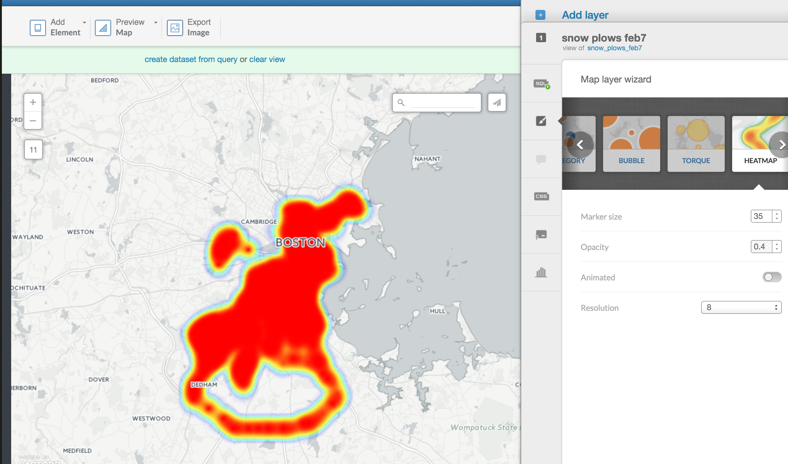
It's kind of blobby at the moment, but you can adjust it with marker size and resolution.
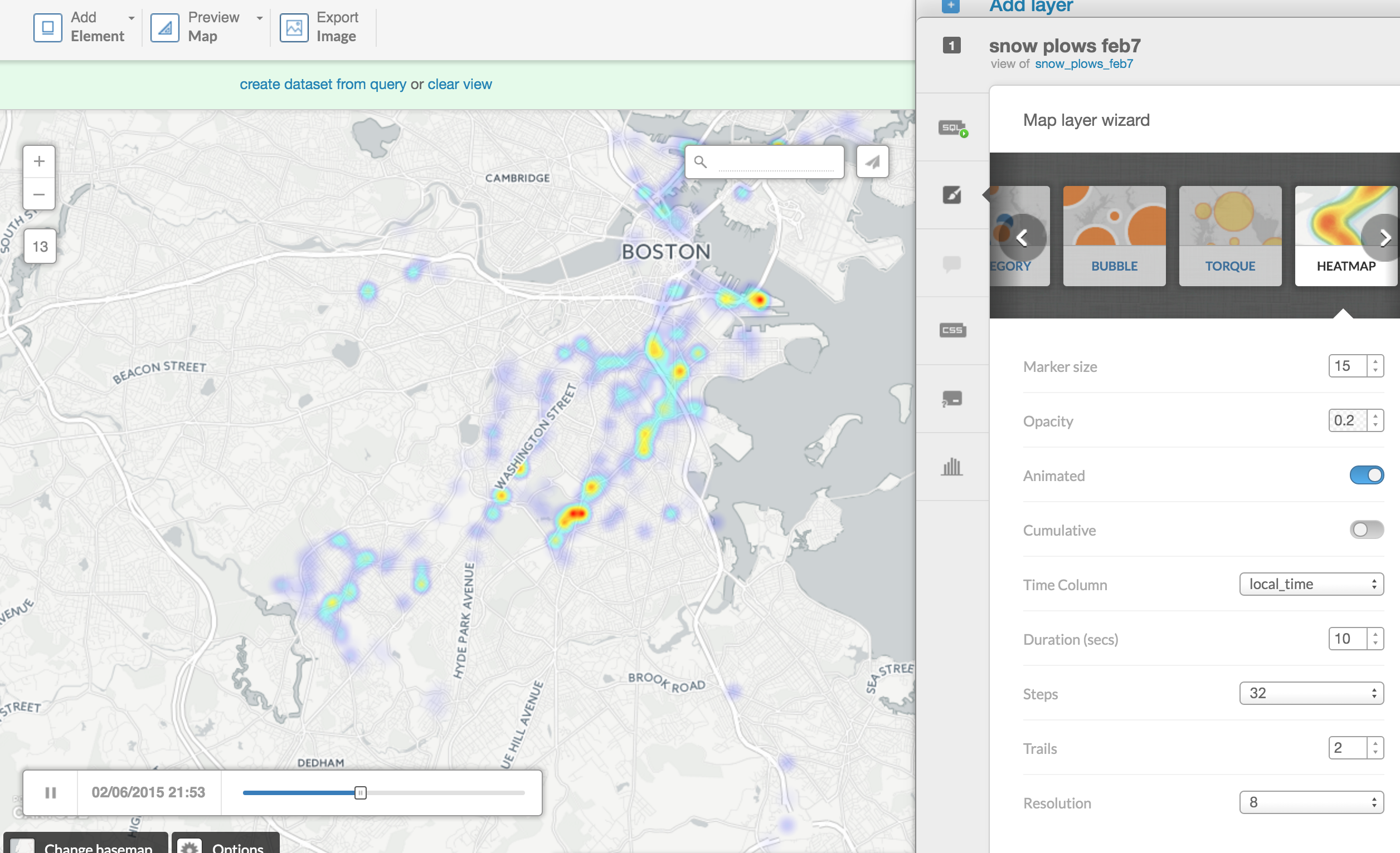
Toggle the Animated button and select local_time.
Now you see the heatmap fluctuate over time.
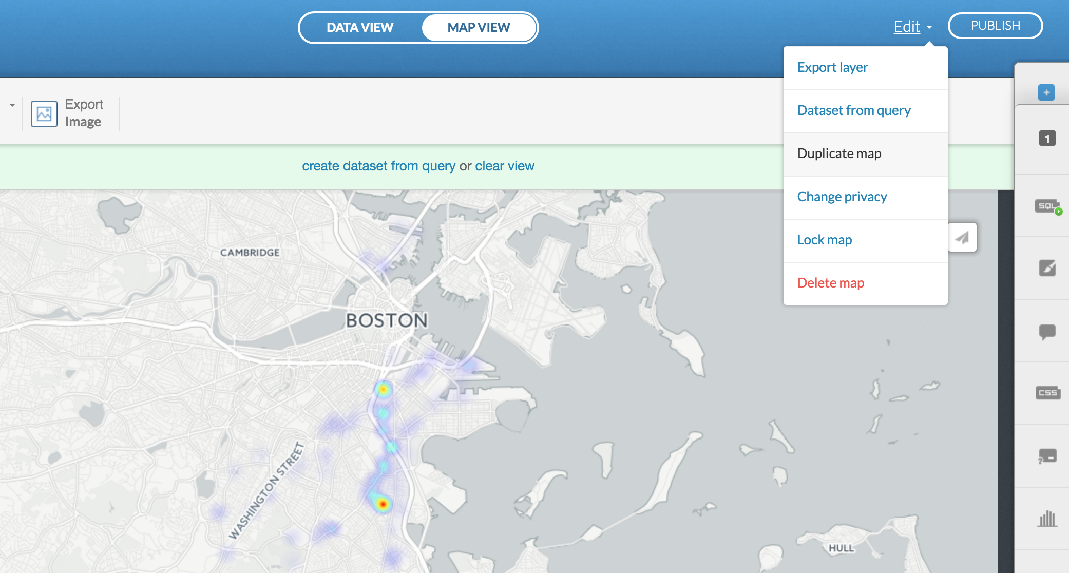
Click Edit at the top right and select Duplicate map.
We want to map the path of each individual snow plow.
We can do that using SQL, structured query language that manages data (via code instead of clicks in Excel or Google Spreadsheet).
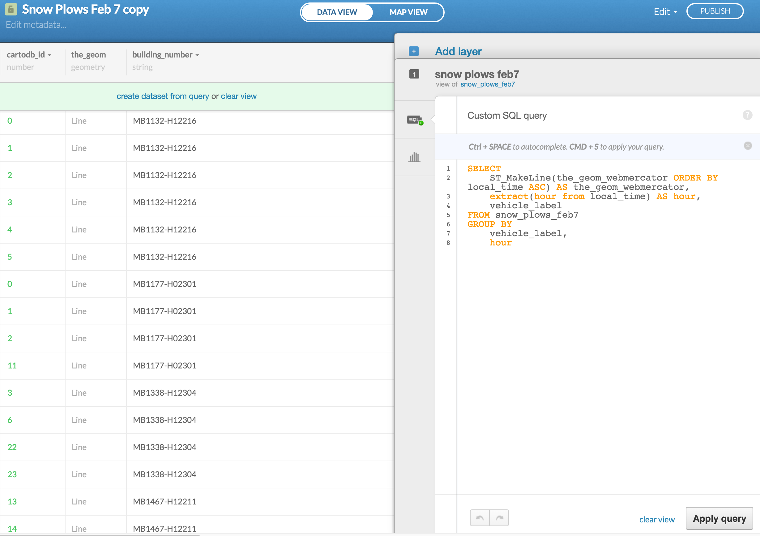
Click on the SQL button on the far right and put this code in.
SELECT
    ST_MakeLine(the_geom_webmercator ORDER BY local_time ASC) AS the_geom_webmercator,
    extract(hour from local_time) AS hour,
    vehicle_label
FROM snow_plows_feb7
GROUP BY
    vehicle_label,
    hour
Make lines based on these dots and time stamps categorized by snow plow vehicles and create a new column called hour based on the timestamp.
Click over to Map view.
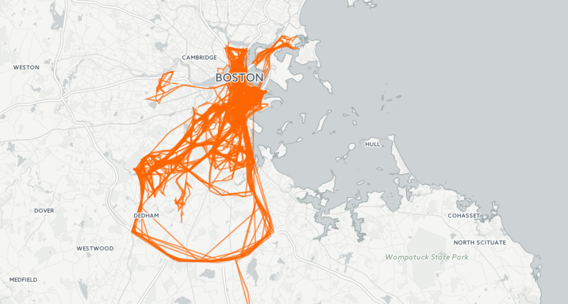
We've got the same problem before. It's hard to distinguish paths from so many different snow plows.
We need to narrow it down.
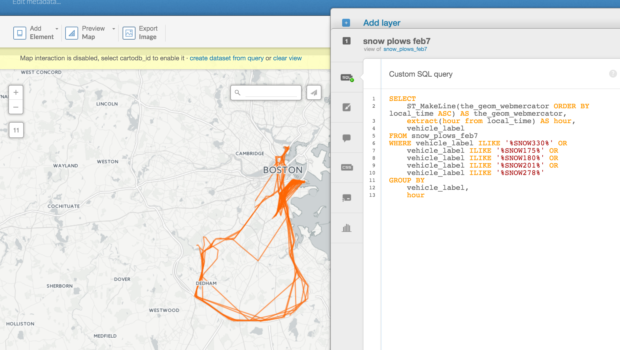
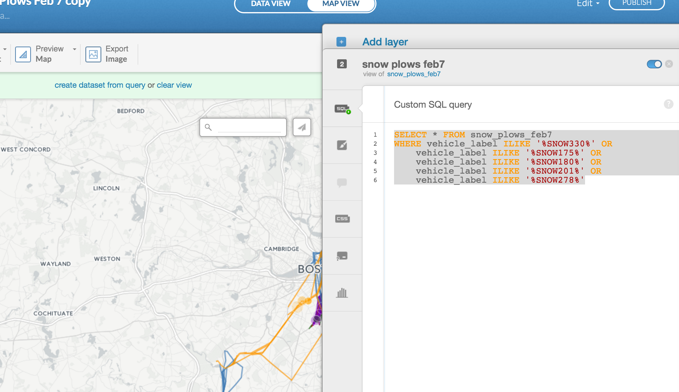
Click on the SQL button again but this time put in this code:
SELECT
    ST_MakeLine(the_geom_webmercator ORDER BY local_time ASC) AS the_geom_webmercator,
    extract(hour from local_time) AS hour,
    vehicle_label
FROM snow_plows_feb7
WHERE vehicle_label ILIKE '%SNOW330%' OR
    vehicle_label ILIKE '%SNOW175%' OR
    vehicle_label ILIKE '%SNOW180%' OR
    vehicle_label ILIKE '%SNOW201%' OR
    vehicle_label ILIKE '%SNOW278%'
GROUP BY
    vehicle_label,
    hour
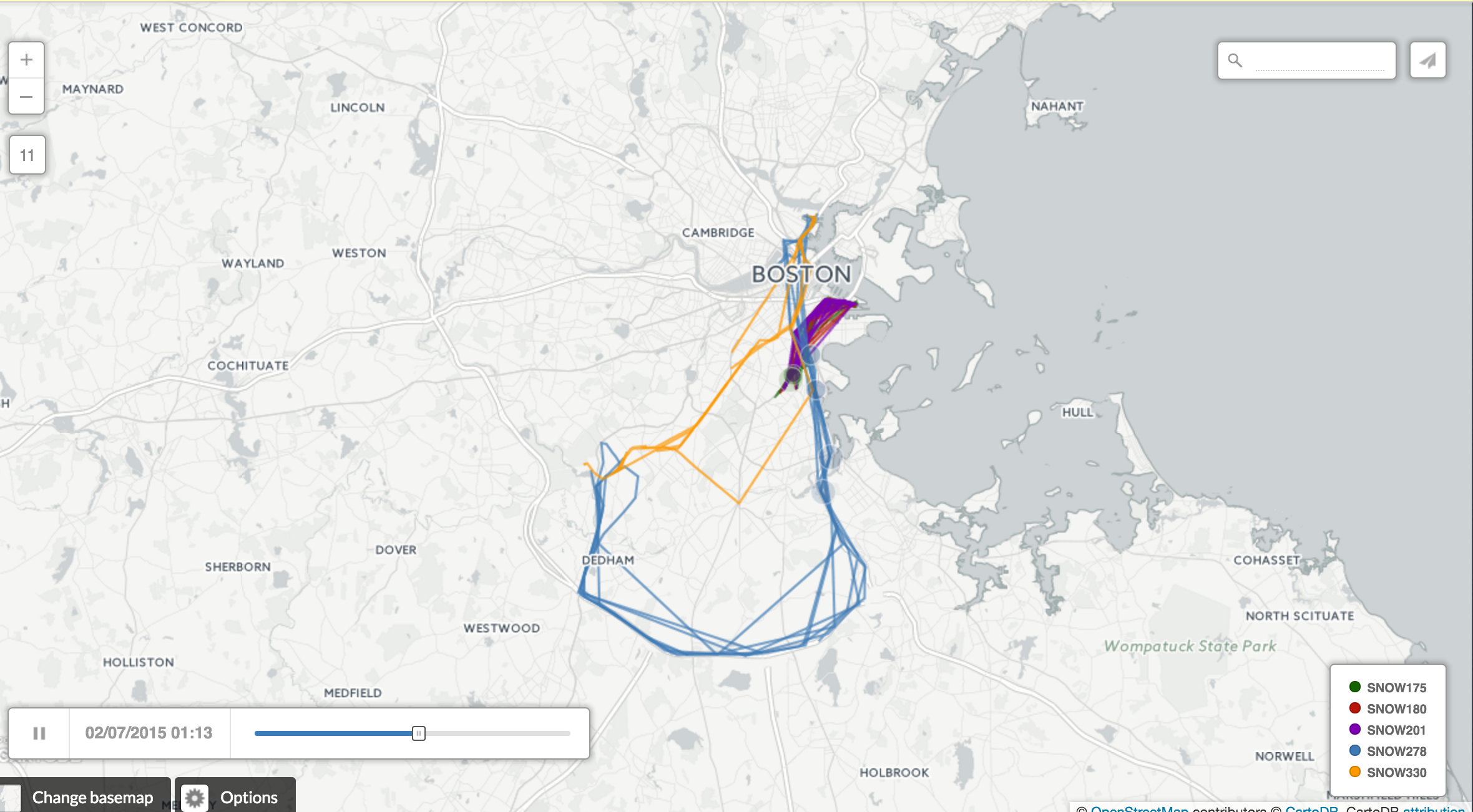
This is the same code as before but now it just focuses on five snow plows that we've pulled out.
There are way less lines now.
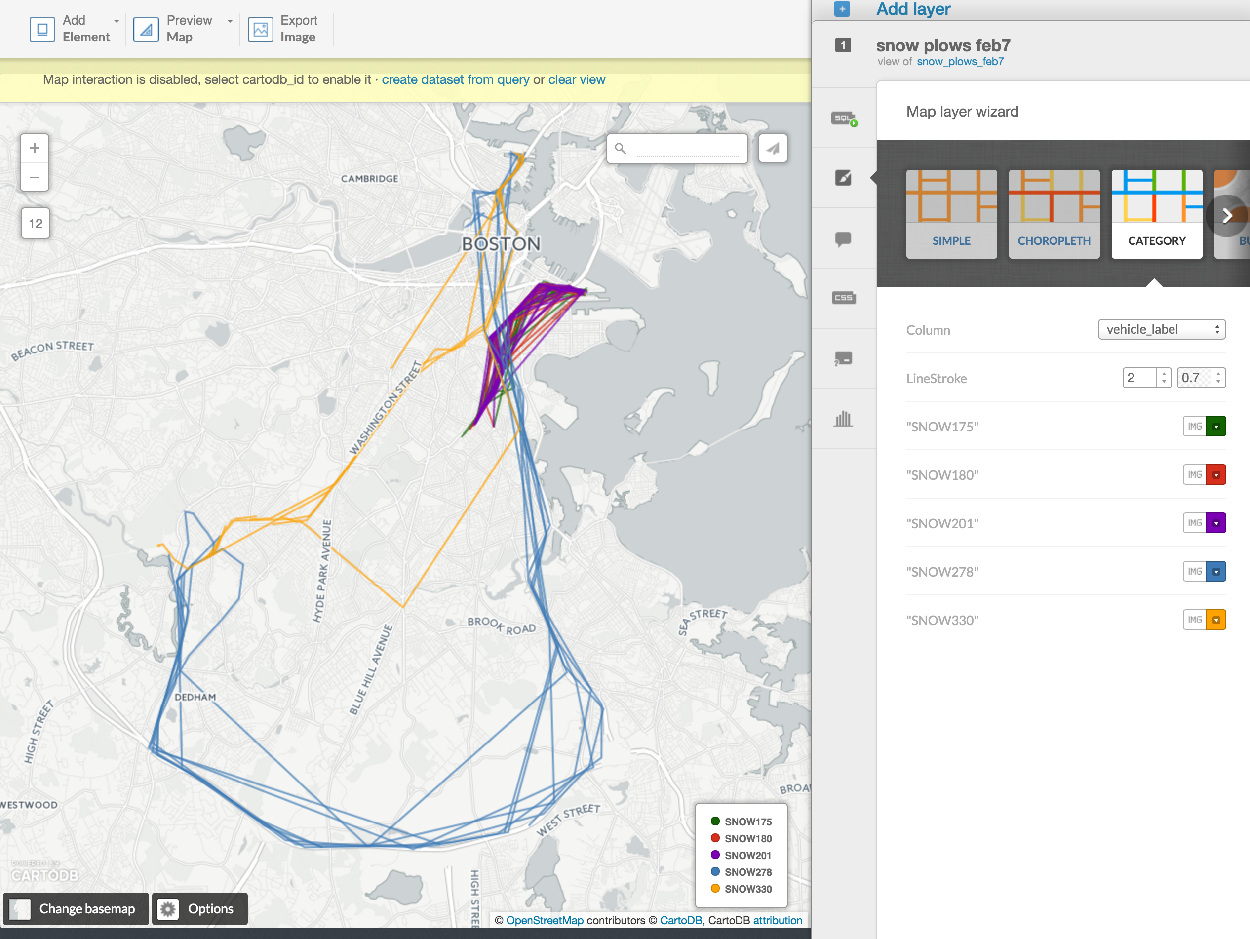
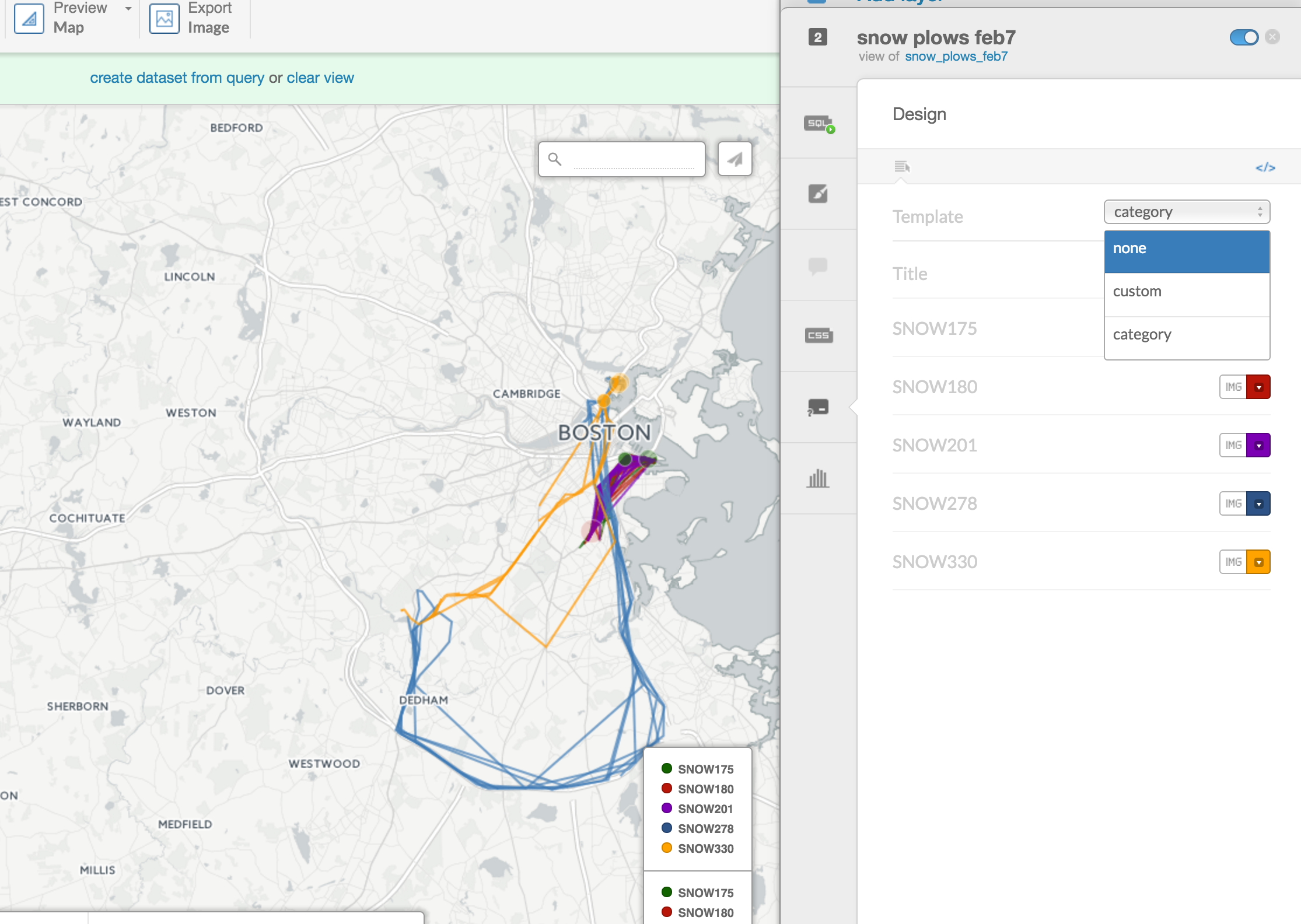
Click on Wizard and scroll over to Category and select vehicle_label in Column.
Differentiate the colors a bit but now you can see the path for each snow plow.
Pretty cool.
Now for more cool stuff.
Click on the Add layer button at the top right.
Find the timelapse map you made earlier with the original
You want to narrow it down to the five snow plows like the previous layer.
Add this to the SQL:
WHERE vehicle_label ILIKE '%SNOW330%' OR
    vehicle_label ILIKE '%SNOW175%' OR
    vehicle_label ILIKE '%SNOW180%' OR
    vehicle_label ILIKE '%SNOW201%' OR
    vehicle_label ILIKE '%SNOW278%'
Scroll to Torque cat and select local_time in Time Column and vehicle_label in Category Column.
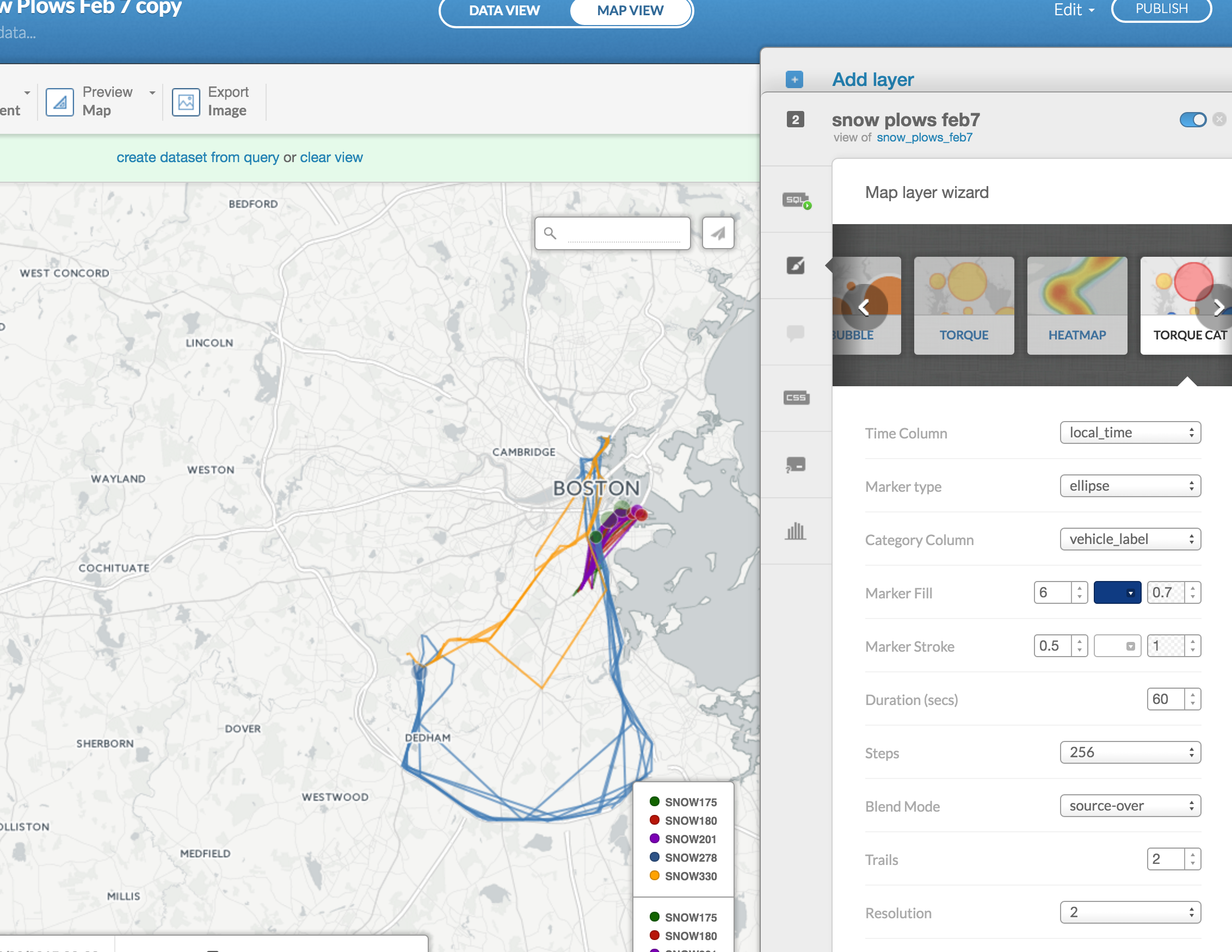
You'll have two legends now, but you can get rid of them by going over to Legend and selecting none in Template.
You're all set!
Now you've got an animated path of five snow plows in Boston during the blizzard.
Just click publish when you're ready to go.